Blender Editor
Blender Editors
Blender provides a number of different editors for displaying and modifying different aspects of data.
The Editor Type selector, the first button at the left side of a header, allows you to change the editor in that area.
Every area in Blender may contain any type of editor and it is also possible to open the same type multiple times.
![]()
The Editor Type selector.
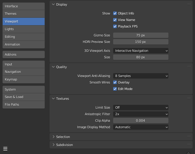
3D View Introduction
The 3D View is used to interact with the 3D scene for a variety of purposes,
such as modeling, animating, texture painting, etc.
Header Region
![]()
Object Mode header.
The header contains various menus and controls based on
the current mode.
Tools and modes in the 3D View header are split in three groups of buttons:
Mode & Menus
- Mode
The 3D View has several modes
used for editing different kinds of data.
- View
This menu offers tools to navigate in 3D space.
Other menus depend on the current mode, Object Mode menus listed below:
- Select
Contains tools for selecting objects.
- Add
Gives a list of different objects types that can be added to a scene.
- Object
This menu appears when in Object Mode.
it contains tools to edit objects.
In Edit Mode, it will change to the appropriate menu with editing tools.
Transform Controls
- Transform Orientations
Use to select and modify the active Transform Orientations.
- Pivot Point
Used to change the reference point (or pivot point) used by many mesh manipulation tools.
Read more about Pivot Points.
- Snapping
Controls the snapping tools
that help with transforming and modeling objects.
- Proportional Edit
Proportional Edit.
Display & Shading
- Object Type Visibility
Change the Object Type Visibility
and selectability of objects in the 3D View.
- Viewport Gizmos
Change the way how gizmos are
displayed in the 3D View.
- X-Ray
Show the whole scene transparent. This is a shortcut to
the X-ray option inside the shading control.
- Viewport Overlays
Change the way how overlays are
displayed in the 3D View.
- Viewport Shading
Change the shading of the 3D View.
Toolbar Region
The Toolbar is a context-sensitive region containing tools depending on the current mode
(for example, modeling tools in Edit Mode, brush tools in Sculpt Mode…).
See Tools for more information.
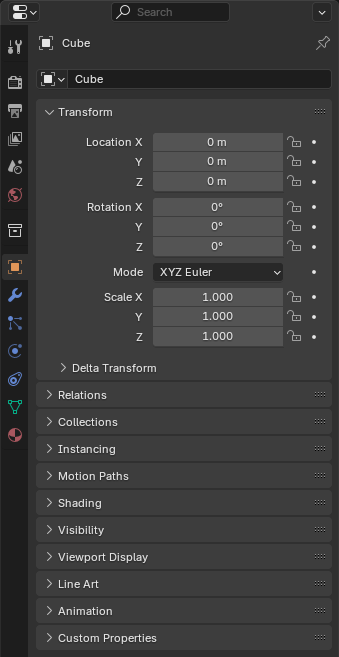
Sidebar Region
The Sidebar region contains properties of the active object and selected objects (such as their locations),
as well as properties of the editor itself.
See Sidebar Panels for more information.
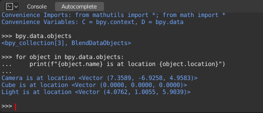
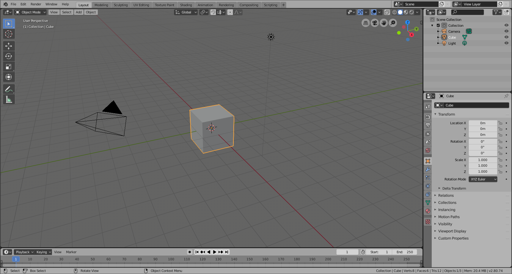
Startup Scene
After closing the splash, the startup scene is displayed in the 3D View
if no other blend-file was loaded. A customized startup scene
can be saved as a part of the startup file.
![]()
The Startup scene.
Elements
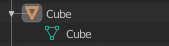
- Cube
The gray cube in the center of the scene is a mesh object.
Because the cube is selected it is displayed with an orange outline.
- Object Origin
The Origin of the object is displayed as
an orange dot and it marks the cube's (relative) position.
- Light
The circles with a thin line to the bottom is a light source illuminating the cube.
Lights in: General Settings.
- Camera
The pyramid with a big triangle pointing upward is the camera used as point of view for rendering.
See also: cameras in Cycles.
- 3D Cursor
The 3D cursor, a cross with a red-and-white circle,
is used for placing objects in the scene.
- Grid Floor
The gray squares forming a floor mark the zero height of the world.
The red and green lines are the axis of the world coordinate system.
They meet at the origin, which is also the position of the Cube.
The Grid Floor settings are in the Viewport Overlay.
Text Info
The visibility and settings of the overlays can be set
in the Viewport Overlay.
- View Name
If the viewport camera is not aligned, the view is named “User” plus
the perspective of the viewport camera.
- Playback FPS
Displays the Frames Per Second screen rate, while playing an animation back.
- Object Info
Shown in brackets is the current frame. Followed by the path of the active object.
And optionally the selected shape key and
in brackets (<>) the Markers name on the current frame.
The color of the Object Info is set by the State Colors (keyframe only).
Object Modes
![]()
The Mode select menu.
Modes are an object-oriented feature, which means that the available modes vary
depending on the selected active object's type – most of them only enable
the default Object Mode (like cameras, lights, etc.).
Each mode is designed to edit an aspect of the selected object.
See Tab. Blender's Modes below for details.
You set the current mode in the Mode selector of 3D View header
(see Fig. The Mode select menu.).
Modes can affect many things in Blender:
They can modify the panels and/or controls available in some Properties editor tabs.
They can modify the behavior of the whole editor, like e.g. the UV Editor and 3D View.
They can modify the available header tools (menus and/or menu entries, as well as other controls…).
For example, in the 3D Viewport, the Object menu in Object Mode changes to a Mesh menu in Edit Mode
(with an active mesh object!), and a Paint menu in Vertex Paint Mode…
They can modify the available shortcuts.
Object Mode List
Blender's Modes
Icon |
Name |
Details |
|---|
![]()
|
Object Mode |
The default mode, available for all object types,
as it is dedicated to Object data-block editing (e.g. position, rotation, size). |
![]()
|
Edit Mode |
A mode available for all renderable object types,
as it is dedicated to their “shape” Object Data data-block editing
(e.g. vertices/edges/faces for meshes, control points for curves/surfaces,
strokes/points for Grease Pencil, etc.). |
![]()
|
Sculpt Mode |
A mesh-only mode, that enables Blender's mesh 3D-sculpting tool. |
![]()
|
Vertex Paint Mode |
A mesh-only mode, that allows you to set your mesh's vertices colors (i.e. to “paint” them). |
![]()
|
Weight Paint Mode |
A mesh-only mode, dedicated to vertex group weighting. |
![]()
|
Texture Paint Mode |
A mesh-only mode, that allows you to paint your mesh's texture directly on the model, in the 3D Views. |
![]()
|
Particle Edit Mode |
A mesh-only mode, dedicated to particle systems, useful with editable systems (hair). |
![]()
|
Pose Mode |
An armature only mode, dedicated to armature posing. |
![]()
|
Draw Mode |
A Grease Pencil only mode, dedicated to create Grease Pencil strokes. |
Note
The cursor becomes a brush in Paint and Sculpt Modes.
We will not go into any more detail on mode usages here,
because they are dealed with in their own sections.
Hint
If you are reading this manual and some button or menu option is referenced
that does not appear on your screen, it may be that you are not in the proper
mode for that option to be valid.
Multi-Object Editing
Edit and Pose Modes support editing of multiple objects at once.
This is convenient if you want to perform the same edits on multiple objects
or want to animate multiple characters at once.
To use edit multiple objects at once, simply select multiple objects and enter the mode.
The Outliner can also be used to add/remove objects while you are in a mode,
by setting or clearing the mode from the context menu, or Shift-LMB clicking on the objects data icon.
Only the active object will be used to display properties such as shape keys, UV layers, etc.
Selecting any element from an object will set this as the active object.
There are limits to the kinds of operations that can run on multiple objects.
You can't for example create an edge that has vertices from different objects.
-Navigation
Navigating in the 3D space is done with the use of both mouse movement and keyboard shortcuts.
To be able to work in the three-dimensional space that Blender uses,
you must be able to change your viewpoint as well as the viewing direction of the scene.
While we will describe the 3D View editor, most of the other editors have similar functions.
For example, it is possible to pan and zoom in the Image editor.
Tip
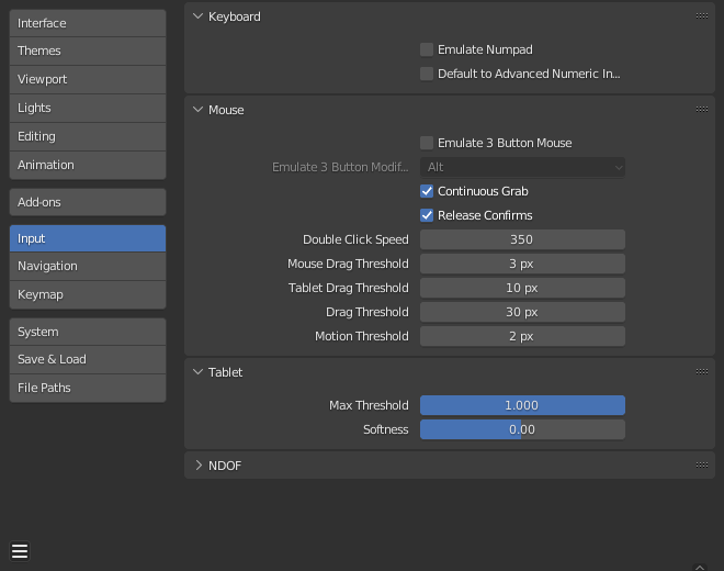
Mouse Buttons and Numpad
If you have a mouse with less than three buttons or a keyboard without a numpad,
see the Keyboard and Mouse
page of the manual to learn how to use them with Blender.
Navigation Gizmo
The navigation gizmo can be found in the top right of the editor.
The four buttons (listed from left to right) do the following:
The Orbit gizmo on the far right can be used to rotate around 3D Viewport.
Hovering over the gizmo and dragging with LMB will orbit the view.
Clicking any of the axis labels will Align to that view.
Clicking the same axis again switches to the opposite side of that same axis.
![]()
Navigation Gizmo.
Orbit
Reference
- Mode
All modes
- Menu
-
- Hotkey
MMB, Numpad2, Numpad4, Numpad6,
Numpad8, Ctrl-Alt-Wheel, Shift-Alt-Wheel
Rotate the view around the point of interest.
Click and drag MMB on the viewport's area.
If you start in the middle of the area and move up and down or left and right,
the view is rotated around the middle of the area.
To change the viewing angle in discrete steps, use Numpad8 and Numpad2
or use Numpad4 and Numpad6
to rotate the scene around the global Z axis from your current point of view.
Finally Numpad9 switches to the opposite side of the view.
Alternatively, if the Emulate 3 button mouse option is select in the Preferences
you can press and hold Alt while dragging RMB in the viewport's area.
Note
Hotkeys
Remember that most hotkeys affect the active area (the one that has focus),
so check that the mouse cursor is in the area you want to work in before you use the hotkeys.
See also
Roll
Reference
- Mode
All modes
- Menu
-
- Hotkey
Shift-Numpad4, Shift-Numpad6
Rotate the viewport camera around its local Z axis in 15° discrete steps.
Panning
Reference
- Mode
All modes
- Menu
-
- Hotkey
Shift-MMB, Ctrl-Numpad2, Ctrl-Numpad4,
Ctrl-Numpad6, Ctrl-Numpad8
Moves the view up, down, left and right.
To pan the view, hold down Shift and drag MMB in the 3D View.
For discrete steps, use the hotkeys Ctrl-Numpad8, Ctrl-Numpad2,
Ctrl-Numpad4 and Ctrl-Numpad6 as with orbiting
(note: you can replace Ctrl by Shift).
For those without a middle mouse button,
you can hold Shift-Alt while dragging with LMB.
Zooming
Reference
- Mode
All modes
- Menu
-
- Hotkey
Ctrl-MMB, Wheel, NumpadPlus, NumpadMinus
Moves the camera forwards and backwards.
You can zoom in and out by holding down Ctrl and dragging MMB.
The hotkeys are NumpadPlus and NumpadMinus.
The submenu holds these functions too as well.
Refer to the 3D View's View menu image above for more information.
If you have a wheel mouse, you can zoom by rotating the Wheel.
Hint
If You Get Lost
If you get lost in 3D space, which is not uncommon, two hotkeys will help you:
Home changes the view so that you can see all objects ,
while NumpadPeriod zooms the view to the currently selected objects
when in perspective mode .
Zoom Region
Reference
- Mode
All modes
- Menu
-
- Hotkey
Shift-B
The Zoom Region tool allows you to specify a rectangular region and zoom in
so that the region fills the 3D View.
You can access this through via the shortcut Shift-B,
then LMB click and drag a rectangle to zoom into.
Alternatively you can zoom out using the MMB.
Dolly Zoom
Reference
- Mode
All modes
- Hotkey
Shift-Ctrl-MMB
In most cases its sufficient to zoom the view to get a closer look at something,
however, you may notice that at a certain point you cannot zoom any closer.
This is because Blender stores a view-point that is used for orbiting and zooming.
It works well in many cases, but sometimes you want to move the view-point to a different place.
This is what Dolly supports, allowing you to transport the view from one place to another.
You can dolly back and forth by holding down Shift-Ctrl and dragging with MMB.
-Fly/Walk Mode
There are cases where it's preferable to navigate with first person controls,
especially for large environments such as architectural models.
In these cases orbiting around the view center is limiting.
While zoom, pan & dolly can be used, it's inconvenient.
With walk/fly modes you can navigate around the scene where view rotation is
performed from the cameras location.
![]()
View Navigation.
In the Preferences editor
select the navigation mode you want to use as default when invoking the View Navigation operator.
Alternatively you can call the individual modes from the View Navigation menu.
Common use cases for walk/fly include:
- Navigation
This can be a quick way to navigate a large scene.
- Camera Placement
When activated from a camera view, this will move the camera too.
- Recording Animation
Running from a camera with auto-keyframe and playing animation
will record the motion as you make it allowing you to record the walk-through.
Walk Mode
Reference
- Mode
All modes
- Hotkey
Shift-AccentGrave
- Menu
-
On activation the mouse pointer will move at the center of the view,
and a cross marker will appear…
This navigation mode behaves similar to the first person navigation system available in most 3D world games.
It works with a combination of keyboard arrow keys and mouse movement.
Shortcuts
Move the mouse in the direction you want to look.
Arrow keys or W, A, S, D move forwards/backwards and strafe left/right.
Teleport Spacebar.
This moves you to the location at the cross-hair
(offset by the camera height value set in the Preferences).
Jump V – only in gravity mode.
Move up and down Q, E – only in free mode.
Alternate between free and gravity modes Tab.
Change the movement speed:
WheelUp or NumpadPlus to increase the movement speed for this open session.
WheelDown or NumpadMinus to decrease the movement speed for this open session.
Shift (hold) – to speed up the movement temporarily.
Alt (hold) – to slow down the movement temporarily.
When you are happy with the new view, click LMB to confirm.
In case you want to go back from where you started, press Esc or RMB, as usual.
If the defaults values (speed, mouse sensitivity, …) need adjustments for your project,
in the Preferences you can select a few options for the navigation system:
Fly Mode
Reference
- Mode
All modes
- Hotkey
Shift-AccentGrave
- Menu
-
On activation the cursor is centered inside a rectangle that defines a safe region.
When the cursor is outside this region the view will rotate/pan.
Shortcuts
Move the mouse outside the safe region in the direction you want to look.
Move the view forward/backward:
WheelUp or NumpadPlus to accelerate the movement forward.
WheelDown or NumpadMinus to accelerate the movement backward.
So if the view is already moving forward,
WheelDown, NumpadMinus will eventually stop it and then move it backward, etc.
MMB Drag to pan the view.
In this case the view can move laterally on its local axis at the moment you drag the mouse.
Shift precision (slow the momentum).
Ctrl disable rotation.
While held, the view rotation doesn't influence the flight direction,
this allows you to fly past an object, keeping it centered in the view,
even as you fly away from it.
When you are happy with the new view, click LMB to confirm.
In case you want to go back from where you started, press Esc or RMB, as usual.
-Aligning
These options allow you to align and orient the view.
Axes
Blender uses a right-angled “Cartesian” coordinate system with the Z axis pointing upwards.
- X axis
Left / Right
- Y axis
Front / Back
- Z axis
Top / Bottom
You can select the viewing direction for a 3D View with the View menu entries,
or by pressing the hotkeys.
These operators change the view to be aligned with the specified global axes:
- Top
Numpad7
- Front
Numpad1
- Right
Numpad3
Holding Ctrl shows the other side of the same axis.
- Bottom
Ctrl-Numpad7
- Back
Ctrl-Numpad1
- Left
Ctrl-Numpad3
Holding Shift aligns the view relative to the active selection.
So you can for example, view a rotated objects side, or align the view to the active face in mesh Edit Mode.
The view can also be aligned by holding Alt-MMB and moving the mouse towards the view to align to.
Align View Menu
- Align View to Active
The options in this menu align your view with specified local axes of the selected active object,
bone, or, in Edit Mode with the normal of the selected face.
Hold down Shift while using the numpad to set the view axis.
- Align Active Camera to View Ctrl-Alt-Numpad0
Gives your active camera the current viewpoint.
- Align Active Camera to Selected
Points the active camera toward the selected object; based on the direction of the current viewpoint.
- Center Cursor and View All Shift-C
Moves the cursor back to the origin and zooms in/out so that you can see everything in your scene.
- Center View to Cursor
Centers view to 3D cursor.
- View Lock to Active
Centers view to the last selected active object, overriding other view alignment settings.
- View Lock Clear
Returns the view alignment to the view align settings before use of View Lock to Active.
-Projections
Reference
- Mode
All modes
- Menu
-
- Hotkey
Numpad5
These operators change the projection of the viewport camera.
Each 3D View supports two different types of projection.
These are demonstrated in the Fig. below.
![]()
Orthographic projections.
|
![]()
Perspective projections.
|
Our eye is used to perspective viewing because distant objects appear smaller.
Orthographic projection often seems a bit odd at first,
because objects stay the same size regardless of their distance.
It is like viewing the scene from an infinitely distant point.
Nevertheless, orthographic viewing is very useful
(it is the default in Blender and most other 3D applications),
because it provides a more “technical” insight into the scene,
making it easier to model and judge proportions.
Options
To change the projection for a 3D View, choose the
or the menu entry.
The Numpad5 shortcut toggles between the two modes.
Changing the projection for a 3D View does not affect the way the scene will be rendered.
Rendering is in perspective by default. If you need to create an orthographic rendering,
select the camera, go to the Camera tab and
press the Orthographic button in the Lens panel.
See also
-Regions
See also
Zoom Region.
View Clipping Region
Reference
- Mode
All modes
- Menu
-
- Hotkey
Alt-B
Allows you to define a clipping region to limit the 3D View display to a portion of 3D space.
It can assist in the process of working with complex models and scenes.
Once activated, you have to draw a rectangle with the mouse,
in the wanted 3D View. It becomes a clipping volume of four planes:
Once clipping is used, you will only see what's inside the volume you have defined.
Tools such as paint, sculpt, selection, transform snapping, etc.
will also ignore geometry outside the clipping bounds.
To delete this clipping, press Alt-B again.
Example
Region/Volume clipping.
![]()
Selecting a region.
|
![]()
Region selected.
|
![]()
View rotated.
|
The Region/Volume clipping image shows an example of using the clipping tool with a cube.
Start by activating the tool with Alt-B (upper left of the image).
This will generate a dashed cross-hair cursor.
Click with the LMB and drag out a rectangular region shown in the upper right.
Now a region is defined and clipping is applied against that region in 3D space.
Notice that part of the cube is now invisible or clipped. Use the MMB to rotate
the view and you will see that only what is inside the pyramidal volume is visible.
All the editing tools still function as normal but only within the pyramidal clipping volume.
The dark gray area is the clipping volume itself.
Once clipping is deactivated with another Alt-B,
all of 3D space will become visible again.
Render Region
Reference
- Mode
All modes
- Menu
- Hotkey
Mark: Ctrl-B
Clear: Ctrl-Alt-B
When using rendered shading mode,
it can be quite slow to render the entire 3D View. To fix this,
you can define a subregion to render just a portion of the viewport
instead of the entire viewport.
This can be very useful for reducing render times for quick previews on an area of interest.
Render region and associated render.
![]()
|
![]()
|
Tip
You can also use this region in a final render by setting a render region
from within the Camera View and
enabling region in the Dimensions panel.
-Contextual Views
The 3D View has several “contextual view” modes that can be set for a particular 3D View.
These views can change how the overall 3D View looks or how you interact with objects.
View Global/Local
Reference
- Mode
All modes
- Menu
-
- Hotkey
NumpadSlash, Slash
Global view shows all of the 3D objects in the scene. Local view isolates the selected object or
objects, so that they are the only ones visible in the viewport. This is useful for working on
objects that are obscured by other ones, or to speed up the viewport performance in heavy scenes.
You can toggle between Global and Local View by selecting the option
from the View Menu or using the shortcut NumpadSlash.
![]()
Global View.
|
![]()
Local View.
|
Note
These notes cover changes in local view which are not immediately obvious.
- 3D Cursor
In local view the 3D cursor is not locked to the scene.
Instead, each view has an independent cursor location.
- Layers
Local view bypasses layers, using only the selected objects when entering local view.
Although new objects may be added while in local view.
It's also possible to send objects out of local view,
using ,
which can be useful to further isolate a selection.
Tip
Accidentally pressing NumpadSlash can happen rather often if you are new to Blender,
so if a bunch of the objects in your scene seem to have mysteriously vanished, try turning off local view.
Remove from Local View
Reference
- Mode
All modes
- Menu
-
- Hotkey
M
Objects can be removed from Local View by selecting them and using the Remove from Local View operator.
This will move the selected object back to global view and all other objects will remain in local view.
If the last remaining object is removed,
the local view will be left empty and you will have to exit local view to see any objects.
Quad View
Reference
- Mode
All modes
- Menu
-
- Panel
-
- Hotkey
Ctrl-Alt-Q
Toggling Quad View will split the 3D View into four views:
Three Orthographic “side views” and one Camera/User View.
This view will allow you to instantly see your model from a number of view points.
In this arrangement, you can zoom and pan each view independently but you cannot rotate the view.
Shortcuts for all views at once:
Note
Quad View is different from splitting the area
and aligning the view manually. In Quad View, the four views are still part of a single 3D View.
So they share the same display options and layers.
![]()
Quad View.
Options
These options can be found in .
- Lock
If you want to be able to rotate each view, you can uncheck the Locked option.
- Box
Syncs the view position between side views.
- Clip
Clip objects based on what is visible in other side views.
-Camera View
![]()
Demonstration of camera view.
The Camera view shows the current scene as seen from the currently active camera's view point.
The Camera view can be used to virtually compose shots and preview how the scene will look when rendered.
The rendered image will contain everything within the dashed line.
See also
Camera Settings for details how camera settings are used for display & rendering.
Hint
The active camera can be selected while in camera view using the camera frame
(assuming the object isn't hidden).
Viewing the Active Camera
Reference
- Mode
All modes
- Menu
-
- Hotkey
Numpad0
This switches the view to the active camera.
The triangle above the camera will become shaded when active.
Setting the Active Camera
Reference
- Mode
Object Mode
- Menu
-
- Hotkey
Ctrl-Numpad0
![]()
Active camera (left) displayed with a solid triangle above it.
This is the camera currently used for rendering and when viewing from the camera.
This sets the current active object as the active camera & switches to the camera view.
The active camera can also be set in the Scene tab of the Properties Editor.
Note
The active camera, as well as the layers, can be specific to a given view,
or global (locked) to the whole scene.
See Local Camera.
Animated Camera Switching
By default a scene contains one camera. However, a scene can contain more than one camera,
but only one of them will be used at a time.
So you will only need to add a new camera if you are making cuts between them.
See Animating Cameras.
Camera Navigation
There are several different ways to navigate and position the camera in your scene, some of them are explained below.
Zooming in and out is possible in this view, but to change the viewpoint,
you have to move or rotate the camera.
Hint
The active “camera” might be any kind of object.
So these actions can be used, for example, to position and aim a light.
Move Active Camera to View
Reference
- Mode
Object Mode
- Hotkey
Ctrl-Alt-Numpad0
This matches the active camera to a regular (non camera) view,
for a convenient method of placing the camera without having to move the object directly.
Camera View Positioning
By enabling Lock Camera to View in the View panel of the Sidebar region,
while in camera view, you can navigate the 3D View as usual,
while remaining in camera view. Controls are exactly the same as when normally moving in 3D.
See also
Fly/Walk Mode for first person navigation that moves the active camera too.
Roll, Pan, Dolly, and Track
To perform these camera moves, the camera must first be selected so transform operations apply to it.
The following actions also assume that you are in camera view.
Having done so, you can now manipulate the camera using the same tools that are used to transform any object:
- Roll
Press R to enter object rotation mode. The default will be to rotate the camera in its local Z axis
(the axis orthogonal to the camera view), which is the definition of a camera “roll”.
- Vertical Pan or Pitch
This is just a rotation along the local X axis. Press R to enter object rotation mode, then X twice
(the first press selects the global axis, pressing the same letter a second time selects the local axis –
this works with any axis;
see the axis locking page).
- Horizontal Pan or Yaw
This corresponds to a rotation around the camera's local Y axis.
Press R, and then Y twice.
- Dolly
To dolly the camera, press G then MMB (or Z twice).
- Sideways Tracking
Press G and move the mouse (you can use X twice or Y
to get pure-horizontal or pure-vertical sideways tracking).
3D Cursor
The 3D Cursor is a point in 3D space which can be used for a number of purposes.
Placement
There are a few methods to position the 3D cursor.
Direct Placement with the Mouse
![]()
Positioning the 3D cursor with two orthogonal views.
Enable the cursor tool. Using RMB in the 3D View will place the 3D cursor
directly under your mouse pointer.
The view space is used to control the rotation of the 3D Cursor.
For accuracy you should use two perpendicular orthogonal 3D Views,
i.e. any combination of top Numpad7, front Numpad1 and side Numpad3.
That way you can control the positioning along two axes in one view and
determine depth in the second view.
By default the depth of the geometry under the cursor is used,
this can be disabled using the Cursor Surface Project toggle
in the Preferences.
See also
The Snap Menu
which allows the cursor placement relative to scene objects.
3D Cursor Panel
Reference
- Mode
All Modes
- Panel
-
![]()
The 3D Cursor panel of the Sidebar region.
The 3D cursor can also be positioned and oriented by editing these values:
- Location
The location of the 3D Cursor.
- Rotation
The rotation of the 3D Cursor.
- Rotation Mode
The Rotation mode of the 3D Cursor.
Usage
The 3D Cursor is used as the origin for any added object, can be used and moved with
the snap tool, and is an option for
the pivot point.
Selecting
This page discusses specific selecting tools for the 3D Viewport.
The 3D Viewport also uses the general select tools used which are described
in the interface section.
- Center Point Ctrl
Selects the object by its center point rather than its contents.
- Menu Alt
If the objects are overlapping in the view, a menu of objects under the cursor
can be used, so you can pick the object by it's name.
These can be combined so you can for example toggle the selection from an objects center point.
Note
Right-click-select (see Select With option) has the advantage that
selection is possible without having to switch to the select tool.
Controls
Transform Orientation
In the Transform orientation pop-over it is possible to select and
configure transformation orientations.
Default transform orientations are:
- Global
Align the transformation axes to world space.
- Local
Align the transformation axes to the selected objects' local space.
- Normal
Align the transformation axes to average normal of selected elements.
- Gimbal
Align each axis to the Euler rotation axis as used for input.
- View
Align the transformation axes to the window.
- Cursor
Align the transformation axes to the 3D cursor.
- Add
+ With the plus button a new transformation orientation can be created from the selected object.
- Name
A name can be specified.
- Delete
X It is also possible to remove these custom transform orientations.
Object Type Visibility
In the Object Type Visibility pop-over the visibility and selectability per type of object can be specified.
This will limit the visibility and selectability per 3D View.
The object types that can be changed are:
Mesh
Curve
Surface
Meta
Font
Grease Pencil
Armature
Lattice
Empty
Light
Light Probe
Camera
Speaker
When visibility is turned off any object of this kind will not be rendered in the 3D Viewport.
When selectability is turned off any object of this kind will not be selectable via the 3D Viewport.
Viewport Gizmos
The way how gizmos are displayed in the 3D View can be changed in the Viewport Gizmos pop-over.
There is a switch to turn off all gizmos for the 3D View.
Viewport Gizmos
- Navigate
Enable/disable the navigation gizmo.
- Active Tool
Enable/disable the gizmo of the active tool.
- Active Object
Enable/disable the gizmo for the active object.
Object Gizmos
- Orientation
The orientation to use for the gizmo. The orientations can be
configured in the viewport orientation Orientations menu.
- Move
Show the gizmo to control the location.
- Rotate
Show the gizmo to control the rotation.
- Scale
Show the gizmo to control the scaling.
Empty
Gizmo settings for empties.
- Image
Show the gizmo to adjust the image size and position of empties.
- Force Field
Show the gizmo to adjust the force field.
Light
Gizmo settings for lights.
- Size
Show the gizmo to adjust the size of lights.
- Look At
Show the gizmo to adjust the direction of the light.
Camera
Gizmo settings for cameras.
- Lens
Show the gizmo to adjust the lens and orthographic size.
- Focus Distance
Show to gizmo to adjust the focus distance.
Viewport Overlays
Using the Viewport Overlays pop-over settings for the overlays can be configured.
There is a switch to turn off all overlays for the 3D View.
The options that are visible in the pop-over depend on the mode that the 3D View is in.
Object Mode
The next options are always present, independent the current mode.
Guides
- Grid
Show grid in orthographic side view.
- Floor
Show the ground plane.
- X/Y/Z
Show the X and/or Y and/or Z axis line.
- Scale
The distance between lines in the grid/floor.
- Subdivision
The number of subdivisions between grid lines.
- Text Info
Show text overlay.
- HDRI Preview
Show two sphere, one glossy and one diffuse,
to preview HDRIs used in Material Preview and Rendered shading modes.
- 3D Cursor
Show the 3D Cursor overlay.
- Annotations
Show the annotation overlay.
Objects
- Extra
Show details of objects including empty wires, cameras and other visual guides.
- Relationship Lines
Show dashed lines indicating parents or constraint relationships.
- Outline Selected
Show an outline highlight around selected objects.
- Bones
Show Bones. Disable to only show their motion path.
- Motion Paths
Show the motion path overlay.
- Origin
Show the object origin of the active object.
- Origin (All)
Show the object origin of all objects.
Geometry
- Wireframe
Show the face edges overlay.
- Wireframe
Adjust the number of wires to display. 1.0 means show all wires.
- Face Orientation
Show the face orientation overlay. In the face orientation overlay
all faces where the face normal points towards the camera are colored blue.
All faces where the face normal points away from the camera are colored red.
With this overlay, it is easy to detect the orientation of the face normals.
Motion Tracking
Show the motion tracking overlay.
- Camera Path
Show the reconstruction camera path.
- Marker Names
Show the names for reconstructed track objects.
- Tracks
Change the display of the reconstructed tracks.
Plain Axes
Arrows
Single Arrow
Circle
Cube
Sphere
Cone
- Size
Change the display size of the reconstructed tracks.
Mesh Edit Mode
The next options are available when in Edit Mesh Mode.
- Edges
Highlighted selected and partially selected edges.
Only affects vertex and face selection mode (as edges are always highlighted in edge-selection mode).
- Faces
Highlight faces using a face overlay that applies to both selected and unselected faces.
Affects all selection modes.
- Center
Show face-center points in solid shading modes.
Only affects face-select mode.
- Creases
Display edges marked with a crease
for the Subdivision Surface Modifier.
- Sharp
Display sharp edges, used with the Edge Split modifier.
- Bevel
Display weights created for the Bevel Modifier.
- Seams
Display the UV unwrapping seams.
- Edge Marks and Face Marks
Used by Freestyle.
Shading
- Hidden Wire
Show only front-facing wireframes.
This is useful for a re-topology workflow.
Tip
Optimally this could be combined with the X-Ray display setting.
- Vertex Groups Weights
Display weights in Edit Mode.
- Zero Weights
To display unreferenced and zero weighted areas in black.
This helps to identify areas with very low weights that have been painted onto.
- None
Vertices are displayed in the usual way.
- Active
Show in black vertices with no weights in the active group.
- All
The vertex is shown in black if it has zero weight in all groups.
Mesh Analysis
Show the mesh analysis overlay.
See: Mesh Analysis.
Measurement
Numerical measures of the selected elements on screen as part of the text info overlay.
The Units can be set in the Scene properties.
- Edge Length
Show the length of selected edges.
- Edge Angle
Show the angle of selected edges between two faces.
- Face Area
Show the area of selected faces.
- Face Angle
Show the angle of selected face corners.
Tip
Geometry connected to the selection is shown while transforming,
allowing you to move a vertex and see the connected edge lengths for example.
Note
These values respect Global/Local.
Use Global if you want the Object's scale to be applied to the measurements.
Normals
- Size
The size to show the selected normals.
Developer
- Indices
Display the indices of selected vertices, edges and faces.
Freestyle
- Edge Marks
Display Freestyle edge marks, used with the Freestyle renderer.
- Face Marks
Display Freestyle face marks, used with the Freestyle renderer.
Sculpt Mode
- Mask
Show mask as overlay on object. The opacity of the overlay can be controlled.
Vertex Paint
- Opacity
The opacity of the overlay.
- Show Wire
Use wireframe display in paint modes.
Weight Paint
- Opacity
The opacity of the overlay.
- Zero Weights
To display unreferenced and zero weighted areas in black.
This helps to identify areas with very low weights that have been painted onto.
- None
Vertices are displayed in the usual way.
- Active
Show in black vertices with no weights in the active group.
- All
The vertex is shown in black if it has zero weight in all groups.
- Show Weight Contours
Show contour lines formed by points with the same interpolated weight.
- Show Wire
Use wireframe display in paint modes.
Texture Paint
- Opacity
The opacity of the overlay.
Pose Mode
- Fade Geometry
Show the bones on top and face other geometry to the back.
The opacity can be controlled with the slider.
Grease Pencil
- Onion Skin
Show ghosts of the keyframes before and after the current frame.
- Canvas
Display a grid over Grease Pencil drawing plane. The opacity of the grid can be controlled with a slider.
- Fade 3D Objects
Cover all viewport except the active Grease Pencil object with a full color layer to improve visibility
while drawing over complex scenes. Include or not other Grease Pencil objects can be toggle
and the opacity factor can be controlled with the slider.
- Fade Layers
Decrease the opacity of all the layers in the object other than the active one.
The opacity factor can be controlled with the slider.
- Fade Grease Pencil Objects
Fades all Grease Pencil objects, except the active object.
- Edit Lines
Show edit lines when editing strokes.
- Show Edit Lines only in Multiframe
Only show edit lines while in multiframe edition.
- Vertex Opacity
Opacity for edit vertices (points).
Viewport Shading
The shading of the 3D Viewport can be adjusted to match the task at hand.
There are several modes to choose from.
Note
The Material Preview option is not available when the render engine of
the scene is set to Workbench.
Wireframe
Shows the full scene by only displaying the edges of the objects (Wireframe).
- Color
- Single
Render the whole scene using a single color.
- Object
Use the color that can be set per object
in the Viewport Display Object panel.
- Random
A random color will be selected for every object in the scene.
- Background
How the background is displayed in the 3D Viewport.
- Theme
Use the background of the theme.
- World
Use the world viewport display options.
- Viewport
Select a custom color for the background of the 3D Viewport.
- Options
- X-Ray
Render the scene transparent. With the slider you can control how
transparent the scene should appear. In wireframe mode the opacity
of the back wires can be adjusted.
- Outline
Render the outline of objects in the viewport. The color of the outline can be adjusted.
Solid
Show the scene using in solid mode. This mode utilized the Workbench engine to
render the 3D Viewport. The lighting,
color and options
can be found at Workbench render engine section.
- Background
The way the background is displayed in the 3D Viewport.
- Theme
Use the background of the theme.
- World
Use the world viewport display options.
- Viewport
Select a custom color for the background of the 3D Viewport.
Material Preview
Render the 3D Viewport with Eevee and a HDRI environment.
This mode is particularly suited for previewing materials and texture painting.
You can select different lighting conditions to test your materials.
- Lighting
- Scene Lights
Use the lights in the scene when rendering the scene.
- Scene World
Use the world of the scene when rendering the scene.
When turned off a world will be constructed with the next options.
- HDRI Environment
The environment map used to light the scene.
- Rotation
The rotation of the environment on the Z axis.
- Strength
Light intensity of the environment.
- Background
The opacity level of a very blurred version of the HDRI will be rendered as
background in the 3D View.
- Render Pass
Instead of the combined render, show another render pass.
Useful to analyze and debug geometry, materials and lighting.
Rendered
Render the 3D Viewport with the scene Render Engine, for interactive rendering.
By default the scene lights are used for lighting.
A HDRI environment can be used as well, with the same options as Material Preview mode.
- Render Pass
Instead of the combined render, show another render pass.
Useful to analyze and debug geometry, materials and lighting.
Toolbar
The Toolbar contains a list of tools.
Links to each modes Toolbar are listed below.
Edit Modes
Paint Modes
Grease Pencil
Properties
Sidebar
Item
Shows Transform settings
of the active objects.
Tool
Show settings of the active tool and Workspace.
View
View Panel
The View panel lets you set other settings regarding the 3D View.
You can show it with the menu entry.
- Focal Length
Control the focal length of the 3D View camera in millimeters,
unlike a rendering camera.
- Clip Start/End
Adjust the minimum and maximum distances range to limit the visible range to the area
between two planes that are orthogonal to the viewing direction of the viewport camera.
Objects outside the range will not be shown.
Note
The definition of the two planes depends on the kind of view:
Perspective view: The planes with distance of start and end from viewport camera.
Orthographic view: The planes with distance of negative end and positive end from the focus point,
in this case the Start is ignored.
Warning
A large clipping range will allow you to see both near and far objects,
but reduces the depth precision resulting in artifacts.
In some cases, a very large range may cause operations that depend on the depth buffer to become unreliable
although this depends on the graphics card and drivers.
See Troubleshooting Depth Buffer Glitches for more information.
- Use Local Camera
Use a local camera in this view, rather then the scene's active camera.
- Local Camera
Active camera used in this view to override the (global) scene camera.
The option is available only when Use Local Camera toggle enabled.
- Render Region
Use a Render Region when not looking through a camera.
Using Ctrl-B to draw a region will automatically enable this option.
View Lock
- Lock to Object
Lock to Object lets you define an object in the Object Data ID as the center of the view.
In that case, the view can be rotated around or zoomed towards that central object,
but not while, unless you move that itself object
(this option is not available in a camera view).
- Lock to 3D Cursor
Lock the center of the view to the position of the 3D cursor.
It is only available when Lock to Object is not active.
- Lock Camera to View
When in camera view, all changes in the view (pans, rotations, zooms) will affect the active camera,
which will follow all those changes. The camera frame will be outlined with a red dashed line.
3D Cursor
- Location
The location of the 3D Cursor.
- Rotation
The rotation of the 3D Cursor.
- Rotation Mode
The Rotation mode of the 3D Cursor.
Collections
The Collections panel shows a list of collections
and can be used to control the visibility of collections in the viewport.
If a collection contains objects, there is a circle to the left of the collection name.
If a collection is empty, there is no circle to the left of the collection name.
- Local Collections
Allows the list of visible collections to be controlled per viewport rather than globally.
- Hide in Viewport (eye icon)
Collections can be hidden in the viewport by clicking on the eye icon.
By clicking directly on the collection names,
it “isolates” the collection by hiding all other collections,
and showing the direct parents and all the children of the selected collection.
See also
Read more about Collections.
Annotations
See Annotations for more information.
Viewport Render
Viewport rendering uses the 3D Viewport rendering for quick preview renders.
This allows you to inspect your animatic
(for object movements, alternate angles, etc.).
This can also be used to preview your animations –
in the event your scene is too complex for your system to play back in real-time in the 3D View.
You can use Viewport Render to render both images and animations.
Below is a comparison between the Viewport render and a final render using
the Cycles Renderer.
Model by © 2016 pokedstudio.com
![]()
Viewport render using Solid Mode.
|
![]()
Viewport render using Material Preview Mode.
|
![]()
Full render.
|
Tip
Disable overlays to render the viewport without any additional overlays.
While this option is not specific to Viewport rendering, it's often useful to
enable, since it removes data such as rigs and empties that can be a distraction.
Settings
Reference
- Editor
Topbar
- Menu
-
For the most part, Viewport Render uses the current viewport settings.
Some settings are located in the render panel of the render engine
that is used to render the view.
Solid mode uses the render settings of Workbench;
Material Preview mode uses the render settings of Eevee.
Sampling and Alpha Transparency Mode options can be set in .
Make sure the Workbench or Eevee render engine is selected to see the appropriate values.
Additionally, some render settings are used too:
Rendering
Activating Viewport Render will render from the current active view.
This means that if you are not in an active camera view then
a virtual camera is used to match the current perspective.
To get an image from the camera point of view,
enter the active camera view with Numpad0.
As with a normal render, you can abort it with Esc.
- Render a Still Image
To render a still image, use .
- Render an Animation
to render an animation, use .
- Render Keyframes
To render an animation, but only those frames that have a keyframe,
use .
This only renders those frames for which the selected objects have an animation key.
The other frames are still written to the output, but will simply repeat the last-rendered frame.
For example, when a six-frame animation is rendered, and the selected objects
have a key on frames 3 and 5, the following frames will be output:
The 1st frame is always rendered.
The 1st frame is repeated because there is no key on this frame.
The 3rd frame is rendered.
The 3rd frame is repeated because there is no key on this frame.
The 5th frame is rendered.
The 5th frame is repeated because there is no key on this frame.
Tip
You can limit the viewport render to a particular region with
Render Regions.
Image Editor Introduction
The Image Editor is where you can view/edit 2D assets like images or textures.
![]()
Image Editor with a test grid texture.
Toolbar
- Sample Tool
Used to sample a pixel's color from anywhere within Blender.
- Sample Size
The dimensions of the square used to sample underlying pixels.
If larger than 1 the resulting sample is an average of all underlying pixels.
- Annotate
See Annotations for more information.
Header
Menus
- View
Tools for controlling how the content is displayed in the editor.
See Navigating.
- Image
- New
Creates a new Generated Image.
- Open
Load image from a file.
- Open Cache Render
Load the current scene's render layers from disk cache, if available.
This can be used to save RAM while rendering because the render layers do not have to be saved in RAM.
This can also be used to recover some information from a fail render.
For this to work, Save Buffers must be enabled.
- Replace
Replaces the current image throughout the blend-file with another image.
- Reload
Reload the image from the file on drive.
- Edit Externally
Using the Edit Externally tool Blender will open an external image editor,
as specified in the Preferences and load in the image to be edited.
- Save
Save the image, if the image is already a file Alt-S.
- Save As
Save the (rendered) image in a separate file Shift-S or
you want to save it under a different name.
- Save a Copy
Using Save as Copy will save the file to a specified name,
but will keep the old one open in the Image editor.
- Save All Images
Save all modified images. Packed images will be repacked.
- Invert
- Invert Image Colors
Invert the colors of an image.
- Invert Channel
Red, Green, Blue, Alpha
- Resize
Adjust the image size in pixels.
- Pack
Packs the image into the blend-file.
See Packed Data.
- Unpack
Unpack the image to a drive.
Important
Rendered images are not automatically saved, they have to be saved to drive manually.
Controls
- Image
A data-block menu used for selecting images.
When an image has been loaded or created in the Image editor,
the Image panel appears in the Sidebar region.
See Image Settings.
Render Result
Viewer Node
- Modes
- View
Displays Images.
- Paint
Texture Paint.
- Mask
Masking.
Multi-Layer
When a rendered image is displayed in the Image Editor,
several new menu items become available.
- Slot
You can save successive renders into the render buffer by selecting a new slot before rendering.
If an image has been rendered to a slot, it can be viewed by selecting that slot.
Empty slots appear as blank grids in the Image editor.
Use the J and Alt-J to cycle forwards and backwards through saved renders.
The Slot Name field in the Display Panel allows you to rename a slot.
- View Layer
If you are using View Layers,
use this menu to select which layer is displayed.
- Render Pass
If you are using Render Passes,
use this menu to select which pass is displayed.
Display Channels
In the dropdown menu on the right, the displayed channels can be selected.
- Color and Alpha
Replaces transparent pixels with background checkerboard, denoting the alpha channel.
- Color
Display the colored image, without alpha channel.
- Alpha
Displays the Alpha channel a grayscale image. White areas are opaque, black areas have an alpha of 0.
- Z-Buffer
Display the depth from the camera, from Clip Start to Clip End,
as specified in the Camera settings.
- Red, Green, Blue
Single Color Channel visualized as a grayscale image.
Main View
When LMB / RMB dragging mouse the color under the cursor is shown in the footer as well the cursor
position and the color values in the RGBA, HSV and Luminance color space.
Sidebar Region
- Tool
Displays the settings of the active tool.
- Image
Tools for working with images, see Image Settings.
- View Tab
Controls display options, see View Tab.
Navigating
Panning can be done by clicking the MMB and dragging.
Zooming can be done by scrolling Wheel up or down.
Also, as in the 3D View, you can use NumpadPlus or NumpadMinus to zoom.
Gizmos
Next to the Sidebar region at the top, there are gizmos that allow panning
and zooming more comfortably when e.g. no mouse wheel is available.
View Menu
- Region Controls
Adjust which regions are visible in the Image editor.
- Update Automatically
Update the view in multiple areas.
- Show Metadata
Displays the Metadata if they were set in the render tab's Metadata panel.
- View Zoom In/Out Wheel
Adjusts the Zoom level.
- Fractional Zoom
Zoom 1:8 Numpad8
Zoom 1:4 Numpad4
Zoom 1:2 Numpad2
Zoom 1:1 Numpad1
Zoom 2:1 Shift-Numpad2
Zoom 4:1 Shift-Numpad4
Zoom 8:1 Shift-Numpad8
- Frame All Home
Center the view to the entire image.
- Frame All Fit Shift-Home
Fit the view to the image dimensions.
- Center View to Cursor
When the 2D cursor is visible, move the view so that it is at the center of the editor.
- Render Region Ctrl-B
See Render Region.
- Clear Render Region Ctrl-Alt-B
See Render Region.
- Area
Adjust the area the Image editor is in.
View Tab
Display
You can set the editors display options in this panel.
![]()
Display panel.
- Aspect Ratio
Display Aspect for this image. Does not affect rendering.
- Repeat Image
Duplicate the image until it is repeated to fill the main view.
Annotations
Options for the annotation tool.
See Annotate Tool.
Scopes
![]()
Scopes in the image editor.
Histogram
This mode displays a graph showing the distribution of color information in the pixels of
the currently displayed image. The X axis represents values of pixel, from 0 to 1 (or 0 to 255),
while the Y axis represents the number of pixels in that tonal range.
A predominantly dark image would have most of its information toward the left side of the graph.
Use this mode to balance out the tonal range in an image.
A well balanced image should have a nice smooth distribution of color values.
- Luma
Shows the luminosity of an image.
- RGB
Shows the RGB channels stacked on top of each other.
- R/G/B/A
Depending on the channel you choose the scope will show the appropriate channel.
- Show line
Displays lines rather than filled shapes.
Waveform
- Waveform Opacity
Opacity of the points.
- Waveform Mode
- Luma
ToDo.
- Parade
The RGB channels are shown side-by-side.
- Red Green Blue
Shows the RGB channels overlaid as a “Full color” waveform.
It is useful for color grading.
Vectorscope
- Vectorscope Opacity
Opacity of the points.
Sample Line
The Sample Line scope is the same as the Histogram
but allows you to get the sample data from a line.
- Sample Line
Used to draw a line to use to read the sample data from.
Scope Samples
- Full Sample
Sample every pixel.
- Accuracy
Proportion of original image source pixel lines to sample.
Image Settings
Image Panel
- Image
Data-block menu.
- New
+ The New Image button opens a pop-up to configure a Generated image.
Source
See about supported Supported Graphics Formats.
Single Image
Still image or a single frame.
Image Sequence
Each frame is stored in a separate file.
How to Opening an Image Sequence.
- Frame
A label showing the current frame.
- Further options
See Movie below.
Movie
Frames packed into a container.
- Deinterlace
Removes fields in a video file. For example,
if it is an analog video and it has even or odd interlacing fields.
- Frame
- Frames
Sets the range of frames to use.
- Start
Global starting frame of the sequence, when the playback should start.
This is a global setting which means it affects all clip users such as the Movie Clip editor itself,
motion tracking constraints and Compositor nodes.
- Offset
Offsets the first frame of the clip. It adds an extra offset to the frame number when
converting a scene frame to the frame number in the file name.
This option does not affect tracking data or any other associated data.
- Match Movie Length
This button sets image's user's length to the one of selected movie.
- Auto Refresh
Automatically refresh images on frame changes.
- Cyclic
Start over and repeats after the last frame to create a continuous loop.
Generated
Image generated in Blender.
- Width, Height
The size of image in pixels.
- Color
Sets the fill color if creating a blank image.
- Type
- Blank
Creates a Blank image of a single specified color.
- UV Grid
Creates a checkerboard pattern with a colored cross (+) in each square.
- Color Grid
Creates a more complex colored grid with letters and numbers denoting locations in the grid.
It could be used for testing how the UVs have been mapped and to reduce stretching or distortion.
- 32 bit Float
Creates a 32 bit image. This is a larger file size,
but holds much more color information than the standard 8 bit image.
For close-ups and large gradients, it may be better to use a 32 bit image.
- Tiled
Creates an image with support for UDIMs.
This option creates the first 1001 tile; more tiles can be added later in the UDIM Tiles panel.
Common Options
- File
Use for replacing or packing files.
- Pack
Embed the resource into the current blend-file.
- Path
Path to the linked file.
- Open
Opens the File Browser to select a file from a drive.
- Reload
Reloads the file. Useful when a file has been reworked in an external application.
- Color Space
Color Space.
- sRGB
Standard RGB display space.
- Linear
Linear 709 (full range). Blender native linear space.
- Linear ACES
ACES linear space.
- XYZ
Standard linear XYZ space.
- Non-Color
Color space used for images which contains non-color data (e.g. normal maps).
- Raw
Same as Non-Color.
- Filmic Log
Intermediate log color space of Filmic view transform.
- View as Render
Applies color transform when displaying this image on the screen.
- Use Multi-View
See Multi-View.
- Alpha
Representation of alpha in the image file, to convert to and from when saving and loading the image.
See Alpha Channel.
- Straight
Store RGB and alpha channels separately with alpha acting as a mask, also known as unassociated alpha.
Commonly used by image editing applications and file formats like PNG.
This preserves colors in parts of the image with zero alpha.
- Premultiplied
Store RGB channels with alpha multiplied in, also known as associated alpha.
The natural format for renders and used by file formats like OpenEXR.
This can represent purely emissive effects like fire correctly, unlike straight alpha.
- Channel Packed
Different images are packed in the RGB and alpha channels, and they should not affect each other.
Channel packing is commonly used by game engines to save memory.
- None
Ignore alpha channel from the file and make image fully opaque.
UV Editor Introduction
The UV Editor is used to map 2D assets like images/textures
onto 3D objects and edit what are called UVs.
![]()
UV Editor with a UV map and a test grid texture.
The most flexible way of mapping a 2D texture over a 3D object is a process called “UV mapping”.
In this process, you take your three-dimensional (X, Y & Z) mesh and unwrap it to a flat two-dimensional
(X & Y … or rather, as we shall soon see, “U & V”) image. Colors in the image are thus mapped to your mesh,
and show up as the color of the faces of the mesh. Use UV texturing to provide realism to your objects that
procedural materials and textures cannot do, and better details than Vertex Painting can provide.
UVs Explained
The best analogy to understanding UV mapping is cutting up a cardboard box.
The box is a three-dimensional (3D) object, just like the mesh cube you add to your scene.
If you were to take a pair of scissors and cut a seam or fold of the box,
you would be able to lay it flat on a tabletop. As you are looking down at the box on the table,
we could say that U is the left-right direction, and V is the up-down direction.
This image is thus in two dimensions (2D). We use U and V to refer to these
“texture-space coordinates” instead of the normal X and Y, which are always used
(along with Z) to refer to the three-dimensional space (3D).
When the box is reassembled, a certain UV location on the paper is transferred to an (X, Y, Z)
location on the box. This is what the computer does with a 2D image in wrapping it around a 3D object.
During the UV unwrapping process, you tell Blender exactly how to map the faces of your object (in this case, a box)
to a flat image in the UV Editor. You have complete freedom in how to do this.
(Continuing our previous example, imagine that, having initially laid the box flat on the tabletop,
you now cut it into smaller pieces, somehow stretch and/or shrink those pieces,
and then arrange them in some way upon a photograph that is also lying on that tabletop.)
Example
![]()
3D space (XYZ) versus UV space.
In this image you can easily see that the shape and
size of the marked face in 3D space is different in UV space.
This difference is caused by the “stretching” (technically called mapping)
of the 3D part (XYZ) onto a 2D plane (i.e. the UV map).
If a 3D object has a UV map, then, in addition to the 3D coordinates X, Y, and Z,
each point on the object will have corresponding U and V coordinates.
Note
On more complex models (like seen in the sphere above)
there pops up an issue where the faces cannot be cut,
but instead they are stretched in order to make them flat.
This helps making easier UV maps, but sometimes adds distortion to the final mapped texture.
Advantages of UVs
While procedural textures (described in the previous chapters) are useful – they never repeat
themselves and always “fit” 3D objects – they are not sufficient for more complex or natural objects.
For instance, the skin on a human head will never look quite right when procedurally generated.
Wrinkles on a human head, or scratches on a car do not occur in random places,
but depend on the shape of the model and its usage. Manually-painted images,
or images captured from the real world gives more control and realism.
For details such as book covers, tapestry, rugs, stains, and detailed props,
artists are able to control every pixel on the surface using a UV texture.
A UV map describes what part of the texture should be attached to each polygon in the model.
Each polygon's vertex gets assigned to 2D coordinates that define which part of the image gets mapped.
These 2D coordinates are called UVs (compare this to the XYZ coordinates in 3D).
The operation of generating these UV maps is also called “unwrap”,
since it is as if the mesh were unfolded onto a 2D plane.
For most simple 3D models, Blender has an automatic set of unwrapping algorithms that you can easily apply.
For more complex 3D models, regular Cubic, Cylindrical or Spherical mapping, is usually not sufficient.
For even and accurate projection, use seams to guide the UV mapping.
This can be used to apply textures to arbitrary and complex shapes,
like human heads or animals. Often these textures are painted images,
created in applications like the Gimp, Krita, or your favorite painting application.
Interface
Header
![]()
UV Editor header.
The header contains several menus and options for working with UVs.
- View
Tools for controlling how the content is displayed in the editor.
See Navigating.
- Select
Tools for Selecting UVs.
- Image
This contains options for Image Editor.
- UVs
Contains tools for Unwrapping Meshes
and Editing UVs.
- Pivot
Similar to working with pivot points in the 3D View.
- Sync Selection
Keeps UV and mesh part selections in sync.
- Selection Modes
-
- Sticky Selection Mode
When Sync Selection is disabled, these options control how UVs are selected.
- Proportional Editing
See Proportional Editing.
- UV Snapping
Similar to Snapping in the 3D View.
- Active UV Texture Map Selector
Select which UV texture to use.
Sidebar Region
Image Tab
- UV Vertex
Transform Properties Selecting UVs.
Tool Tab
Shows the settings for the active tool.
View Tab
- Display
See Display Panel.
- 2D Cursor
Control 2D cursor location.
Navigating
The UV Editor has a 2D cursor. Its position can be changed by LMB
clicking in the UV editor. You can also manually adjust its position in the Sidebar region.
The range by default is from 0 to 256 starting from the lower left corner.
By enabling Pixel Coordinates, the range changes from 0 to 1.
2D View
Panning can be done by clicking the MMB and dragging.
Zooming can be done by scrolling Wheel up or down.
Also, as in the 3D View, you can use NumpadPlus or NumpadMinus to zoom.
View Menu
Also see Navigating in the Image editor.
- UV Local View
Displays only the UV faces that are assigned to the currently displayed image.
- Display Other Objects
Displays the UVs of selected objects (Object Mode) in the background.
- Display Texture Paint UVs
Hides the UVs in Paint Mode.
- Frame Selected
Change view so that all selected uv vertices are visible.
Display Panel
You can set the editors display options in this panel.
![]()
Display panel: With both an image and UVs selected.
- Aspect Ratio
Display Aspect for this image. Does not affect rendering.
- Repeat Image
Duplicate the image until it is repeated to fill the main view.
- Pixel Coordinates
Display UV coordinates in pixels rather than from 0.0 to 1.0
- Overlays
- Display As
- Outline
Display white edges with black outline.
- Dash
Display dashed black-white edges.
- Black
Display black edges.
- White
Display white edges.
- Faces
Display faces over the image.
- Smooth
Makes edges appear anti-aliased.
- Modified
Show results of modifiers in the UV display.
- Stretching
Shows how much of a difference there is between UV coordinates and 3D coordinates.
Blue means low distortion, while Red means high distortion.
Choose to display the distortion of Angles or the Area.
Selecting
Selection tools are available in the Select Menu in the header,
and the shortcuts listed below:
Menu
- Box Select
Click and drag to box select UV coordinates.
Alternatively, use B to start box selection.
See Select Box.
- Box Select Pinned
Use the box lasso to select only pinned UV coordinates Ctrl-B.
- Circle Select
See Select Circle.
- Select/Deselect All
Selects or deselects all UV coordinates A.
- Inverse
Inverts the current selection Ctrl-I.
- Select Pinned
Selects all pinned UVs Shift-P.
See Pinning.
- Select Linked
This operator selects all UVs that are connected to currently selected UVs Ctrl-L.
This works similarly to the tools in 3D View.
- More/Less Ctrl-NumpadPlus, Ctrl-NumpadMinus
Expands/Contracts the selection to/from the adjacent elements of the selection type.
- Select Split Y
Cuts apart the selected UVs from the map. Only those UVs which belong to
fully selected faces remain selected. As the name implies, this is particularly useful to
unlink faces and move them elsewhere. The hotkey is analogous to the mesh Split tool.
- Select Overlap
Selects any UVs that are extended over other UVs while also selecting any underlying UVs.
Header
- Sync Selection
Turning on the Sync Selection button causes selection of components
in the 3D View to sync with their corresponding elements in the UV editor.
If off only the selected faces are displayed in the UV editor.
These two modes have very different results when transforming components in the UV editor.
Selection Modes
Select Modes dependent on the Sync Selection.
Sync Selection Off
- Vertex
Select individual vertices.
- Edge
Select edges.
- Face
Select faces.
- Island
Select contiguous groups of faces.
- Sticky Selection Mode
This selector lets you enable automatic additional selection.
- Shared Vertex
Selects UVs that share a mesh vertex, even if they are in different UV locations.
- Shared Location
Selects UVs that are in the same UV location and share a mesh vertex.
- Disabled
Disables Sticky Selection.
When you move a UV in this mode, each face owns its own UVs, allowing them to be separated.
Sync Selection On
When selecting UVs or Edges, it behave like Shared Vertex mode above.
When selecting Faces, it behaves as in Disabled Stick Selection above.
Shader Editor
The Shader Editor is used to edit materials which are used for rendering.
Materials used by Cycles and Eevee are defined using a node tree.
Therefore, the main window of the Shader editor is a node editor.
![]()
Shader Editor with the default material node tree.
A list of all shader nodes is available in the rendering section.
Header
- Use Nodes
The Use Nodes setting is mostly a legacy setting and should always be checked for materials.
- Slot
The Slot menu can be used to select
the active material slot on the active object.
The material selector to the right of it can change the material that is in the selected slot.
- Pin (pin icon)
The pin button will keep the current material selection fixed.
When a material is pinned, it will remain visible in the shader editor
even when another object or material is selected elsewhere.
Options
The Options panel in the Sidebar region contains the same settings
that are also available in the Material tab in the Properties editor.
They differ depending on the selected render engine.
The settings are duplicated to make it possible to edit the entire material from the shader editor.
Compositing Introduction
Compositing Nodes allow you to assemble and enhance an image (or movie). Using composition nodes,
you can glue two pieces of footage together and colorize the whole sequence all at once.
You can enhance the colors of a single image or an entire movie clip in a static manner or
in a dynamic way that changes over time (as the clip progresses). In this way,
you use composition nodes to both assemble video clips together and enhance them.
Note
Term: Image
The term Image may refer to a single picture, a picture in
a numbered sequence of images, or a frame of a movie clip.
The Compositor processes one image at a time, no matter what kind of input you provide.
To process your image, you use nodes to import the image into Blender, change it,
optionally merge it with other images, and finally, save it.
![]()
An example of a composition.
![]()
An example of color correction.
Getting Started
Access the Compositor and activate nodes for compositing by clicking the Use Nodes checkbox
(see Properties).
Note
After clicking Use Nodes the Compositor is enabled, however,
it can also be disabled in the Post Processing Panel.
You now have your first node setup, from here you can add and connect many types of
Compositing Nodes, in a sort of map layout,
to your heart's content (or physical memory constraints, whichever comes first).
Note
Nodes and node concepts are explained in more detail
in the Nodes reference.
Examples
You can do just about anything with images using nodes.
Raw footage from a foreground actor in front of a blue screen,
or a rendered object doing something, can be layered on top of a background.
Composite both together, and you have composited footage.
You can change the mood of an image:
To make an image ‘feel' colder, a blue tinge is added.
To convey a flashback or memory, the image may be softened.
To convey hatred and frustration, add a red tinge or enhance the red.
A startling event may be sharpened and contrast-enhanced.
A happy feeling – you guessed it – add yellow (equal parts red and green, no blue) for bright and sunny.
Dust and airborne dirt are often added as a cloud texture over the image to give a little more realism.
Image Size
It is recommended to pay attention to image resolution and color depth when mixing and
matching images. Aliasing (rough edges), color flatness,
or distorted images can all be traced to mixing inappropriate resolutions and color depths.
The Compositor can mix images with any size,
and will only perform operations on pixels where images have an overlap.
When nodes receive inputs with differently sized Images, these rules apply:
The first/top Image input socket defines the output size.
The composite is centered by default,
unless a translation has been assigned to a buffer using a Translate node.
So each node in a composite can operate on different sized images as defined by its inputs.
Only the Composite output node has a fixed size,
as defined by the settings in Properties Editor .
The Viewer node always shows the size from its input, but when not linked
(or linked to a value) it shows a small 320×256 pixel image.
Saving your Composite Image
The Render button renders a single frame or image.
Save your image using or Shift-S.
The image will be saved using the image format settings on the Render panel.
To save a sequence of images, for example,
if you input a movie clip or used a Time node with each frame in its own file,
use the Animation button and its settings. If you might want to later overlay them,
be sure to use an image format that supports an Alpha channel (such as PNG).
If you might want to later arrange them front to back or create a depth of field effect,
use a format that supports a Z-depth channel (such as EXR).
To save a composition as a movie clip (all frames in a single file),
use an AVI or Quicktime format, and use the Animation button and its settings.
Properties
Header
![]()
Compositing specific options.
- Use Nodes
Enables basic compositing set up with a Render Layer Node
and a Composite Node.
- Backdrop
Enables the use of a backdrop using a Viewer Node.
- Backdrop Channels
See below.
Backdrop
Reference
- Panel
-
![]()
Backdrop options.
- Backdrop Channels
Set the image to be displayed with Color, Color and Alpha, or just Alpha.
- Zoom
Sets how big the backdrop image is.
- Offset
Change the screen space position of the backdrop,
or click the Move button, or shortcut Alt-MMB to manually move it.
- Fit
Automatically scales the backdrop to fit the size of the editor.
Performance
Reference
- Panel
-
![]()
Performance settings.
This panel help you to tweak the performance of the Compositor.
- Render
Sets the quality when doing the final render.
- Edit
Sets the quality when making edits.
- Chunk Size
Max size of a tile (smaller values give a better distribution of multiple threads, but more overhead).
- OpenCL
This allows the use of an OpenCL platform to aid in rendering.
Generally, this should be enabled unless your hardware does not have good OpenCL support.
- Buffer Groups
Enables buffering of group nodes to increase the speed at the cost of more memory.
- Two Pass
Use two pass execution during editing: the first pass calculates fast nodes, the second pass calculates all nodes.
- Viewer Border
This allows to set an area of interest for the backdrop and preview.
The region is started by Ctrl-B and finished by selection of a rectangular area.
Ctrl-Alt-B discards the region back to a full preview.
This is only a preview option, final compositing during a render ignores this region.
- Auto Render
Re-render and composite changed layer when edits to the 3D scene are made.
Input Nodes
Input nodes produce information from some source.
For instance, an input could be:
taken directly from the active camera in a selected scene,
from a JPG, PNG, etc. file as a static picture,
a movie clip (such as an image sequence or video),
or just a color or value.
These nodes generate the information that feeds other nodes.
As such, they have no input-connectors; only outputs.
Output Nodes
These nodes are used to output the composited result in some way.
Color Nodes
These nodes adjust the image's colors, for example increasing the contrast, making it warmer,
overlaying another image, etc.
Converter Nodes
As the name implies, these nodes convert the colors or other properties of various data
(e.g. transparency) in some way.
They also split out or re-combine the different color channels that make up an image,
allowing you to work on each channel independently.
Various color channel arrangements are supported, including traditional RGB, HSV
and HDMI formats.
Filter Nodes
Filters process the pixels of an image to highlight additional details or perform some sort of
post-processing effect on the image.
Vector Nodes
These nodes can be used to manipulate various types of vectors, such as surface normals and speed vectors.
Matte Nodes
These nodes give you the essential tools for creating a Matte for images
that do not already have their own Alpha Channel.
One usage scenario is blue-screen or green-screen footage,
where live action is shot in front of a blue or green backdrop for replacement by
a matte painting or virtual background.
In general, hook up these nodes to a viewer, set your Image Editor to show the Viewer node,
and play with the sliders in real-time using a sample image from the footage,
to get the settings right. In some cases,
small adjustments can eliminate artifacts or foreground image degradation.
Taking out too much green can result in foreground actors looking flat or blueish/purplish.
You can and should chain these nodes together,
improving your masking and color correction in successive refinements,
using each node's strengths to operate on the previous node's output.
Keying Node is the closest to a “does-it-all” node
for green screens, but the best results stem from a combination of techniques.
Note
Garbage Matte is not a node, but a technique selecting what to
exclude from an image. It is a Mask used to identify content to be
removed from an image that cannot be removed by an automatic process like
chroma keying. It is used either to select specific content to be removed, or
it is the inverse of a rough selection of the subject; removing everything else.
Some nodes accept a garbage matte directly. For those that don't, you can
still apply one by subtracting the garbage matte from the matte generated
by the node.
Simple garbage mattes can be created with
the Box Mask or
the Ellipse Mask.
More complicated matte shapes using
a Double Edge Mask or
using a Mask.
Distort Nodes
These nodes distort the image in some fashion, operating either uniformly on the image,
or by using a mask to vary the effect over the image.
Node Groups
![]()
Example of a node group.
Grouping nodes can simplify a node tree by allowing instancing and hiding parts of the tree.
Both material and composite nodes can be grouped.
Conceptually, grouping nodes allows you to specify a set of nodes that you can treat as
though it were “just one node”. Node groups are similar to functions in programming.
You can then reuse them inside, which are then called “NodeGroups”,
or in other blend-file(s), when appending called “NodeTrees”.
As an example: If you have created a material that you would like to use with different inputs
e.g. diffuse color: red plastic, green plastic. You could create different materials with Make Single User
for each different color with a copy of the tree part describing the plastic material.
If you like to edit the material you would need to redo the edit on all materials.
A better method of reuse is to create node groups, exposing only the variable inputs (e.g. diffuse color).
Also nested node groups are supported. I.e. a node group can be inserted or created inside another node group.
Note
Recursive node groups are prohibited for all the current node systems to prevent infinite recursion.
A node group can never contain itself (or another group that contains it).
Make Group
Reference
- Mode
All Modes
- Menu
-
- Hotkey
Ctrl-G
To create a node group, select the nodes you want to include, then
press Ctrl-G, .
A node group will have a green title bar. All of the selected nodes will now be contained within the node group.
Default naming for the node group is “NodeGroup”, “NodeGroup.001” etc.
There is a name field in the node group you can click into to change the name of the group.
Change the name of the node group to something meaningful.
When appending node groups from one blend-file to another,
Blender does not make a distinction between material node groups or composite node groups,
so it is recommended to use some naming convention that will allow you to easily distinguish between the two types.
Tip
What not to include in node groups:
Remember that the essential idea is that a group should be an easily-reusable,
self-contained software component. Material node groups should not include:
- Input nodes
If you include a source node in your group,
you will end up having the source node appearing twice: once inside the group,
and once outside the group in the new material node tree.
- Output node
If you include an output node in the group, there will not be an output socket available from the group!
Edit Group
Reference
- Mode
All Modes
- Menu
-
- Header
-
- Hotkey
Tab, Ctrl-Tab
With a node group selected, Tab expands the node to a frame, and the individual nodes within
it are shown. You can move them around, play with their individual controls, re-thread them internally, etc.
just like you can if they were a normal part of the editor view. You will not be able, though,
to thread them to a node outside the group; you have to use the external sockets on the side of the node group.
While Tab can be used to both enter and exit a group, Ctrl-Tab only exits.
![]()
Example of an expanded node group.
Interface
Interactively
When a node group is created, new Group Input and Group Output nodes are generated
to represent the data flow into and out of the group. When created, connections to input sockets coming
from unselected nodes will become attached to new sockets on the Group Input node.
Similarly, outgoing connections to input sockets of unselected nodes will become attached to
the new Group Output node.
If during node group development an additional parameter needs to be passed into the group,
an additional socket must be added to the Group Input node.
This is easily done by adding a connection from the hollow socket on the right side of the Group Input node
to the desired input socket on the node requiring input.
The process is similar for the Group Output regarding data
you want to be made available outside the group.
Panel
Reference
- Mode
All Modes
- Panel
-
![]()
The interface panel for editing groups.
Sockets can be added, re-ordered, or removed, descriptive names can be added and
the details of the input data value defined here.
If you have multiple inputs or outputs, they can be re-ordered by selecting the socket in the list
and then moving it up or down with the arrow buttons on the right side of the panel.
The larger plus sign buttons below the list will add an unconnected socket of the same type
as the selected socket or a value socket if there is no selection.
The triangle at the bottom of the list has filtering functions to facilitate finding nodes
if the group has a large number of sockets.
Ungroup
Reference
- Mode
All Modes
- Menu
-
- Hotkey
Alt-G
The Alt-G tool removes the group and places the individual nodes into your editor workspace.
No internal connections are lost, and now you can thread internal nodes to other nodes in your workspace.
- Separate P
Separate selected nodes from the node group.
- Copy
Copy to parent node tree, keep group intact.
- Move
Move to parent node tree, remove from group.
Group Insert
Reference
- Mode
All Modes
- Menu
-
Selecting a set of nodes, ending with the destination group node,
and pressing will move those nodes into that group.
The moved nodes are collected into a group of their own to preserve their connection context,
having their own group input and output nodes.
The group's existing input and output nodes are updated with new sockets, if any, from the new nodes.
The node group must be edited to contain a single Group Input and a single Group Output node.
Appending Node Groups
Reference
- Editor
Topbar
- Mode
All Modes
- Menu
-
Once you have appended a Node Tree to your blend-file, you can make use of it in a node editor by
pressing Shift-A, , then selecting the appended group.
The “control panel” of the Group include the individual controls for the grouped nodes.
You can change them by working with the Group node like any other node.
Layout Nodes
These are nodes which help you control the layout and connectivity of nodes within the Compositor.
texture node Introduction
Note
The texture node system is legacy and will be replaced soon by a new system.
Due to this, the manual is not up to date with the latest version of Blender.
Blender includes a node-based texture generation system, which enables textures
creation by combining colors, patterns and other textures in the same way as
shader writing with material nodes.
![]()
Combined textures based on nodes.
These textures can be used for brushes, compositing and inside particle systems.
Using Texture Nodes
To use texture nodes with the current texture, open the Texture Node editor.
A new texture can be created by either clicking the New button in the Texture Node editor,
or the New button in the Texture panel. Once a texture is selected,
it can be toggled to a function as a regular texture or a node texture by
clicking the Use Nodes option in the Texture Node editor.
The default node setup will appear: a red-and-white checkerboard node
connected to an Output named “Default”. For texture nodes,
multiple Outputs can exist in the node setup.
Compare to other types of node contexts, which are limited to one active Output node.
See the next section for details.
For instructions on how to add, remove and manipulate the nodes in the tree,
see the nodes reference.
Using Multiple Outputs
Each texture defined with texture nodes can have several outputs,
which can then be used for different things. For example,
a texture that defines both a diffuse (color) map and a normal map.
This can be done by:
Create two texture slots in the texture list, and set them to the same texture data-block.
Add two Output nodes to the node tree,
and type new names into their Name text fields: e.g. “Diffuse” for one and “Normal” for the other.
Underneath the texture list view in the Texture panel, a selector with the names of the outputs is shown.
For each entry in the Texture list, select the desired output by changing the menu entry
(e.g. set one to Diffuse and the other to Normal).
These named outputs could be used, when the material is defined with material nodes.
In this case, Texture Channels are probably not used. Instead, insert
the texture nodes into the material node tree by using .
Inside the just added texture node the output to use can then be selected (e.g. Diffuse or Normal).
Color Nodes
Converter Nodes
Distort Nodes
These nodes allow you to change the mapping of a texture.
Input Nodes
Input nodes provide input data for other nodes.
Output Nodes
These nodes serve as outputs for node textures.
Pattern Nodes
Texture Nodes
These nodes generate procedural textures,
and function just like their non-node-based counterparts.
Common Options
- Color 1/Color 2
Remaps the procedural texture with these colors. These do not function in the Magic node.
Node Groups
![]()
Example of a node group.
Grouping nodes can simplify a node tree by allowing instancing and hiding parts of the tree.
Both material and composite nodes can be grouped.
Conceptually, grouping nodes allows you to specify a set of nodes that you can treat as
though it were “just one node”. Node groups are similar to functions in programming.
You can then reuse them inside, which are then called “NodeGroups”,
or in other blend-file(s), when appending called “NodeTrees”.
As an example: If you have created a material that you would like to use with different inputs
e.g. diffuse color: red plastic, green plastic. You could create different materials with Make Single User
for each different color with a copy of the tree part describing the plastic material.
If you like to edit the material you would need to redo the edit on all materials.
A better method of reuse is to create node groups, exposing only the variable inputs (e.g. diffuse color).
Also nested node groups are supported. I.e. a node group can be inserted or created inside another node group.
Note
Recursive node groups are prohibited for all the current node systems to prevent infinite recursion.
A node group can never contain itself (or another group that contains it).
Make Group
Reference
- Mode
All Modes
- Menu
-
- Hotkey
Ctrl-G
To create a node group, select the nodes you want to include, then
press Ctrl-G, .
A node group will have a green title bar. All of the selected nodes will now be contained within the node group.
Default naming for the node group is “NodeGroup”, “NodeGroup.001” etc.
There is a name field in the node group you can click into to change the name of the group.
Change the name of the node group to something meaningful.
When appending node groups from one blend-file to another,
Blender does not make a distinction between material node groups or composite node groups,
so it is recommended to use some naming convention that will allow you to easily distinguish between the two types.
Tip
What not to include in node groups:
Remember that the essential idea is that a group should be an easily-reusable,
self-contained software component. Material node groups should not include:
- Input nodes
If you include a source node in your group,
you will end up having the source node appearing twice: once inside the group,
and once outside the group in the new material node tree.
- Output node
If you include an output node in the group, there will not be an output socket available from the group!
Edit Group
Reference
- Mode
All Modes
- Menu
-
- Header
-
- Hotkey
Tab, Ctrl-Tab
With a node group selected, Tab expands the node to a frame, and the individual nodes within
it are shown. You can move them around, play with their individual controls, re-thread them internally, etc.
just like you can if they were a normal part of the editor view. You will not be able, though,
to thread them to a node outside the group; you have to use the external sockets on the side of the node group.
While Tab can be used to both enter and exit a group, Ctrl-Tab only exits.
![]()
Example of an expanded node group.
Interface
Interactively
When a node group is created, new Group Input and Group Output nodes are generated
to represent the data flow into and out of the group. When created, connections to input sockets coming
from unselected nodes will become attached to new sockets on the Group Input node.
Similarly, outgoing connections to input sockets of unselected nodes will become attached to
the new Group Output node.
If during node group development an additional parameter needs to be passed into the group,
an additional socket must be added to the Group Input node.
This is easily done by adding a connection from the hollow socket on the right side of the Group Input node
to the desired input socket on the node requiring input.
The process is similar for the Group Output regarding data
you want to be made available outside the group.
Panel
Reference
- Mode
All Modes
- Panel
-
![]()
The interface panel for editing groups.
Sockets can be added, re-ordered, or removed, descriptive names can be added and
the details of the input data value defined here.
If you have multiple inputs or outputs, they can be re-ordered by selecting the socket in the list
and then moving it up or down with the arrow buttons on the right side of the panel.
The larger plus sign buttons below the list will add an unconnected socket of the same type
as the selected socket or a value socket if there is no selection.
The triangle at the bottom of the list has filtering functions to facilitate finding nodes
if the group has a large number of sockets.
Ungroup
Reference
- Mode
All Modes
- Menu
-
- Hotkey
Alt-G
The Alt-G tool removes the group and places the individual nodes into your editor workspace.
No internal connections are lost, and now you can thread internal nodes to other nodes in your workspace.
- Separate P
Separate selected nodes from the node group.
- Copy
Copy to parent node tree, keep group intact.
- Move
Move to parent node tree, remove from group.
Group Insert
Reference
- Mode
All Modes
- Menu
-
Selecting a set of nodes, ending with the destination group node,
and pressing will move those nodes into that group.
The moved nodes are collected into a group of their own to preserve their connection context,
having their own group input and output nodes.
The group's existing input and output nodes are updated with new sockets, if any, from the new nodes.
The node group must be edited to contain a single Group Input and a single Group Output node.
Appending Node Groups
Reference
- Editor
Topbar
- Mode
All Modes
- Menu
-
Once you have appended a Node Tree to your blend-file, you can make use of it in a node editor by
pressing Shift-A, , then selecting the appended group.
The “control panel” of the Group include the individual controls for the grouped nodes.
You can change them by working with the Group node like any other node.
edit video Introduction
In addition to modeling and animation, Blender can be used to edit video.
There are two possible methods for this, one being the Compositor.
However, this chapter describes the other, the Video Sequence Editor (VSE), sometimes shortened to just “Sequencer”.
The Sequencer within Blender is a complete video editing system that allows you to combine multiple
video channels and add effects to them. You can use these effects to create powerful video edits,
especially when you combine it with the animation power of Blender!
To use the VSE, you load multiple video clips and lay them end-to-end (or in some cases, overlay them),
inserting fades and transitions to link the end of one clip to the beginning of another.
Finally, you can add audio and synchronize the timing of the video sequence to match it.
![]()
Default Video Editing screen layout.
View Types
![]()
The Video Sequence Editor has three view types for the main view:
- Sequencer
View timeline and strip properties.
- Preview
View preview window and preview properties.
- Sequencer/Preview
Combined view of preview and timeline and properties of both.
It is possible to create multiple instances of any view type in single workspace.
Note
By default the Sequencer is enabled, however, it can be disabled
in the Post Processing Panel.
Sequencer Introduction
The Sequencer region is horizontally divided into channels,
each channel can contain what is called a strip.
A strip can be an image, animation, or any number of effects.
Each channel is numbered consecutively on the Y axis,
starting from zero and allows up to 32 total channels.
The X axis represents time. Each channel can contain as many strips
as it needs as long as they do not overlap. If a strip needs to overlap another,
it needs to be placed on a channel above or below the other strip.
When strips are stacked, they stack from bottom to top where the lowest channel
forms the background and the highest the foreground.
Note
The first channel 0 is unusable as a place to put strips.
This is because it is used by the Sequencer Display
to show a composite of all strips above channel 0.
This region is where strips can be selected,
modified by moving, cutting, or extending strips.
There are also several built-in effects
that can be combined with other strips to change their appearance.
Navigating
Header
![]()
Video Sequencer Header.
View Menu
As usual, the View Menu controls the editor's view settings.
- Sidebar N
Show or hide the Sidebar.
- Preview as Backdrop
Displays the current frame in the background of the main view like in the Compositor.
- Frame Selected NumpadPeriod
Zooms in the display to fit only the selected strips.
- Frame All Home
Zooms the display to show all strips.
- Zoom Shift-B
Click and drag to draw a rectangle and zoom to this rectangle.
- Navigation
- Play Animation Spacebar
Start or stop playback of animation. This will start playback in all editors.
- Go to Playhead Numpad0
Scrolls the timeline so the current frame is in the center.
- Jump to Previous Strip PageDown
Current frame will jump to beginning of strip.
- Jump to Next Strip PageUp
Current frame will jump to end of strip.
- Jump to Previous Strip (Center) Alt-PageDown
Jump to previous center of the strip.
- Jump to Next Strip (Center) Alt-PageUp
Jump to next center of the strip.
- Range
- Set Preview Range P
Interactively define frame range used for playback.
Allows you to define a temporary preview range to use for animation playback
(this is the same thing as the Playback Range option of
the Timeline editor header).
- Clear Preview Range Alt-P
Clears preview range.
- Set Start Frame Ctrl-Home
Set Start of animation range to current playhead position.
- Set End Frame Ctrl-End
Set End of animation range to current playhead position.
- Set Frame Range to Strips
Sets the frame range of preview and render animation to the frame range of the selected strips.
- Refresh All
To force Blender to re-read in files, and to force a re-render of the 3D Viewport,
click the Refresh Sequencer button.
Blender will update and synchronize all cached images and compute the current frame.
Certain operations, like moving an object in the 3D Viewport, may not force the Sequencer
to call for a refresh of the rendered image (since the movement may not affect the rendered image).
If an image or video, used as a strip, is changed by some application outside of Blender,
Blender has no real way of being notified from your operating system.
- Show Seconds Ctrl-T
Shows seconds instead of frames on the time axis.
- Show Offsets
Shows overflow bars of “extra” content from either cutting or sliding strips.
- Show Markers
Shows the markers region. When disabled, the Markers Menu is also hidden
and markers operators are not available in this editor.
- Cache
- Show Cache
Show all enabled types;
Final Images, Raw Images, Preprocessed Images, Composite Images
- Waveform Displaying
Global option to either display the waveform, or the strip info,
or use the individual strip option.
- Sequence Render Image
Render image at playhead position.
- Sequence Render Animation
Render timeline from Preview Start to Preview End Frame to a Video file or series of images.
- Export Subtitles
Exports Text strips,
which can act as subtitles, to a SubRip file (.srt).
The exported file contains all Text strips in the video sequence.
Markers Menu
Markers are used to denote frames with key points or significant events
within an animation. Like with most animation editors, markers are shown at the bottom of the editor.
![]()
Markers in animation editor.
For descriptions of the different marker tools see Editing Markers.
Main View
Adjusting the View
Use these shortcuts to adjust the sequence area of the VSE:
Pan: MMB
Zoom: Wheel
Vertical Scroll: use Shift-Wheel, or drag on the left scrollbar.
Horizontal Scroll: use Ctrl-Wheel, or drag on the lower scrollbar.
Scale View: Ctrl-MMB and drag up/down (vertical scale) or left/right (horizontal scale).
Scale View Vertically: drag on the circles on the vertical scrollbar.
Scale View Horizontally: drag on the circles on the horizontal scrollbar.
Playhead
The playhead is the blue vertical line with the current frame number at the top.
It can be set or moved to a new position by pressing or holding LMB
in scrubbing area at the top of the timeline.
You can move playhead in increments by pressing Left or Right,
or you can jump to the beginning or end frame by pressing
Shift-Left or Shift-Right. As you do, the image for that frame is displayed in the Preview region.
When you drag the frame indicator with Shift-RMB directly on a sequence strip,
this will show the strip solo, (temporarily disregarding effects and other strips,
showing only this strip's output) and the strip will be highlighted.
When holding Ctrl while dragging it will snap to the start and endpoints of strips.
Real-time preview is possible on reasonable computers
when viewing an image sequence or movie (avi/mov) file.
Scene strips can use viewport previews or proxies for real-time playback,
otherwise displaying rendered frame is supported, but typically too slow for real-time playback.
Hint
Every other synced editor can be used for scrubbing e.g. the Timeline.
Strips
Types
Selecting
The active sequence strip is displayed with a light outline.
The entire strip could be selected by clicking LMB in the middle of the strip.
Select Menu
The Select Menu helps you select strips in different ways.
- All A
Selects all the strips in the timeline.
- None Alt-A
Deselects all the strips in the timeline.
- Invert Ctrl-I
Inverts the current selection.
- Box Select B
Click and drag a rectangular lasso around a region of strips in your Sequence workspace.
Selects strips all intersecting this rectangle.
- Playhead
Select strips laying left or right to playhead position.
- Handle
Select left, right or both handles of selected strips.
Note
Select with this method
when you want to change the timing of a cut.
- Channel
Select strips in the same channel laying left or right to active strip.
- Linked
- All Ctrl-L / Less Ctrl-NumpadMinus / More Ctrl-NumpadPlus
Selects strips, that are placed next to each other without any gaps.
- Select Grouped Shift-G
Selects strips according to their relation with other strips.
- Type
Selects any strips of the same type within a category for example,
if you have a cross strip selected this will select all other effect strips.
- Global Type
Selects any strips of the same type, e.g. Effect, Image, Movie, etc.
- Effect Type
Selects all effect strips.
- Data
Selects strips that share the same data, for example, two image strips sharing the same image file.
- Effect
Selects the strip that shares an effect strip.
- Effect/Linked
Selects the effect strips, if any, linked to the currently selected strip.
- Overlap
Selects any strips that occur on the same frame as the current.
Editing
Move
Reference
- Menu
-
- Hotkey
G
Pressing G moves the all selected strip(s).
Move your mouse horizontally (left/right) to change the strip's position in time.
Move vertically (up/down) to change channels.
Holding down Ctrl while dragging snaps to the start and endpoints of other strips.
The position of the mouse relative to the selection influences where the strips are snapped.
If it is closer to the start of the selection, then the start frame of the selection gets snapped,
else the end frame will get snapped.
To “ripple edit” (make room for strips you drag) hold Alt when placing a strip.
You can also lock the direction to time with X or to change the strip's channel with Y.
It is possible to move strips using mouse by dragging them while holding LMB.
Currently it is possible to move only 1 strip by dragging
Start Frame Offset
The start frame offset for that strip could be selected by clicking LMB on the left arrow of the strip;
holding it down (or pressing G and then moving the mouse left/right)
changes the start frame within the strip by the number of frames you move it.
The frame number label under the strip displays the start frame of the strip.
If you have a 20-image sequence strip, and drag the left arrow to the right by 10 frames,
the strip will start at image 11 (images 1 to 10 will be skipped).
Use this to clip off a roll-up or undesired lead-in.
Dragging the left arrow left will create a lead-in (copies) of the first frame for as many frames as you drag it.
Use this when you want some frames for a transition at the start of the clip.
End Frame
The end frame of the strip could be selected by clicking LMB on the right arrow of the strip;
holding it down (or pressing G) and then moving the mouse changes the ending frame within the strip.
The frame number label over the strip displays the end frame of the strip.
Dragging the right arrow to the left shortens the clip;
any original images at the tail are ignored. Use this to quickly clip off a roll-down.
Dragging the right arrow to the right extends the clip.
For movies and images sequences, more of the animation is used until exhausted.
Extending a clip beyond its length will render as a copy of the last image.
Use this for transitions out of this clip.
Note
Multiple selection
You can select several (handles of) strips by Shift-LMB clicking: when you press G,
everything that is selected will move with your mouse – this means that,
for example, you can at the same time move a strip, shorten two others, and extend a forth one.
Move/Extend from Frame
Reference
- Menu
-
- Hotkey
E
With a number of strips selected, pressing E lets you interactively extend the strips.
This is similar to moving but is useful for extending (or shortening) time around the current frame.
All selected strip handles to the “mouse side” of the current frame indicator will transform together,
so you can change the duration of the current frame.
Slip Strip Content
Reference
- Menu
-
- Hotkey
S
The Slip tool allows you to change the position of the contents of a strip without moving the strip itself.
Snap Strips
Reference
- Menu
-
- Hotkey
Shift-S
Position your playhead (vertical blue line) to the time you want.
Snap to current frame to start a strip exactly at the beginning of the frame.
If your Time display is in seconds,
you can get to fractional parts of a second by zooming the display;
you can get all the way down to an individual frame.
Set Frame Range
Reference
- Menu
-
Sets the frame range of preview to the range of the selected strips.
Clear Strips Offsets
Reference
- Menu
-
- Hotkey
Alt-O
To reset the (soft) start/end frame handles.
Duplicate Strips
Reference
- Menu
-
- Hotkey
Shift-D
Duplicate a strip to make an unlinked copy;
drag it to a time and channel, and drop it by LMB click.
Delete Strips
Reference
- Menu
-
- Hotkey
Delete / X
Delete the selected strip(s).
Separate Images
Reference
- Menu
-
- Hotkey
Y
For images sequence only – Converts the strip into multiple strips, one strip for each frame.
Useful for slide shows and other cases where you want to bring in a set on non-continuous images.
- Length
You have to specify the duration you want the resulting strips will be.
Cut
Reference
- Menu
-
- Hotkey
K
This cuts the selected strip in two at the current frame.
This will result in two strips which use the same source, fitting the original strip's timing and length.
Hint
This can be thought of as a quick way to duplicate the current strip,
adjusting the start/end frames to form two non-overlapping strips showing the same content as before.
Hold Cut
Reference
- Menu
-
- Hotkey
Shift-K
Like Cut, it cuts a strip in two distinct strips;
however you will not be able to drag the endpoints to show the frames past the cut of each resulting strip.
Although you can adjust the Hold Offset
number fields in the Strip Info panel.
Hint
This can be thought of as a way to simulate splitting the video file in two parts at the cut-point,
replacing the current strip with each.
Mute
- Mute/Unmute Strips H, Alt-H
Mute or unmute the selected strips.
- Mute/Unmute Deselected Strips Shift-H, Ctrl-Alt-H
Mute or unmute all strips but the selected.
Change
The Change sequence operator modifies the file path or effect inputs/type on active strip.
- Effect
Switch the effects on a selected Effect strip.
- Path/Files
Changes the source file contained in a selected strip.
Reassign Inputs
Reference
- Menu
-
- Hotkey
R
This tool can be used to assign (reconnect) effect strips in a different way.
Just select three arbitrary strips and press R.
If you don't create a cycle, those will be connected to a new effect chain.
The Strip menu contains additional tools for working with strips:
Insert/Remove Gap
Deinterlace Movies
Set Render Size
Reload Strips
Swap Inputs
Lock Strips
Unlock Strips
Swap Strips
Context Menu
You can activate context menu by clicking RMB in the Sequencer's timeline.
In this menu you can quickly access some common tools such as:
Fades
Reference
- Menu
-
This submenu contains tools to add or remove fades to strips.
In case of visual strips the tools will animate the opacity or volume in case of audio strips.
- Clear Fades
Removes fade animation from selected sequences.
- Fade In And Out
Fade selected strips in and out.
- Fade In
Fade in selected strips.
- Fade Out
Fade out selected strips.
- From Playhead
Fade from the playhead to the end of overlapping sequences.
- To Playhead
Fade from the start of sequences under the playhead to the current frame.
Meta Strips
A Meta Strip is a strip which contain multiple strips treated as if it was one strip.
It allows you to reduce the vertical space used in the Sequencer.
You can edit it the same way as any other strips.
It is organization tool. For example, if you are using a lot of strips with
complicated arrangement, you can group them together using Meta strips.
- Make Meta Strip Ctrl-G
To create a Meta strip, select all the strips you want to group, and Ctrl-G to group them.
The Meta strips will span from the beginning of the first strip to the end of the last one,
and condenses all channels into a single strip.
- UnMeta Strip Ctrl-Alt-G
Separating (ungrouping) the Meta strip restores the strips to their relative positions and channels.
This can be used if you choose to delete a Meta strip and want to keep the strips inside.
![]()
Example of Meta strips.
You can edit the content inside a Meta strip by pressing Tab.
It will expand the strip to the whole view and hide any other strips.
To exit the Meta strip press Tab again.
Meta strips can also be nested, which make editing them a little confusing.
To exit out one level of Meta Strip make sure you do not have a Meta strips selected when you press Tab.
Note
The default blend mode for a Meta strip is Replace. There are many cases where this alters
the results of the animation so be sure to check the results and adjust the blend mode if necessary.
One convenient use for Meta strips is when you want to apply the same effect to multiple strips.
For example: if you have a video that was recorded in different files and want to add an effect strip.
It is much more convenient to apply a single set of effects
to one Meta strip than applying it to each individual strip.
See also
It is also possible to do the similar task described above with
an Adjustment Layer effect strip.
Sequencer preview Introduction
Sequencer preview is used to display result of rendering Sequencer timeline.
This can be further configured to display output from certain channel, overlay or image analyzer (scope).
You can adjust the view by zooming in with NumpadPlus and zoom out with NumpadMinus.
Header
![]()
Sequencer Display header.
View Menu
- Sidebar N
Show or hide the Sidebar.
- Fit Preview in Window Home
Resize the preview so that it fits in the window.
- Zoom Shift-B
Click and drag to draw a rectangle and zoom to this rectangle.
- Fractional Zoom
Resize the preview in steps from 1:8 to 8:1.
- Show Frame Overlay
Displays the Frame Overlay,
to compare the current frame to a reference frame.
- Show Safe Areas
Display an overlay on the preview, marking where title safe region is.
- Show Metadata
Display Image metadata in the preview area.
- Show Annotations
Displays Annotations in the preview region.
- Sequence Render Image
Render image at playhead position.
- Sequence Render Animation
Render timeline from Preview Start to Preview End Frame to a Video file or series of images.
- Export Subtitles
Exports Text strips,
which can act as subtitles, to a SubRip file (.srt).
The exported file contains all Text strips in the video sequence.
Display Mode
Mode to show different aspects of the composite result,
for the current frame:
- Image Preview
Render image preview.
- Luma Waveform
Brightness/contrast analyzer.
- Chroma Vectorscope
Color hue and saturation analyzer.
- Histogram
RGB distribution histogram.
Display Channels
- Color and Alpha
Display preview image with transparency over checkerboard pattern.
- Color
Ignore transparency of preview image (fully transparent areas will be black).
Gizmos
You can use gizmos to pan and zoom image in the Sequencer preview region.
Display Mode
The are different display modes available, each having a specific purpose.
Image Preview
The Image Preview mode shows you what the resulting video will look like when saved.
This is the main working mode for adding strips and moving them around,
cutting, grouping (making meta) and splicing them through special effects.
Luma Waveform
For the selected channel, brightness, or luminosity, is mapped with this display.
A luma waveform allows you to judge the quality of the luminance distribution across the video signal,
you can view a luma waveform instead of the usual output display on every control monitor.
The display plots for every scanline the luminance value. The lines are all drawn on top of each other.
The points get brighter if the lines cross (which is very likely with several hundred scanlines).
You will understand the picture most easily if you plug an oscilloscope to
the Luma-video-output of your television set. It will basically look the same.
In this mode, the vertical axis represents the luminosity: 0 at the bottom, 1 at the top;
the horizontal axis is a mapping from the horizontal axis of the frame.
There are as many curves as scanlines in the frame:
each one of this curves represents the luminosity of the pixels of one line.
Moreover, the color of a pixel in this mode represents the number of pixels from the matching column of
the frame sharing the same luminosity, i.e. the number of curves that cross at this point
(black/transparent, for no pixel, white/opaque for at least three pixels).
- Separate Colors
Separates RGB channels into separate graphs.
This mode is good for:
If the waveform does not fill the whole picture you might want to play with the Bright/Contrast modifier
until it fills the whole picture (contrast autostretch).
With the more advanced Curves or Color Balance modifiers, you can be more precise.
You can judge if you want to dump the whole thing since it is
completely distorted and clips at the top or the bottom.
![]()
The various horizontal lines in the Luma waveform
match the uniform-colored lines of the picture. Note that the ‘gray 20%'
one-pixel width line (inside the yellow strip) is represented in the Luma waveform by a gray line.
The two lines drawing an “X” are from the two linear tone shades (white –> black and black –> white).
Finally, the broken line matches the complex tone shade at the bottom of the picture.
|
![]()
The curves are quite visible. We found a luma of 80-100% for the sky,
a luma around 40% for the sea, and a luma of 10-20% for the mountains,
growing around 40% for the sunny part.
|
Note
The pictures (first green frame, at the top) are only 50px high,
to limit the number of curves displayed in the Luma waveform.
Use this display to check for appropriate contrast and luminosity across all frames in the channel.
When spots in the film that should have even illumination do not,
it looks like a flashbulb went off or an extra light was suddenly turned on. This can happen
if two strips were rendered or shot under different lighting conditions but are supposed to be contiguous.
Chroma Vectorscope
Use this mode judge the quality of the color-distribution and saturation, you can also view a U/V scatter-plot.
The picture is converted to YUV-format. The U and V values represent the angle of the color.
For pixel of the picture, one point is plotted in the display at the U and V value position.
If several pixels happen to have the same UV value the pixel in the plot gets brighter.
To help you understand what color is meant, a hexagram marking the extreme positions
(red, magenta, blue, cyan, green, yellow) is shown and a red cross to mark the origin.
In other words, for the selected channel, this display shows the color space of the image inside a hexagon.
Each point of the hexagon is a primary color: red, magenta, blue, cyan, green, and yellow.
Black is at the center, and overall saturation is scaled as dots closer to the outside.
The example to the right shows that the image has a lot of red (50% saturation)
and small amount of blue, with no green.
Always: remember to activate an additional control monitor of the end result.
Color calibration is a matter of taste and depends on what you want.
Use this display to check for too much color saturation.
While over-saturated images look great for op-art and computer displays,
they might not when shown on the big screen TV.
This mode is good for:
If you picture looks very moody or desaturated you might want to take a look at the U/V plot.
You will most likely see all pixels building a crowd at the origin.
If you add saturation using the Saturation slider in the Filter panel or any modifiers that change color,
you can see in the U/V plot if you distort the color.
If you do color-matching on a by hand basis you can match the angle you see of different channels monitors.
![]()
Example image.
![]()
Example of a Chroma Vectorscope Preview.
Histogram
This mode displays a graph showing the distribution of color information in the pixels of
the currently displayed image. The X axis represents values of pixel, from 0 to 1 (or 0 to 255),
while the Y axis represents the number of pixels in that tonal range. A predominantly dark
image would have most of its information toward the left side of the graph.
Use this mode to balance out the tonal range in an image.
A well balanced image should have nice and smooth distribution of color values.
![]()
Example image.
![]()
Example of Histogram Preview.
Properties
Metadata
A list of metadata of the displayed image.
Note
The metadata will only be displayed for the image, that has not been processed by any effect.
By default images are processed by alpha over blending.
Scene Preview/Render
It allows you to control how the images of Scene Strips
are displayed in the preview.
- Preview Shading
Method for rendering the viewport.
See the 3D Viewport's Viewport Shading options.
- Override Scene Settings
Use the Workbench render settings from the sequencer scene, instead of each individual scene used in the strip.
View Settings
- Channel
Selects the channel to show in the preview.
Channel 0 is the compositing result of all strips.
Channel 1 is the current frame's image from the strip in channel 1 only
(channel 1 is at the bottom of the stack). The display of these modes is either the composite
(channel 0) or the frame from the strip (channels 1 through n).
- Show Overexposed
Shows overexposed (bright white) areas using a zebra pattern.
The threshold can be adjust with the slider.
- Proxy Render Size
Size to display proxies at in the preview region.
Using a smaller preview size will increase speed.
- Prefetch Frames
Automatically fill the cache with frames after the current frame in the background.
Use this feature to achieve more consistent playback speed.
This feature currently doesn't support rendering scene strips.
Frame Overlay
Option to enable the overlay. It can be used for comparing the current frame to a reference frame.
- Set Overlay Region
Selects the rectangular bounds for the overlay region.
This area can be defined by pressing O key over the preview.
- Frame Offset
The slider controls the offset of the reference frame relative to current frame.
- Overlay Type
It describes the way the reference frame should be displayed.
- Rectangle
Which means the rectangle area of reference frame will be displayed on top of current frame.
- Reference
Only the reference frame is displayed in the preview region.
- Current
Only the current frame is displayed in the preview region.
Tip
It is possible to have several Sequence Editors opened and they can use different overlay types.
So it is possible to have current and reference frames displayed in different editor spaces.
- Overlay Lock
It's still possible to lock the reference frame to its current position.
Safe Areas
Shows guides used to position elements to ensure that
the most important parts of the video can be seen across all screens.
See also
See Safe Areas in the camera docs.
Annotations
Allows you to use Annotations in the Sequencer.
Movie Clip Editor Introduction
The Movie Clip Editor has two main purposes,
it can be used for tracking or masking movies.
The empty editor looks like the image below.
![]()
Movie Clip Editor interface.
Header
Menus
- View
Tools for controlling how the content is displayed in the editor.
- Center View to Cursor
Centers the view so that the cursor is in the middle of the view.
- Select
TODO.
- Clip
- Open Clip Alt-O
Open a new clip from an image file sequence.
- Prefetch Frames
TODO.
- Reload Clip
TODO.
- Proxy
TODO.
Controls
- Clip
A data-block menu used for add a movie file.
Both movie files and image sequences can be used in the Clip editor.
When a movie clip is loaded into the Clip editor, extra panels are displayed in the interface.
![]()
Movie Clip Editor with an opened clip.
- Modes
-
- Pivot Point
See Pivot Points.
- Clip Display
This pop-over contains display settings related to editor itself.
- Channels
The R, G, B toggles control the color channels used for frame preview.
It is needed because the tracking algorithm works with grayscale images and it is not
always obvious to see which channels disabled will increase contrast of feature points and reduce noise.
- Grayscale Preview (B/W)
Shows the whole frame gray-scale.
- Mute (eye icon) M
Changes displaying on movie frame itself with black square,
It helps to find tracks which are tracked inaccurately or which were not tracked at all.
- Render Undistorted
Applies the Lens Distortion settings to the viewport image in order to display the footage undistorted.
It is only a preview option, which does not actually change the footage itself.
- Lock to Selection L
Makes the editor display selected tracks at the same screen position
along the whole footage during playback or tracking.
This option helps to control the tracking process and
stop it when the track is starting to slide off or when it jumped.
- Show Stable
This option makes the displayed frame be affected by the 2D stabilization settings
(available in reconstruction mode only).
It is only a preview option, which does not actually change the footage itself.
- Grid
Displays a grid which is originally orthographic,
but is affected by the distortion model (available in distortion mode only).
This grid can be used for manual calibration –
distorted lines of grids are equal to straight lines in the footage.
- Calibration
Applies the distortion model for annotation strokes (available in distortion mode only).
This option also helps to perform manual calibration.
A more detailed description of this process will be added later.
- Display Aspect Ratio
Changes the aspect ratio for displaying only. It does not affect the tracking or solving process.
Sidebar Region
Proxy/Timecode Panel
Once you have chosen the Proxy/Timecode parameters,
you need to use
to generate the proxy clip and it will be available after Blender makes it.
Proxy
![]()
A proxy is a smaller image (faster to load) that stands in for the main image.
When you rebuild proxies Blender computes small images (like thumbnails)
for the big images and may take some time. After computing them, though,
editing functions like scrubbing and scrolling is much faster but gives a low-res result.
Make sure to disable proxies before final rendering.
- Build Original
Used to define which resolutions of proxy images should be built.
- Build Undistorted
Builds images from undistorted original images for the sizes set above.
This helps provide faster playback of undistorted footage.
- Quality
Defines the quality of the JPEG images used for proxies.
- Proxy Custom Directory
By default, all generated proxy images are storing to
the <path of original footage>/BL_proxy/<clip name> folder,
but this location can be set by hand using this option.
- Rebuild Proxy
Regenerates proxy images for all sizes set above and regenerate all timecodes which can be used later.
- Timecode
See Timecode.
- Proxy Render Size
Defines which proxy image resolution is used for display.
If Render Undistorted is set, then images created from undistorted frames are used.
If there are no generated proxies, render size is set to “No proxy, full render”,
and if render undistorted is enabled, undistortion will happen automatically on frame refresh.
Timecode
When you are working with footage directly copied from a camera without pre-processing it,
there might be bunch of artifacts, mostly due to seeking a given frame in sequence.
This happens because such footage usually does not have correct frame rate values in their headers.
This issue can still arise when the source clip has the same frame rate as the scene settings.
In order for Blender to correctly calculate frames and frame rate there are two possible solutions:
Preprocess your video with e.g. MEncoder to repair the file header and insert the correct keyframes.
Use Proxy/Timecode option in Blender.
The following timecodes are supported:
Note
Record Run is the timecode which usually is best to use, but if the clip's file is totally damaged,
Record Run No Gaps will be the only chance of getting acceptable result.
Footage Settings
See Image Settings.
Main View
Mini Timeline
When a clip is loaded a Timeline is shown at bottom of the Preview.
It expands over the full area limited by the animation range.
You can move the Playhead by dragging with LMB.
The Timeline is composed of the following visual elements:
Blue line: Playhead
Yellow: Motion track
Yellow line: Keyframe
Orange line: Shape keyframe
Purple: Prefetched frames
Light green line: Solve start/end keyframe
The Dope Sheet Introduction
![]()
The Dope Sheet.
The Dope Sheet gives the animator a birds-eye-view of the keyframes inside the scene.
The Dope Sheet is inspired by classical hand-drawn animation process,
in which animators will make use of a chart, showing exactly when each drawing,
sound and camera move will occur, and for how long. This is called an exposure sheet or ‘dope sheet'.
While CG foundations dramatically differ from classical hand-drawn animation,
Blender's Dope Sheet inherits a similar directive.
Dope Sheet Modes
![]()
Dope Sheet modes.
While the Dope Sheet Mode allow you to edit multiple actions at once,
the other ones are dedicated to view and edit specific data-blocks used in different context of animation.
Main Region
Navigation
As with most editors, you can:
- Pan
Pan the view vertically (values) or horizontally (time) with click and drag (MMB).
- Zoom
Zoom in and out with the mouse wheel (Wheel).
- Scale View
Scale the view vertically or horizontally (Ctrl-MMB).
In addition, you can also use the scrollbars to pan and zoom the view.
Keyframes
![]()
The Dope Sheet Editor with object channels.
This area contains keyframes for all visible action channels.
As with the other time-based editors, the X axis represents time.
The Y axis represents a stack of action channels.
On these channels lay the keyframes, which can show different information:
Gray |
Unselected |
Yellow |
Selected |
Diamond |
Free Keyframe Handle |
Round |
Auto-Clamped Keyframe Handle |
Circle |
Automatic Keyframe Handle |
Square |
Vector Keyframe Handle |
Rhombus |
Aligned Keyframe Handle |
Various colors |
These represent custom keyframe tags set by the user () |
Gray bar between keys |
Held key (the two keyframes are identical) |
Green line between keys |
Fixed keyframe interpolation (set in ) |
Upwards arrow |
Maximum Extreme keyframe (visible if are enabled) |
Downwards arrow |
Minimum Extreme keyframe (visible if are enabled) |
Selecting Keyframes
Selection tools are available in the Select menu in the header, and the main shortcuts are listed below:
- Selecting
Click on a key to select it. Hold Shift to extend the current selection.
- Box Selecting
Click and drag to box select multiple keyframes at once.
You can hold Shift to extend or Ctrl to subtract from the current selection.
- Select/Deselect All
To select all keys, press A.
To deselect all keys, press Alt-A.
To inverse the selection, press Ctrl-I.
- Select all to the right or left
Hold Shift-Ctrl and click on either side of the Playhead.
You can also use ] and [.
See the Select menu for a full list of selection tools.
Manipulating Keyframes
Keyframe tools are available in the Key menu in the header, and the main shortcuts listed below:
- Moving Keyframes
To move a single keyframe, click and drag on a key.
To move multiple keyframes, make sure several keys are selected and press G.
- Scaling Keyframes
To scale (stretch) selected keys, press S.
- Extending Keyframes
To extend the time between two keys, select all with A,
place the Playhead between two keyframes and press E.
See the Key menu for a full list of selection tools.
Channels Region
![]()
The Action editor's channels region.
See Channels.
Header
Here you find the menus, a first group of controls related to the editor “mode”,
a second one concerning the action data-blocks, and a few other tools
(like the copy/paste buttons, and snapping type).
- Summary
Toggles the “Dope Sheet Summary” channel at the top of the Channels Region.
This is used to give an overview of all the channels by combining all the actions into one channel.
View Menu
![]()
Handle types.
- Show Handles and Interpolation
Instead of displaying all keyframes as diamonds, different icons are used to show the Bézier handle type.
When curves use a different interpolation type, a line is shown between keys to highlight that.
See Handles & Interpolation Display.
![]()
Extreme markers.
- Show Extremes
Detect keys where the curve changes direction based on comparing with the adjacent key values,
and display that by changing the keyframe icons to resemble an arrow.
A muted version of the icon is used if the curve overshoots the extreme,
or for groups with different results for contained curves.
See Graph editor's View Menu.
Markers Menu
Markers are used to denote frames with key points or significant events
within an animation. Like with most animation editors, markers are shown at the bottom of the editor.
![]()
Markers in animation editor.
There are some options that are exclusive to the Dope Sheet editor:
- Sync Markers
Sync Markers with keyframe edits.
- Show Pose Markers
Available in Action and Shape Key modes.
Shows pose markers owned by the active action instead of the scene ones.
- Make Markers Local
Available in Action and Shape Key modes.
Converts selected scene markers in pose markers, assigning them to the active action.
For more information and the description of the other marker tools
see Editing Markers.
Key Menu
- Keyframe Type R
Sets the Keyframe Types of the selected keyframes.
See F-Curve.
Action Editor
The Action Editor is where you can define and control actions.
It enables you to view and edit the F-curve data-blocks you defined as Actions in the F-Curve editor.
So it takes place somewhere in between the low-level
F-Curves, and the high-level NLA editor.
It gives you a slightly simplified view of the F-curve data-blocks
(somewhat similar to F-curve shown without handles).
The editor can list all Action data-blocks of an object at once.
Each Action data-block forms a top-level channel (see below).
Note that an object can have several Constraint (one per animated constraint)
and Pose (for armatures, one per animated bone) F-curve data-blocks,
and hence an action can have several of these channels.
![]()
The Action Editor.
Header
- Layer Previous/Next (down/up arrow peak icon)
Switch between different actions stacked/stashed on top of each other in the NLA Stack,
without having to go to the NLA Editor and leaving tweak mode and reentering it on the other strip.
Clicking on the up/down arrow buttons to go to the action in the NLA Track above/below the NLA Strip being
whose action is being tweaked in the Action Editor.
If there are multiple actions/strips on the same layer/track,
then only the one closest to the current frame will be used.
The operators will take into account the settings to view/edit the action in isolation (i.e. Solo and NLA Muting).
This was done to make it easier to preview different stashed actions.
If moving from a solo'd NLA Track to the active action,
the NLA stack will be muted so that the action can be edited in isolation.
Likewise, if the NLA stack is muted when editing the action,
the NLA Track below it will be edited with solo enabled.
If switching between NLA Tracks, the solo status for the previous track will be transferred to the new track.
Note
These still work when you're not editing the action used by an NLA Strip.
If you're just animating a new action normally,
it is possible to use the “down arrow” to temporarily jump down to the previous action
without losing the new action you're working on, and then use the “up arrow” to get back to
it once you're done checking the other action(s).
- Action
A data-block menu.
- Add
+ When an action is created it is stored in an NLA Action Stash.
- Unlink
X When Shift-LMB clicking it clears the Fake User and
removes the stashed action from the NLA stack too.
- Push Down (double down arrow peak icon)
Adds the active action on to the NLA stack as a contributing strip.
This is basically the same as pressing the Push Down button in the NLA Editor.
- Stash (snowflake icon)
Stashes the active action on to the NLA stack. i.e. it is added as a non-contributing stack
in the same way that it would if you were creating a new action instead.
Note
In both of these cases (Push Down and Stash), once the action has been added to the NLA stack,
it is cleared/unassigned from the active action slot
(i.e. it cannot be edited anymore from the Action/Graph Editors,
unless you enter “Tweak Mode” on the corresponding strips later).
Grease Pencil
This Mode allows you adjust the timing of the Grease Pencil object's
animation frames. It is especially useful for animators blocking out shots,
where the ability to re-time blocking is one of the main purposes of the whole exercise.
This mode can be accessed by changing the Dope Sheet editor's Mode selector (found in the header to the far left)
to Grease Pencil.
To use this editor mode, make sure you have a Grease Pencil object selected.
![]()
Channels Region
- Grease Pencil (light blue)
The channels' region shows the Grease Pencil data-blocks containing the layers.
Multiple blocks are used for each area (e.g. one for the 3D View and the Image editor).
- Layers (gray)
These channels contain the keyframes to which
the layers are bound.
- Opacity
Controls the layers Opacity.
- Mask (mask icon)
When the mask is enabled, all the layers below the current one function as a single mask.
This mask hide any pixel in the current layer outside the mask created by the underlying layers.
- Onion Skinning (onion skin icon)
Toggle the use the layer for Onion Skinning.
- Lock Animation (checkbox icon)
Toggles playback of animation or keep the channel static.
- Viewport/Render Visibility (eye icon)
Toggle layer visibility in the viewport and in render.
- Lock (padlock icon)
Toggle layer from being editable.
Header
- Layer Move
Moves the selected layer/channel up or down in the evaluation stack.
- Layer Add/Remove
Adds/removes Grease Pencil layers/channels.
- Active Only
Only show the Grease Pencil data-blocks attached to the current scene and the objects within it.
Insert Keyframe
Insert Keyframe I can be used for creating blank Grease Pencil frames at a particular frame.
It will create blank frames if Additive Drawing is disabled, otherwise
it will make a copy of the active frame on that layer, and use that.
Copying Frames
It is possible to copy frames from one layer to another,
or from object to object, using the Copy and Paste tools in the Key menu.
Note that keyframes will be pasted into selected layers, so make sure you have a destination layer selected.
Main View
The keyframes can be manipulated like any other data in the Dope Sheet.
Interpolated keyframes (alias breakdowns) are visualized as smaller light blue points.
Sidebar
The Sidebar contains a copy of the Grease Pencil Layer Properties.
Shape Key
Shape Key Editor
The Shape Key Editor is used to adjust the animation timing of shape keys.
These are stored inside an Action data-block. It lets you edit the value
of shape keys over time.
This mode of the Dope Sheet uses a similar interface as the Action Editor Mode
with the distinction of the absence of header filter controls and tools for channels.
Mask
In the Dope Sheet's Mask Mode mask shape keyframes can be selected and edited.
All Mask data-blocks in the blend-file are shown.
See Masking.
Timeline
The Timeline editor, identified by a clock icon, is used for manipulating keyframes and
scrubbing the playhead.
![]()
The Timeline.
The Timeline gives the user a broad overview of a scene's animation,
by showing the current frame, the keyframes of the active object,
the start and end frames of your animation sequence, as well as markers set by the user.
The Timeline includes Transport Controls, to play, pause, and skip through an animation sequence.
It also includes tools for manipulating Keyframes, Keying Sets, and Markers.
Main View
The main Timeline region displays the animation frames over time.
![]()
Here you can see the Keyframes (diamond shapes), Playhead (blue handle), Scrollbar (along the bottom).
Adjusting the View
The Timeline can be panned by holding MMB,
then dragging the area left or right.
You can zoom the Timeline by using Ctrl-MMB, the mouse Wheel,
or pressing NumpadMinus and NumpadPlus.
You can also use the scrollbars, located at the bottom or the right of the editor, to pan and zoom the view.
Playhead
The Playhead is the blue vertical line with the current frame number at the top.
![]()
Playhead.
The Playhead can be set or moved to a new position by pressing or
holding LMB in scrubbing area at the top of the timeline.
The Playhead can be moved in single-frame increments by pressing Left or Right,
or you can jump to the beginning or end frame by pressing Shift-Left or Shift-Right.
Frame Range
By default, the Frame Range is set to start at frame 1 and end at frame 250.
You can change the frame range in the top right of the Timeline header, or in the Output Properties.
Keyframes
For the active and selected objects, keyframes are displayed as diamond shapes.
You can click to select one at a time, or select several by holding Shift,
or by dragging a box around the keyframes.
You can then move single keys by dragging them,
and you can move multiple keys by pressing G and scale them with S.
Only Selected Channels can be enabled. .
For Armatures, this will display the object keyframes,
and the keyframes for the active and selected pose bones.
Markers
See the Markers page for more information.
Header
Popovers
Playback Popover
![]()
The Playback popover contains options controlling the animation playback.
- Sync Mode
-
![]()
3D View red FPS.
60:54.75
When you play an animation, the frame rate is displayed at the top left of the 3D View.
If the scene is detailed and playback is slower than the set
Frame Rate (see Dimensions Panel),
these options are used to synchronize the playback.
- No Sync
Do not sync, play every frame.
- Frame Dropping
Drop frames if playback is too slow.
- AV-sync
(Audio/Video Synchronization). Sync to audio clock, dropping frames if playback is slow.
- Audio Scrubbing
If your animation has sound, this option plays bits of the sound wave
while you move the playhead with LMB or keyboard arrows (like a moving playhead).
- Mute Audio
Mute the sound from any audio source.
- Subframes
Display and allow changing the current scene sub-frame.
- Limit Playhead to Frame Range
Don't allow selecting frames outside of the playback range using the mouse.
- Follow Playhead
Animation editors can be setup to always follow the time indicator as animation is being played back.
Following will be done when animating and changing frame.
When the cursor reaches the end of the screen, the next range of frames of the same width will be displayed.
- Active Editor Only
While playing, updates the Timeline, if Animation Editors and All 3D Viewports disabled.
- All 3D Viewports
While playing, updates the 3D View and the Timeline.
- Animation Editors
While playing, updates the Timeline, Dope Sheet, Graph Editor, Video Sequencer.
- Property Editors
When the animation is playing, this will update the property values in the UI.
- Image Editors
The Image editor in Mask mode.
- Sequencer Editors
While playing, updates the Video Sequencer.
- Node Editors
While playing, updates the Node properties for the node editors.
- Clip Editors
While playing, updates the Movie Clip Editor.
Keying Popover
![]()
The Keying popover contains options that affect keyframe insertion.
- Active Keying Set
-
![]()
Timeline Keying Sets.
Keying Sets are a set of keyframe channels in one.
They are made so the user can record multiple properties at the same time.
With a keying set selected, when you insert a keyframe,
Blender will add keyframes for the properties in the active Keying Set.
There are some built-in keying sets, LocRotScale, and also custom keying sets.
Custom keying sets can be defined in the panels
.
- Insert Keyframes (plus icon)
Insert keyframes on the current frame for the properties in the active Keying Set.
- Delete Keyframes (minus icon)
Delete keyframes on the current frame for the properties in the active Keying Set.
- New Keyframe Type
Keyframe Types on insertion.
- Auto-Keyframing Mode
This controls how the auto keyframe mode works.
Only one mode can be used at a time.
- Add & Replace
Add or replace existing keyframes.
- Replace
Only replace existing keyframes.
- Auto Keying Set (two keys icon)
When enabled Auto Keyframe will insert new keyframes for the properties in the active Keying Set.
- Layered Recording
Adds a new NLA Track and strip for every loop/pass made over the animation to allow non-destructive tweaking.
- Cycle-Aware Keying
When inserting keyframes into trivially cyclic curves, special handling
is applied to preserve the cycle integrity (most useful while tweaking an established cycle):
If a key insertion is attempted outside of the main time range of the cycle,
it is remapped back inside the range.
When overwriting one of the end keys,
the other one is updated appropriately.
Menus
View Menu
The View Menu controls what you see, and what it looks like.
- Show Seconds Ctrl-T
Whether to show the time in the X axis and the Playhead as
frames (based on the FPS) or as seconds.
- Lock Time to Other Windows
It synchronizes the horizontal panning and scale of the current editor
with the other editors (Graph, Dope Sheet, NLA) when this option is set.
That way you always have these editors showing an identical part of the time you work on.
- Show Markers
Shows the markers region. When disabled, the Markers Menu is also hidden
and markers operators are not available in this editor.
- Only Keyframes from Selected Channels
For Armatures, this will display the object keyframes,
and the keyframes for the active and selected pose bones.
- Cache
- Show Cache
Show all enabled types.
Soft Body, Particles, Cloth, Smoke, Dynamic Paint, Rigid Body.
![]()
Timeline Cache.
- View All Home
Maximize the area based on the Animation Range.
- View Frame Numpad0
Centers the Timeline to the Playhead.
- Bind Camera to Markers Ctrl-B
This is used to switch cameras during animation.
It binds the active camera to the selected markers.
First select a camera. Then select the marker(s). Then use the tool.
Markers Menu
Markers are used to denote frames with key points or significant events
within an animation. Like with most animation editors, markers are shown at the bottom of the editor.
![]()
Markers in animation editor.
For descriptions of the different marker tools see Editing Markers.
Header Controls
The Timeline header controls.
![]()
Timeline header controls.
1. Popovers for Playback and Keying, 2. Transport Controls, 3.Frame Controls
Transport Controls
These buttons are used to set, play, rewind, the Playhead.
![]()
Transport controls.
- Jump to start (⏮) Shift-Ctrl-Down, Shift-Left
This sets the cursor to the start of frame range.
- Jump to previous keyframe (⏪︎) Down
This sets the cursor to the previous keyframe.
- Rewind (◀) Shift-Ctrl-Spacebar
This plays the animation sequence in reverse.
When playing the play buttons switch to a pause button.
- Play (▶) Spacebar
This plays the animation sequence.
When playing the play buttons switch to a pause button.
- Jump to next keyframe (⏩︎) Up
This sets the cursor to the next keyframe.
- Jump to end (⏭) Shift-Ctrl-Up, Shift-Right
This sets the cursor to the end of frame range.
- Pause (⏸) Spacebar
This stops the animation.
Frame Controls
- Current Frame Alt-Wheel
The current frame of the animation/playback range.
Also the position of the Playhead.
- Preview Range (clock icon)
This is a temporary frame range used for previewing a smaller part of the full range.
The preview range only affects the viewport, not the rendered output.
See Preview Range.
- Start Frame
The start frame of the animation/playback range.
- End Frame
The end frame of the animation/playback range.
Keyframe Control
- Auto Keyframe
-
![]()
Timeline Auto Keyframe.
The record button enables Auto Keyframe:
It will add and/or replace existing keyframes for the active object when you transform it in the 3D View.
For example, when enabled, first set the Playhead to the desired frame,
then move an object in the 3D View, or set a new value for a property in the UI.
When you set a new value for the properties,
Blender will add keyframes on the current frame for the transform properties.
Other use cases are Fly/Walk Mode to record the walk/flight path
and Lock Camera to View to record the navigation in camera view.
Note
Note that Auto Keyframe only works for transform properties (objects and bones),
in the 3D Views (i.e. you can't use it e.g. to animate the colors of a material in the Properties editor…).
Graph Editor Introduction
The Graph Editor allows users to adjust animation curves over time for any animatable property.
F-Curves.
![]()
The Graph Editor.
Main Region
The curve view allows you to view and edit F-curves.
An F-curve has several key parts:
- Curve
The curve defines the value (Y axis) of the property over time (X axis).
See F-Curves.
- Keyframes
Keyframes are user-defined values on certain frames and are represented
by little black squares which become orange if selected.
See Keyframes for more information.
- Handles
Each keyframe has a handle that helps determine the values of the curve between keyframes.
These handles are represented by extruding lines with circular ends
and can be selected and modified to change the shape of the curve.
See Handle Types for more information.
![]()
A simple curve.
See also
See F-Curves for more info.
Navigation
As with most editors, you can:
- Pan
Pan the view vertically (values) or horizontally (time) with click and drag MMB.
- Zoom
Zoom in and out with the mouse wheel Wheel.
- Scale View
Scale the view vertically or horizontally Ctrl-MMB.
In addition, you can also use the scrollbars to pan and zoom the view.
Playhead & 2D Cursor
![]()
Graph Editor 2D Cursor.
The current frame is represented by a blue vertical line called the Playhead.
As in the Timeline,
you can change the current frame by LMB-dragging in the scrubbing area at the top of the editor.
The blue horizontal line is called the 2D Cursor.
This can be enabled or disabled via the View Menu or the View Properties panel.
These two lines can be used as a reference for moving and scaling keyframe handles.
See also
See Graph Editor's View Properties.
View Axes
For Actions the X axis represents time,
the Y axis represents the value to set the property.
Depending on the selected curves, the values have different meaning:
for example rotation properties are shown in degrees.
Header
View Menu
- Realtime Updates
When transforming keyframes, changes to the animation data are propagated to other views.
- Show Cursor
Toggles the visibility of the Playhead & 2D Cursor.
- Show Sliders
A toggle option that shows the value sliders for the channels.
See the Fig. The Action editor's channels region..
- Show Group Colors
Display groups and channels with colors matching their corresponding groups.
- AutoMerge Keyframes
Automatically merge nearby keyframes.
- Show Markers
Shows the markers region. When disabled, the Markers Menu is also hidden
and markers operators are not available in this editor.
- Use High Quality Display
Display F-curves using anti-aliasing and other fancy effects (disable for a better performance).
- Show Handles Ctrl-H
Toggles the display of a curve's handles in the curve view.
- Only Selected Curve Keyframes
Only shows the keyframes markers on the selected curves.
- Only Selected Keyframes Handles
Only shows the handles for the currently selected curves.
- View All Home
Reset viewable area to show all keyframes.
- View Selected NumpadPeriod
Reset viewable area to show selected keyframes.
- View Frame Numpad0
Centers the area to the Playhead.
See also
Preview Range
- Set Preview Range P
Interactively define frame range used for playback.
Allows you to define a temporary preview range to use for animation playback
(this is the same thing as the Playback Range option of
the Timeline editor header).
- Clear Preview Range Alt-P
Clears the preview range.
- Auto-Set Preview Range Ctrl-Alt-P
Automatically sets the preview range to playback the whole action or
the selected NLA strips.
Markers Menu
Markers are used to denote frames with key points or significant events
within an animation. Like with most animation editors, markers are shown at the bottom of the editor.
![]()
Markers in animation editor.
For descriptions of the different marker tools see Editing Markers.
View Controls
![]()
View controls.
- Show Only Selected (mouse cursor icon)
Only include curves related to the selected objects and data.
- Show Hidden (dashed object icon)
Include curves from objects/bones that are not visible.
- Show Only Errors (warning triangle icon)
Only include curves and drivers that are disabled or have errors.
Useful for debugging.
- Filter popover (funnel icon)
Only include curves with keywords contained in the search field.
- Multi-Word (az icon)
Fuzzy/Multi-Word name filtering matches word snippets/partial words,
instead of having to match everything. It breaks down the search string based on white-space placement.
e.g. “lo ro” will filter all location and rotation, while “lc rt” will not work.
- Type Filter
Filter curves by property type.
- Data-block Sort (az icon)
Objects data-blocks appear in alphabetical order, so that it is easier to find where they occur
(as well as helping to keep the animation of related objects together in the NLA for instance).
If you find that your playback speed suffers from this being enabled
(it should only really be an issue when working with lots of objects in the scene),
you can turn this off.
- Normalize
Normalize curves so the maximum or minimum point equals 1.0 or -1.0.
- Auto
Automatically recalculate curve normalization on every curve edit.
This is useful to prevent curves from jumping after tweaking it.
F-Curve Controls
![]()
F-Curve controls.
- Proportional Editing O
See Proportional Editing.
- Auto Snap
Auto snap the keyframes for transformations.
No Auto-Snap
Frame Step
Second Step
Nearest Frame
Nearest Second
Nearest Marker
- Pivot Point
Pivot point for rotation.
- Bounding Box Center
Center of the selected keyframes.
- 2D Cursor
Center of the 2D Cursor. Playhead + Cursor.
- Individual Centers
Rotate the selected keyframe Bézier handles.
- Create Ghost Curves (framed F-curve icon)
Creates a picture with the current shape of the curves.
Sidebar Region
The panels in the Sidebar region.
View Tab
View Properties Panel
![]()
View Properties panel.
- Show Cursor
Show the vertical Cursor.
- Cursor from Selection
Set the 2D cursor to the center of the selected keyframes.
- Cursor X
Playhead X position.
- To Keys
Snap selected keyframes to the Playhead.
- Cursor Y
Vertical Cursor Y position.
- To Keys
Snap selected keyframes to the Cursor.
Further Tabs
- F-Curve Tab
See F-Curve.
- Modifiers Tab
See F-Curve Modifiers.
Channels
Channels Region
![]()
The Channels region.
The channels region is used to select and manage the curves for the Graph editor.
This part shows the objects and their animation data hierarchy each as headers.
Each level can be expanded/collapsed by the small arrow to the left of its header.
Scenes, Objects (dark blue)
Actions, Shape keys, etc. (light blue)
Groups (green)
Channels (gray)
Controls
On the headers, there are toggles to control channel's setting:
- Pin (pin icon)
Make the channel always visible regardless of the current selection (Graph editor only).
- Hide (eye icon)
Hides the channel(s)/curve (Graph editor only).
- Modifiers (wrench icon)
Deactivates the F-curve modifiers of the selected curve or all curves in the channel.
- Mute (speaker icon)
Deactivates the channel/curve.
- Lock (padlock icon) Tab
Toggle channel/curve from being editable.
Selected channels can be locked by pressing Tab.
Note
In the Dope Sheet this is also working inside the NLA,
but that it does not prevent edition of the underlying F-curve.
Selecting
Select channel (text in white/black): LMB
Multi Select/Deselect: Shift-LMB
Toggle Select All: A
Box Select: (LMB drag) or B (LMB drag)
Box Deselect: (Shift-LMB drag) or B (Shift-LMB drag)
Select all keyframes in the channel: double LMB on a channel header.
Editing
Rename: Ctrl-LMB
Delete selected: X or Delete
Lock selected: Tab
Make only selected visible: V
Enable Channel Setting: Shift-Ctrl-W
Disable Channel Setting: Alt-W
Toggle Channel Setting: Shift-W
Sliders
![]()
The Action editor showing sliders.
On channels headers you can have another column with number fields or sliders,
allowing you to change the value on the current keyframes, or to add new keyframes.
See View Menu for how to show these sliders.
Menu
- Delete Channels X
Deletes the whole channel from the current action
(i.e. unlink the underlying F-curve data-block from this action data-block).
Warning
The X shortcut is area-dependent: if you use it in the left list part,
it will delete the selected channels, whereas if you use it in the main area,
it will delete the selected keyframes.
- Un/Group Channels Ctrl-Alt-G, Ctrl-G
Un/Groups the selected channels into a collection that can be renamed by double clicking on the group name.
For example, this helps to group channels that relate a part of an armature to keep the editor more organized.
- Settings Toggle/Enable/Disable, Shift-W, Shift-Ctrl-W, Alt-W
Enable/disable a channel's setting (selected in the menu that pops up).
Protect, Mute
- Toggle Channel Editability Tab
Locks or unlocks a channel for editing.
- Extrapolation Mode
Change the extrapolation between selected keyframes.
- Expand Channels, Collapse Channels NumpadPlus, NumpadMinus
Expands or collapses selected channels.
- Hide Selected Curves H
Hides the selected curves.
- Hide Unselected Shift-H
Show only the selected curve (and hide everything else).
- Reveal Curves Alt-H
Show all previous hidden curves.
- Move…
This allows you to move top-level channels up/down Shift-PageUp, Shift-PageDown,
or directly to the top/bottom Shift-Ctrl-PageUp, Shift-Ctrl-PageDown.
- Revive Disabled F-Curves
Clears “disabled” tag from all F-curves to get broken F-curves working again.
F-Curves Introduction
After animating some property in Blender using keyframes you can edit their corresponding curves.
When something is “animated”, it changes over time. This curve is shown as something called an F-curve.
Basically what an F-curve does is an interpolation between two animated properties. In Blender,
animating an object means changing one of its properties, such as the object's location, or its scale.
As mentioned, Blender's fundamental unit of time is the “frame”,
which usually lasts just a fraction of a second, depending on the frame rate of the scene.
As animation is composed of incremental changes spanning multiple frames,
usually these properties are not manually modified frame-by-frame, because:
This is why nearly all direct animation is done using interpolation.
The idea is simple: you define a few Keyframes, which are multiple frames apart.
Between these keyframes, the properties' values are computed (interpolated)
by Blender and filled in. Thus, the animators' workload is significantly reduced.
![]()
Example of an interpolation.
For example, if you have:
A control point of value 0 at frame 0,
another one of value 10 at frame 25,
and you use linear interpolation, then, at frame 5 we get a value of 2.
The same goes for all intermediate frames: with just two points,
you get a smooth increase from (0 to 10) along the 25 frames.
Obviously, if you would like the frame 15 to have a value of 9,
you would have to add another control point (or keyframe)…
Direction of Time
Although F-curves are very similar to Bézier,
there are some important differences.
For obvious reasons, a property represented by a curve
cannot have more than one value at a given time, hence:
When you move a control point ahead of a control point that was previously ahead of the point that you are moving,
the two control points switch their order in the edited curve, to avoid that the curve goes back in time.
For the above reason, it is impossible to have a closed F-curve.
Two control points switching: the curve cannot go back in time!
![]()
Before moving the second keyframe.
|
![]()
After moving the second keyframe.
|
Settings
F-Curves have three additional properties, which control the interpolation between points,
extension behavior, and the type of handles.
Interpolation Mode
Reference
- Menu
-
- Hotkey
T
Mode for the Interpolation between the current and next keyframe.
Interpolation
- Constant
There is no interpolation at all. The curve holds the value of its last keyframe,
giving a discrete (stairway) “curve”.
Usually only used during the initial “blocking” stage in pose-to-pose animation workflows.
![]()
Constant.
- Linear
This simple interpolation creates a straight segment, giving a non-continuous line.
It can be useful when using only two keyframes and the Extrapolation extend mode,
to easily get an infinite straight line (i.e. a linear curve).
![]()
Linear.
- Bézier
The more powerful and useful interpolation, and the default one.
It gives nicely smoothed curves, i.e. smooth animations!
![]()
Bézier.
Note
Remember that some F-curves can only take discrete values,
in which case they are always shown as if constant interpolated, whatever option you chose.
Easing (by strength)
Different methods of easing interpolations for F-curve segment.
The “Robert Penner easing equations” (basically, equations which define some preset ways that
one keyframe transitions to another) which reduce the amount of manual work (inserting and tweaking keyframes)
to achieve certain common effects. For example, snappy movements.
Linear
Sinusoidal
Quadratic
Cubic
Quartic
Quintic
Exponential
Circular
See also
For more info and a few live demos, see http://easings.net and
http://www.robertpenner.com/easing/
Dynamic Effects
These additional easing types imitate (fake) physics-based effects like bouncing/springing effects.
The corresponding settings can be found in the .
- Elastic
Exponentially decaying sine wave, like an elastic band.
This is like bending a stiff pole stuck to some surface,
and watching it rebound and settle back to its original state.
- Amplitude
The amplitude property controls how strongly the oscillation diverges from the basic curve.
At 0.0, there is no oscillation (i.e. it just snaps to the B-value like an extreme exponential transition),
and at 1.0 a profile similar to the one shown in the icon occurs.
- Period
The period property controls the frequency with which oscillations occur.
Higher values result in denser oscillations.
- Bounce
Exponentially decaying parabolic bounce, like when objects collide.
e.g. for Bouncing balls, etc.
- Back
Cubic easing with overshoot and settle.
Use this one when you want a bit of an overshoot coming into the next keyframe,
or perhaps for some wind-up anticipation.
- Back
The back property controls the size and direction (i.e. above/below the curve) of the overshoot.
Easing Type
Reference
- Menu
-
- Hotkey
Ctrl-E
The Easing Type controls which end of the segment between the two keyframes that the easing effects apply to.
- Automatic Easing
The most commonly expected of the below behaviors is used.
For the transitional effects, this is basically ease in, while for the physics effects it is ease out.
- Ease In
Effect builds up to the second keyframe.
- Ease Out
Effect fades out from the first keyframe.
- Ease In Out
Effect occurs on both ends of the segment.
Extrapolation
Reference
- Menu
-
- Hotkey
Shift-E
Extrapolation defines the behavior of a curve before the first and after the last keyframes.
There are two basic extrapolation modes:
- Constant
The default one, curves before their first keyframe and after their last one have a constant value
(the one of these first and last keyframes).
![]()
Constant extrapolation.
- Linear
Curves ends are straight lines (linear), as defined by the slope of their first and last keyframes.
![]()
Linear extrapolation.
Additional extrapolation methods (e.g. the Cycles modifier)
are located in the F-Curve Modifiers.
Handle Types
Reference
- Menu
-
- Hotkey
V
When using Bézier-interpolated curves it is possible to control the slope of the curve at the control points.
This is done via the curve point handles; you can set the type of handle to use
for the curve points by pressing V or choosing Key, Handle Type in the Graph editor menu.
Each curve point can have a different handle type, even within the same curve.
There are three automatic modes, Automatic, Auto Clamped, and Vector,
where Blender automatically determines the curve's slope at each control point.
The neighboring control points have the most influence of the slope,
and points further away have a smaller influence. This can be controlled per F-curve with
the Auto Handle Smoothing properties.
By using the other, non-automatic modes, you have full manual control over the slope.
- Automatic
Handle positions are automatically chosen to produce smooth curves.
![]()
Auto handles.
- Auto Clamped
Automatic handles clamped to prevent overshoots and
changes in the curve direction between keyframes (S-shapes).
![]()
Auto clamped handles.
- Vector
Creates automatic linear interpolation between keyframes. The segments remain linear when
keyframe centers are moved. However, when the handles are moved, the handle type switches to Free.
![]()
Vector handles.
- Aligned
The two handles of the curve point are locked together to always point in exactly opposite directions.
This results in a curve that is always smooth at the control point.
![]()
Aligned handles.
- Free
The handles can be moved completely independently, and thus can result in a sharp change of direction.
![]()
Free handles.
Editing
Transform
Reference
- Mode
Edit Mode
- Menu
-
An F-curve can be edited by transforming the locations of the keyframes.
- Move, Rotate, Scale
Like other elements in Blender, keyframes can be
moved, rotated, or scaled as described in
Basic Transformations.
- Extend
Todo.
Tip
For precise control of the keyframe position and value,
you can set values in the Active Keyframe of the Sidebar region.
Snap
Reference
- Menu
-
- Hotkey
Shift-S
Keyframes can be snapped to different properties by using the Snap Keys tool.
- Current Frame
Snap the selected keyframes to the Playhead.
- Cursor Value
Snap the selected keyframes to the 2D Cursor.
- Nearest Frame
Snap the selected keyframes to their nearest frame individually.
- Nearest Second
Snap the selected keyframes to their nearest second individually, based on the FPS of the scene.
- Nearest Marker
Snap the selected keyframes to their nearest marker individually.
- Flatten Handles
Flatten the Bézier handles for the selected keyframes.
Flatten Handles snapping example.
![]()
Before Flatten Handles.
|
![]()
After Flatten Handles.
|
Mirror
Reference
- Menu
-
- Hotkey
Ctrl-M
Selected keyframes can be mirrored over different properties using the Mirror Keys tool.
- By Times Over Current Frame
Mirror horizontally over the playhead.
- By Values over Cursor Value
Mirror vertically over the 2D cursor.
- By Times over Time 0
Mirror horizontally over frame 0.
- By Values over Value 0
Mirror vertically over value 0.
- By Times over First Selected Marker
Mirror horizontally over the first selected marker.
Insert Keyframes
Reference
- Menu
-
- Hotkey
Ctrl-LMB, Shift-Ctrl-LMB
Ctrl-LMB inserts a keyframe to the active F-curve at the mouse position.
The newly added keyframes will be selected, making it easier to quickly tweak the newly added keyframes.
All previously selected keyframes are kept selected by using Shift-Ctrl-LMB.
Add F-Curve Modifier
Todo.
Bake Sound to F-Curves
Reference
- Menu
-
The Bake Sound to F-Curves operator takes a sound file and uses its sound wave to create the animation data.
- Lowest Frequency
Cutoff frequency of a high-pass filter that is applied to the audio data.
- Highest Frequency
Cutoff frequency of a low-pass filter that is applied to the audio data.
- Attack Time
Value for the hull curve calculation that tells how fast the hull curve can rise.
The lower the value the steeper it can rise.
- Release Time
Value for the hull curve calculation that tells how fast the hull curve can fall.
The lower the value the steeper it can fall.
- Threshold
Minimum amplitude value needed to influence the hull curve.
- Accumulate
Only the positive differences of the hull curve amplitudes are summarized to produce the output.
- Additive
The amplitudes of the hull curve are summarized. If Accumulate is enabled,
both positive and negative differences are accumulated.
- Square
Gives the output as a square curve.
Negative values always result in -1, and positive ones in 1.
- Square Threshold
All values lower than this threshold result in 0.
Jump to Keyframe
Todo.
Copy/Paste
Todo.
Duplicate
Todo.
Delete Keyframes
Todo.
Handle Type
Todo.
Interpolation Mode
Todo.
Easing Mode
Todo.
Decimate
Reference
- Menu
-
- Menu
-
The Decimate operator simplifies an F-curve by removing
keyframes that influence the curve shape the least.
- Mode
Controls which method is used pick the number of keyframes to use.
- Ratio
Deletes a defined percentage of keyframes,
the amount of keyframes to delete is define by the Remove property.
- Error Margin
Deletes keyframes which only allowing the F-curve to change by a defined amount.
The amount of change is controlled by the Max Error Margin
which controls how much the new decimated curve is allowed to deviate from the original.
Clean Keyframes
Reference
- Menu
-
- Hotkey
X
Clean Keyframes resets the keyframe tangents on selected keyframes
to their auto-clamped shape, if they have been modified.
![]()
F-Curve before cleaning.
|
![]()
F-Curve after cleaning.
|
Clean Channels
Reference
- Menu
-
- Hotkey
X
Acts like the Clean Keyframes operator but will also delete the channel itself if it is only left with
a single keyframe containing the default property value and
it's not being used by any generative F-curve modifiers or drivers.
Note
The modified curve left after the Clean tool is run is not the same as the original,
so this tool is better used before doing custom editing of F-curves and after initial keyframe insertion,
to get rid of any unwanted keyframes inserted while doing mass keyframe insertion
(by selecting all bones and pressing I for instance).
Smooth Keys
Reference
- Menu
-
- Hotkey
Alt-O
There is also an option to smooth the selected curves, but beware: its algorithm seems to be
to divide by two the distance between each keyframe and the average linear value of the curve,
without any setting, which gives quite a strong smoothing! Note that the first and last keys
seem to be never modified by this tool.
![]()
F-Curve before smoothing.
|
![]()
F-Curve after smoothing.
|
Sample Keyframes
Reference
- Menu
-
- Hotkey
Shift-O
Sampling a set of keyframes replaces interpolated values with a new keyframe for each frame.
![]()
F-Curve before sampling.
|
![]()
F-Curve after sampling.
|
Bake Curve
Reference
- Menu
-
- Hotkey
Alt-C
Baking a curve replaces it with a set of sampled points, and removes the ability to edit the curve.
Discontinuity (Euler) Filter
Todo.
Properties
Active F-Curve Panel
Reference
- Panel
-
![]()
Active F-Curve panel.
This panel displays properties for the active F-curve.
- Channel Name
ID Type + Channel name (X Location).
- RNA Path
RNA Path to property + Array index.
- Color Mode
Color Mode for the active F-curve.
- Auto Rainbow
Increment the hue of the F-curve color based on the channel index.
- Auto XYZ to RGB
For property sets like location XYZ, automatically set the set of colors to red, green, blue.
- User Defined
Define a custom color for the active F-curve.
- Auto Handle Smoothing
Selects the method used to compute automatic Bézier handles
(Automatic, Auto Clamped, Vector).
![]()
Handle smoothing mode comparison. Yellow: None, Cyan: Continuous Acceleration.
From left to right, four Auto Clamped keys, one Vector, and the rest are Automatic.
- None
Only directly adjacent key values are considered when computing the handles.
Vector handles are pointed directly at the adjacent keyframes.
This older method is very simple and predictable, but it can only produce
truly smooth curves in the most trivial cases. Note the kinks in the yellow curve
around the keys located between the extremes, and near the Vector handles.
- Continuous Acceleration
A system of equations is solved in order to avoid or minimize jumps in acceleration
at every keyframe. Vector handles are integrated into the curves as smooth transitions
to imaginary straight lines beyond the keyframe.
This produces much smoother curves out of the box, but necessarily means that
any changes in the key values may affect interpolation over a significant stretch
of the curve; although the amount of change decays exponentially with distance.
This change propagation is stopped by any key with Free, Aligned, or Vector
handles, as well as by extremes with Auto Clamped handles.
This mode also tends to overshoot and oscillate more with fully Automatic handles
in some cases (see the right end of the image above), so it is recommended to use
Auto Clamped by default, and only switch to Automatic handles in places where this
is desired behavior. This effect can also be reduced by adding in-between keys.
Considering the upsides and downsides of each mode, Continuous Acceleration should be
better suited for limited animation, which uses a small number of interpolated keys with
minimal manual polish. In case of highly polished high key rate animation, the benefits of
smoothing may not outweigh the workflow disruption from more extensive change propagation.
Active Keyframe Panel
Reference
- Panel
-
![]()
Active Keyframe panel.
- Interpolation
Set the forward Interpolation Mode for the active keyframe.
- Easing
See Easing Type.
- Key
- Frame
Set the frame for the active keyframe.
- Value
Set the value for the active keyframe.
- Left/Right Handle
Set the position of the left/right interpolation handle for the active keyframe.
- Handle Type
See Handle Types.
View Properties
Reference
- Panel
-
![]()
View Properties.
- Show Cursor
Toggles the visibility of the 2D Cursor.
- Cursor from Selection
Places the 2D Cursor at the midpoint of the selected keyframes.
- Cursor Location
Moves the cursor to the specified frame (X value) and value (Y value).
- To Keys
Applies the current location of the 2D cursor to the selected keyframes.
See also
Graph Editor's View Menu.
F-Curve Modifiers
Reference
- Panel
-
F-Curve modifiers are similar to object modifiers, in that they add non-destructive effects,
that can be adjusted at any time, and layered to create more complex effects.
Adding a Modifier
![]()
Modifiers panel.
The F-curve modifier panel is located in the Sidebar region.
Select a curve by selecting one of its curve points, or by selecting the channel list.
Click on the Add Modifier menu to select a modifier.
Types of Modifiers
Generator
Generator creates a Factorized or Expanded Polynomial function.
These are basic mathematical formulas that represent lines, parabolas,
and other more complex curves, depending on the values used.
- Additive
This option causes the modifier to be added to the curve, instead of replacing it by default.
- Polynomial Order
Specify the order of the polynomial, or the highest power of X for this polynomial.
(Number of coefficients: 1.)
Change the Coefficient values to change the shape of the curve.
See also
The Wikipedia Page
for more information on polynomials.
Built-in Function
These are additional formulas, each with the same options to control their shape.
Consult mathematics reference for more detailed information on each function:
- Amplitude
Adjusts the Y scaling.
- Phase Multiplier
Adjusts the X scaling.
- Phase Offset
Adjusts the X offset.
- Value Offset
Adjusts the Y offset.
Envelope
Allows you to adjust the overall shape of a curve with control points.
- Reference Value
Set the Y value the envelope is centered around.
- Min
Lower distance from Reference Value for 1:1 default influence.
- Max
Upper distance from Reference Value for 1:1 default influence.
- Add Point
Add a set of control points. They will be created at the current frame.
- Point
- Frame
Set the frame number for the control point.
- Min
Specifies the lower control point's position.
- Max
Specifies the upper control point's position.
Cycles
Cycles allows you add cyclic motion to a curve that has two or more control points.
The options can be set for before and after the curve.
- Cycle Mode
- Repeat Motion
Repeats the curve data, while maintaining their values each cycle.
- Repeat with Offset
Repeats the curve data, but offsets the value of the first point to the value of the last point each cycle.
- Repeat Mirrored
Each cycle the curve data is flipped across the X axis.
- Before, After Cycles
Set the number of times to cycle the data. A value of 0 cycles the data infinitely.
Trivially Cyclic Curves
When the Cycle Mode for both ends is set to either Repeat Motion or
Repeat with Offset, and no other options of the modifier are
changed from their defaults, it defines a simple infinite cycle.
This special case receives some additional support from other areas of Blender:
Automatic Bézier handle placement is aware of the cycle and adjusts to achieve a smooth transition.
The Cycle-Aware Keying option can be enabled to take
the cycle into account when inserting new keyframes.
Noise
Modifies the curve with a noise formula.
This is useful for creating subtle or extreme randomness to animated movements,
like camera shake.
- Blend Type
- Replace
Adds a -0.5 to 0.5 range noise function to the curve.
- Add
Adds a 0 to 1 range noise function to the curve.
- Subtract
Subtracts a 0 to 1 range noise function to the curve.
- Multiply
Multiplies a 0 to 1 range noise function to the curve.
- Scale
Adjust the overall size of the noise. Values further from 0 give less frequent noise.
- Strength
Adjusts the Y scaling of the noise function.
- Offset
Offsets the noise in time.
- Phase
Adjusts the random seed of the noise.
- Depth
Adjusts how detailed the noise function is.
Limits
Limit curve values to specified X and Y ranges.
- Minimum, Maximum X
Cuts a curve off at these frames ranges, and sets their minimum value at those points.
- Minimum, Maximum Y
Truncates the curve values to a range.
Stepped Interpolation
Gives the curve a stepped appearance by rounding values down within a certain range of frames.
- Step Size
Specify the number of frames to hold each frame.
- Offset
Reference number of frames before frames get held.
Use to get hold for (1-3) vs (5-7) holding patterns.
- Use Start Frame
Restrict modifier to only act before its “end” frame.
- Use End Frame
Restrict modifier to only act after its “start” frame.
Drivers Editor
The Drivers Editor allows users to drive one property with another.
See Drivers and F-Curves.
![]()
The Drivers Editor.
Main Region
The main view allows you to view and edit Driver F-curves.
An F-curve has several key parts:
- Axes
The curve defines the relationship between two properties:
The current (driven) property (Y axis) and the driver (X axis).
See F-Curves.
- Handles
Each point on the driver curve has a handle that helps determine the relationship between the two values.
They can be selected and modified to change the shape of the curve.
See Handle Types for more information.
![]()
A simple driver.
See also
See F-Curves for more info.
Navigation
As with most editors, you can:
- Pan MMB
Pan the view vertically (values) or horizontally (time) with click and drag MMB.
- Zoom Wheel
Zoom in and out with the mouse wheel.
- Scale View Ctrl-MMB
Scale the view vertically or horizontally.
- View All (Frame) Home
Fit the curve in the available space.
In addition, you can also use the scrollbars to pan and zoom the view.
Header
View Controls
![]()
View controls.
- Normalize
Normalize curves so the maximum and minimum points equal 1.0 and -1.0 respectively.
- Auto
Automatically recalculate curve normalization on every curve edit.
Disabling this setting may be useful to prevent curves from jumping after tweaking.
- Show Only Selected (mouse cursor icon)
Only include curves related to the selected objects and data.
- Show Hidden (dashed object icon)
Include curves from objects/bones that are not visible.
- Show Only Errors (warning triangle icon)
Only include curves and drivers that are disabled or have errors.
Useful for debugging.
- Create Ghost Curves (square with curve icon)
Makes a visual indication in the background of the editor
with a snapshot of the current state of the selected curves.
This is useful to have a base for comparison on top of which to make edits.
- Filter (funnel icon)
- Type Filter
Filter curves by property type.
- Sort Data-Blocks (az icon)
Object data-blocks appear in alphabetical order, so that it is easier to find where they occur
(as well as helping to keep the animation of related objects together).
This option may affect the playback speed for heavy scenes.
Curve Controls
![]()
Curve controls.
- Pivot Point
Pivot point for rotation.
- Bounding Box Center
Center of the selected curve handles.
- 2D Cursor
Center of the 2D Cursor. Playhead + Cursor.
- Individual Centers
Rotate the selected curve handles.
- Auto Snap
Auto snap the curve handles when editing.
No Auto-Snap
Frame Step
Second Step
Nearest Frame
Nearest Second
Nearest Marker
- Proportional Editing O
See Proportional Editing.
Sidebar Region
Drivers Tab
See Drivers Panel.
Modifiers Tab
See F-Curve Modifiers.
View Properties Panel
![]()
View Properties panel.
- Show Cursor
Show the vertical Cursor.
- Cursor from Selection
Set the 2D cursor to the center of the selected curve handles.
- Cursor X
Time Cursor X position.
- To Keys
Snap selected curve handles to the Time Cursor.
- Cursor Y
Vertical Cursor Y position.
- To Keys
Snap selected curve handles to the Cursor.
NLA editor Introduction
The NLA editor, short for NonLinear Animation, can manipulate and repurpose Actions,
without the tedium of handling keyframes. It is often used to make broad,
significant changes to a scene's animation, with relative ease.
It can also repurpose, chain together a sequence of motions, and “layered” actions, which make it easier to organize,
and version-control your animation.
Header
View Menu
- Realtime Updates
When transforming NLA-strips, the changes to the animation are propagated to other views.
- Show Control F-Curves
Overlays a graph of the NLA-strip's influence on top of the strip.
- Show Markers
Shows the markers region. When disabled, the Markers Menu is also hidden
and markers operators are not available in this editor.
- Show Local Markers
Shows action-local markers on the strip, this is useful when synchronizing time across strips.
- Set Preview Range P
Selecting a preview range by dragging in the NLA Editor.
- Clear Preview Range Alt-P
Unset the preview range
- Auto Select Preview Range Shift-Ctrl-P
Automatically select the preview range based on the range of keyframes.
See also
See Timeline's View Menu.
Select Menu
- All A
Select all NLA-strips.
- None
Deselect all NLA-strips.
- Invert Ctrl-I
Invert the current selection of NLA-strips.
- Box Select B
Select NLA-strips by drawing a box. All NLA-strips that intersects the box
will be added to the current selection.
- Border Axis Range Alt-B
Select NLA-strips by drawing a box. All NLA-strips that intersects the frames
of the drawn box will be added to the current selection.
- Before Current Frame [
Select all NLA-strips before the current frame.
- After Current Frame ]
Select all NLA-strips after the current frame.
Markers Menu
Markers are used to denote frames with key points or significant events
within an animation. Like with most animation editors, markers are shown at the bottom of the editor.
![]()
Markers in animation editor.
For descriptions of the different marker tools, see Editing Markers.
Edit Menu
- Transform
- Move
Move the selected NLA-strips in time or to different NLA-track.
- Extend E
Extend the selected NLA-strips.
- Scale S
Scale the selected NLA-strips.
- Snap
- Current Frame
Move the start of selected NLA-strips to the current frame.
- Nearest Frame
Move the start of the selected NLA-strips to the nearest frame.
- Nearest Second
Move the start of the selected NLA-strips to the nearest second.
- Nearest Marker
Move the start of the selected NLA-strips to the nearest marker.
- Duplicate Shift-D
Make a copy of the selected NLA-strips.
- Linked Duplicate Alt-D
Make a shallow copy of the selected NLA-strips.
- Split Strips Y
NLA-Split the selected strips into two NLA-strips. The split happens at the current frame.
- Delete Strips X
Delete selected NLA-Strips.
- Delete Tracks
Delete the selected NLA track and all strips that it contains.
- Toggle Muting H
Mute or unmute the selected NLA-strips. Muted NLA-strips will not influence the animation.
- Apply Scale Ctrl-A
Apply the scale of the selected NLA-strips to their referenced Actions.
- Clear Scale Alt-S
Reset the scaling of the selected NLA-strips.
- Sync Action Length
Synchronize the length of the action to the length used in the NLA-strip.
- Make Single User U
This tool ensures that none of the selected strips use an action
which is also used by any other strips.
- Swap Strips Alt-F
Swap the order of the selected NLA-strips in their NLA-track.
- Move Strips Up PageUp
Move selected NLA-strips a track up if there is room.
- Move Strips Down PageDown
Move selected NLA-strips a track down if there is room.
- Track Ordering
- To Top
Move selected track to the top of the tracks.
- Up
Move selected track one track up.
- Down
Move selected track one track down.
- To Bottom
Move selected tracks to the bottom of the tracks.
- Remove Empty Animation Data
Remove Animation Data from selected objects when they don't contain any animation.
- Start Editing Stashed Action Shift-Tab
It will enter and exit Tweak Mode as usual, but will also make sure that the action can be edited in isolation
(by flagging the NLA track that the action strip comes from as being “solo”).
This is useful for editing stashed actions, without the rest of the NLA Stack interfering.
- Start Tweaking Strips Actions Tab
The contents of Action strips can be edited, but you must be in Tweak Mode to do so.
The keyframes of the action can then be edited in the Dope Sheet.
Add
- Add Action strip Shift-A
Add an NLA-strip referencing an Action to the active track.
- Add Transition Shift-T
Add an NLA-strip to create a transition between a selection of two adjacent NLA-strips.
- Add Sound Strip Shift-K
Add an NLA-strip controlling when the speaker object plays its sound clip.
- Add Meta-Strip Ctrl-G
Group selected NLA-strips into a meta strip.
A meta strip will group the selected NLA-strips of the same NLA-track.
- Remove Meta-Strip Ctrl-Alt-G
Ungroup selected Meta strips.
- Add Tracks
Add a new NLA-Track on top of the selected object.
- Add Track Above Selected
Add a new NLA-Track just above the selected NLA-track.
- Include Selected Objects
Let the selected objects appear in the NLA Editor. This is done by adding
an empty animation data object to the selected object.
Tracks
Tracks are the layering system of the NLA. At its most basic level,
it can help organize strips. But it also layers motion much like an image editor layers pixels –
the bottom layer first, to the top, last.
![]()
NLA Tracks and Strips.
- Solo (star icon)
Toggling Solo Track causes only the selected tracks effects to be visible when animating.
This is very useful for debugging complex animations.
- Mute (speaker icon)
Keeps the track from having an effect on the animation. (Mute only applies when Solo is not used.)
All strips in that track are shown as being muted (dashed outline).
- Lock (padlock icon)
Prevents changes from being made to this layer.
This is useful, for example, if you want to select several strips and move them;
but you want to keep a few tracks excluded from the change.
Action Track
By default, the Action Editor automatically stores the keyframes you create through the 3D View
by storing them into an action based on the name as the object you are working on.
- Push Down
Turns the active action into a new NLA strip at the top of the NLA stack.
![]()
Push Down action button.
- Pin (pin icon)
If you try moving the strip, while in Tweak Mode,
you will notice that the keys will go along with it. On occasion,
you will prefer the keys to remain on their original frames, regardless of where the strip is.
To do so, hit the unpin icon, next to the strip.
![]()
NLA strip with pinned keys.
![]()
Strip moved, notice the keys move with it.
![]()
The unpinned keys return to their original frames.
Action Stashing
When creating a new action, if the existing action only has a single user (i.e. the current reference only),
it will get “stashed” in the NLA stack. Action Stashing should prevent most cases actions getting lost.
The action “stashing” method works by storing otherwise unused/dormant actions in the NLA stack
as strips in special muted NLA tracks. This way, the action is linked up to a particular data-block
(i.e. to a specific object, or to a specific material/light/etc.) and will be preserved for later use.
Deleting & Converting
If you decide that you no longer want a stashed action anymore, simply delete the corresponding NLA strip,
then save and reload the file.
Also, note that since these are NLA strips, you can reuse these as normal NLA strips simply by un-muting
(and renaming) the NLA track they live in. You may also want to move it above all the other stashed-action tracks.
Remove Empty Animation Data
Reference
- Menu
-
This operator removes AnimData data-blocks (restricted to only those
which are visible in the animation editor where it is run from) which are “empty”
(i.e. that is, have no active action, drivers, and NLA tracks or strips).
It is sometimes possible to end up with a lot of data-blocks which have old and
unused Animation Data containers still attached.
This most commonly happens when doing motion graphics work
(i.e. when some linked-in objects may have previously been used to develop a set of reusable assets),
and is particularly distracting in the NLA Editor.
Strips
Types
There are four kinds of strips: Action, Transition, Sound clip and Meta.
Action Strips
An Action Strip is a container of keyframe data of an action.
Any action used by the NLA first must be turned into an Action strip.
This is done so by clicking the Push Down action button see above.
Alternatively, you can go to .
Transition Strips
Transitions interpolate between Actions. They must be placed in between other strips.
Select two or more strips on the same track,
and go to .
![]()
Transition Strip.
Sound Clip Strips
Controls when a speaker plays a sound clip.
.
Meta Strips
Meta strips group strips together as a whole, so you can move them as one.
If you find yourself moving a lot of strips together, you can group them into a Meta strip.
A Meta strip can be moved and duplicated like a normal strip.
Reference
- Menu
-
- Hotkey
Shift-G
![]()
Select two or more strips.
|
![]()
Combine them into a meta strip.
|
A Meta strip still contains the underlying strips. You can ungroup a Meta strip.
Reference
- Menu
-
- Hotkey
Alt-G
Editing
Start Tweaking Strips Action
Reference
- Menu
-
- Hotkey
Tab
The contents of Action strips can be edited, but you must be in Tweak Mode to do so.
The keyframes of the action can then be edited in the Dope Sheet.
![]()
Strip in NLA mode.
|
![]()
Strip in Tweak mode.
|
When you finished editing the strip, simply go to
or press Tab.
Start Editing Stashed Action
Reference
- Menu
-
- Hotkey
Shift-Tab
It will enter and exit Tweak Mode as usual, but will also make sure that the action can be edited in isolation
(by flagging the NLA track that the action strip comes from as being “solo”).
This is useful for editing stashed actions, without the rest of the NLA Stack interfering.
Duplicate
Reference
- Menu
-
- Hotkey
Shift-D
Creates a new instance of the selected strips with a copy of the action.
Linked Duplicate
Reference
- Menu
-
- Hotkey
Alt-D
The contents of one Action strip can be instanced multiple times. To instance another strip,
select a strip, go to .
It will uses the same action as the selected strips.
Now, when any strip is tweaked, the others will change too.
If a strip other than the original is tweaked,
the original will turn to red.
![]()
Linked duplicated strip being edited.
Make Single User
Reference
- Menu
-
- Hotkey
U
This tool ensures that none of the selected strips use an action which is also used by any other strips.
Properties & Modifiers
Properties
Strip properties can be accessed via the NLA Sidebar region.
Animation Data
Reference
- Panel
-
![]()
Animation Data panel.
- Action
A Data-Block menu that allows you to edit actions shown in the action track.
See also the Action Editor's Action.
- Action Extrapolation
Action to take for gaps past the strip extents.
- Hold
Affects both sides of the strip. This should only be set on the very first strip.
- Hold Forward
Affects the region after the clip, only. This can be set on any strip.
- Nothing
Affects only the region of the strip itself. This can be set on any strip.
- Action Blending
Affects how the property values directly produced by the strip are combined with
the result of evaluating the stack below. The bottom-most strip is blended on top of
the default values of the properties.
- Replace
The top strip is linearly blended in with the accumulated result according to influence,
completely overwriting it if influence is set to 100%.
- Multiply, Subtract, Add
The result of the strip is multiplied, subtracted, or added to the accumulated results,
and then blended in according to influence.
\(result = mix(previous, previous (+-*) value, influence)\)
- Combine
Depending on the type of each property, one of the following methods is automatically chosen:
- Axis/Angle Rotation
\(result = previous + value * influence\)
This results in averaging the axis and adding the amount of rotation.
- Quaternion Rotation
Quaternion math is applied to all four channels of the property at once:
\(result = {previous} \times {value} ^ {influence}\)
- Proportional (Scale)
\(result = previous * (value / default) ^ {influence}\)
- Others
\(result = previous + (value - default) * {influence}\)
This allows layering actions that can also be used as a standalone.
Properties keyframed at their default values remain at default.
Note
Since this blending mode is based on using quaternion multiplication to calculate
the Quaternion Rotation properties, it always drives all four channels during playback,
and Insert Single Keyframe is forced to insert all four keys.
Other types of channels can still be keyed individually.
- Action Influence
Amount the active Action contributes to the result of the NLA stack.
Active Track
Reference
- Panel
-
- Name
Name of the track which the strip currently belongs to.
Active Strip
![]()
Active Strip panel.
Options of the strip itself.
- Name
Renames the strips.
- Type
Will either say “Action Clip”, “Transition”, or “Meta”, according to the three types of strips.
- Strip Extents
The boundaries of the strip itself. Note that this will stretch the duration of the Action,
it will not cause greater or fewer keyframes from the Actions to play (see below for that option).
- Extrapolation
See Action Extrapolation above.
- Blending
See Action Blending above.
- Auto Blend In/Out
Creates a ramp starting at the overlap of the strips. The first strip has full control,
and it ramps linearly giving the second strip full control by the end of the overlapping time period.
- Blend In
Set the frame that represents when this strip will have full influence.
- Blend Out
Set the last frame of this strip's full influence.
- Muted
Mute a single strip (like muting the track, above). Causes the track outline to be dashed.
- Reversed
Cause this strip to be played completely backwards.
Action Clip
Reference
- Panel
-
![]()
Action Clip panel.
This represents the ‘object data' of the strip. Much like the transform values of an object.
- Action
A reference to the Action contained within the strip.
Can be changed to replace the current strip's value with another Action.
- Action Extents
How much of the Action to use.
For instance, it is common to set the first and last keyframe of an Action to be the same keyframes.
The problem with this is if you loop the animation,
there is a slight hitch where the same keyframes are played twice.
To fix this, simply reduce the End Frame one.
Note: If you select values that are above or below the actual keyframe count of the Action,
then the F-curve Extrapolation will be applied.
Which can be changed in the Graph Editor, under .
- Sync Length
Causes the “Start” and “End” Frames, above, to be reset to the first and last keyframed frames of the Action.
- Sync Action Length “Now”
Causes the “Start” and “End” Frames, above, to be reset to the first and last keyframed frames of the Action.
- Playback Settings
- Scale
Stretches strip, another way of increasing the Strip Extents: End Frame, above.
- Repeat
Also expands the strip, but by looping from the first keyframe and going forward.
Evaluation
Reference
- Panel
-
![]()
Evaluation panel.
This determines the degree of influence the strip has, and over what time.
- Animated Influence
Enabling alteration of the degree of influence this strip has as a keyframable value.
If influence isn't animated, the strips will fade linearly, during the overlap.
These can be found in the Dope Sheet or Graph Editors under the NLA Control Curves and
look like group channels. They appear before all the groups/F-curves for that channel.
- Animated Strip
Same as Animated Influence, but with Strip Time.
- Cyclic Strip Time
Cycle the animated time within the action start and end.
Modifiers
Reference
- Panel
-
Like its counterparts in graph and video editing,
Modifiers can stack different combinations of effects for strips.
See F-Curve Modifiers.
Text Editor
Blender has a Text Editor among its editor types,
accessible via the Editor type menu, or the shortcut Shift-F11.
Header
The newly opened Text editor is empty, with a very simple header.
More options become available when a text file is created or opened.
![]()
Text header.
![]()
Text header with a text loaded.
- Editor type
The standard editor selection button.
- Menus
Editor's menus.
- Text
A data-block menu to select a text or to create a new one.
After that the header will change.
- Show
The following three buttons toggle display options:
line numbers, word-wrap text and syntax highlighting.
- Register
Registers the current text data-block as a module on loading (the text name must end with .py).
Read more about the registration of Python modules in
API documentation.
- Run Script / Script Node Update
Executes the text as a Python script Alt-P. See Template Menu.
View Menu
- Sidebar Ctrl-T
Show or hide the Sidebar.
- Line Numbers
Displays the text file's line numbers on the left of the Main View.
- Word Wrap
Wraps words that are too long to fit into the horizontal space by pushing them to a new “pseudo line”.
- Syntax Highlighting
Colors special words, in the Main View, that are used in the Python programming language.
- Highlight Line
Emphasizes the active line by altering the color of the background.
- Navigation
- Top Ctrl-Home
Moves the view and cursor to the start of the text file.
- Bottom Ctrl-End
Moves the view and cursor to the end of the text file.
- Line Begin Home
Moves the cursor to the start of the current line.
- Line End End
Moves the cursor to the end of the current line.
- Previous Line Up
Moves the cursor to the same position in the line above the current line.
- Next Line Down
Moves the cursor to the same position in the line below the current line.
- Previous Word Ctrl-Left
Moves the cursor to the beginning of the previous word.
If the cursor is in the middle of a word, the cursor is moved to the beginning of the current word.
- Next Word Ctrl-Right
Moves the cursor to the end of the next word.
If the cursor is in the middle of a word, the cursor is moved to the end of the current word.
Text Menu
- New Alt-N
Creates a new text Data Block.
- Open Text Block Alt-O.
Loads an external text file that is selected via the File Browser.
- Reload Alt-R
Reopens (reloads) the current buffer (all non-saved modifications are lost).
- Save Alt-S
Saves an already open file.
- Save As Shift-Ctrl-Alt-S.
Saves text as a new text file,
a File Browser is opened to select the directory
to save the file along with giving the file a name / file extension.
- Register
Registers the current text data-block as a module on loading (the text name must end with .py).
Read more about the registration of Python modules in
API documentation.
- Live Edit
Todo.
- Run Script Alt-P
Executes the text as a Python script, see Running Scripts for more information.
Edit Menu
- Undo/Redo
See Undo & Redo.
- Cut Ctrl-X
Cuts out the marked text into the text clipboard.
- Copy Ctrl-C
Copies the marked text into the text clipboard.
- Paste Ctrl-V
Pastes the text from the clipboard at the cursor location in the Text editor.
- Duplicate Line Ctrl-D
Duplicates the current line.
- Move Line(s) Up Shift-Ctrl-Up
Swaps the current/selected line(s) with the above.
- Move Line(s) Down Shift-Ctrl-Down
Swaps the current/selected line(s) with the below.
- Find & Replace Ctrl-F
Shows the Find & Replace panel in the Sidebar.
- Find Next Ctrl-G
Finds the next instance of the selected text.
- Jump to Ctrl-J
Shows a pop-up, which lets you select a line number where to move the cursor to.
- Text Auto Complete Tab
Shows a selectable list of words already used in the text.
- Text To 3D Object
Converts the text file to a Text Object
either as One Object or One Object Per Line.
Select Menu
- All Ctrl-A
Selects the entire text file.
- Line Shift-Ctrl-A
Selects the entire current line.
- Word double-click LMB
Selects the entire current word.
- Top Shift-Ctrl-Home
Selects everything above the cursor.
- Bottom Shift-Ctrl-End
Selects everything below the cursor.
- Line Begin Shift-Home
Selects everything between the beginning of the current line and the cursor.
- Line End Shift-End
Selects everything between the cursor and the end of the current line.
- Previous Line Shift-Up
Selects everything between the cursor and the position of the cursor one line above.
- Next Line Shift-Down
Selects everything between the cursor and the position of the cursor one line below.
- Previous Word Shift-Ctrl-Left
Selects everything between the cursor and the beginning of the previous word.
If the cursor is in the middle of a word, select everything to the beginning of the current word.
- Next Word Shift-Ctrl-Right
Selects everything between the cursor and the end of the next word.
If the cursor is in the middle of a word, select everything to the end of the current word.
Format Menu
- Indent Tab
Inserts a tab character at the cursor.
- Unindent Shift-Tab.
Unindents the selection.
- Toggle Comments Ctrl-Slash.
Toggles whether the selected line(s) are a Python comment.
If no lines are selected the current line is toggled.
- Convert Whitespace
Converts indentation characters To Spaces or To Tabs.
Template Menu
The Text Editor has some dedicated Python scripts,
which are useful for writing tools, like a class/function/variable browser, completion…
Python, OpenShading Language
Main View
Typing on the keyboard produces text in the text buffer.
As usual, pressing, dragging and releasing LMB selects text.
Pressing RMB opens the context menu.
Tip
Usages for the Text editor
The Text editor is handy also when you want to share your blend-files with others.
The Text editor can be used to write in a README text explaining the contents of your blend-file.
Be sure to keep it visible when saving!
Footer
The Text editor footer displays if the text is saved internal or external and
if there are unsaved changes to an external file.
For external files, this region also displays the file path to the text file.
Usage
Running Scripts
The most notable keystroke is Alt-P which makes the content of the buffer
being parsed by the internal Python interpreter built into Blender.
Before going on it is worth noticing that Blender comes with a fully functional Python interpreter built-in,
and with a lots of Blender-specific modules,
as described in the Scripting & Extending Blender section.
Python Console
The Python Console is a quick way to execute commands,
with access to the entire Python API, command history and auto-complete.
The command prompt is typical for Python 3.x,
the interpreter is loaded and is ready to accept commands at the prompt >>>.
The Python Console is a good way to explore the possibilities of Blender built-in Python.
The Python Console can be used to test small bits of Python code which can then be pasted into larger scripts.
![]()
Python Console.
Interface
Header Menus
View Menu
- Zoom In / Zoom Out
Increases/Decreases the font size of the console text.
- Move to Previous Word Ctrl-Left
Moves the cursor to the beginning of the previous word.
If the cursor is in the middle of a word, the cursor is moved to the beginning of the current word.
- Move to Next Word Ctrl-Right
Moves the cursor to the end of the next word.
If the cursor is in the middle of a word, the cursor is moved to the end of the current word.
- Move to Line Begin Home
Moves the cursor to the start of the current line.
- Move to Line End End
Moves the cursor to the end of the current line.
Console Menu
- Clear All
Refreshes the console giving the view a fresh start.
Note that command history is not cleared.
- Clear Line Shift-Return.
Removes everything from the prompt line.
- Delete Previous Word Ctrl-Backspace
Deletes everything between the cursor and the beginning of the previous word (separated by periods).
If the cursor is in the middle of a word, deletes everything to the beginning of the current word.
- Delete Next Word Ctrl-Delete
Deletes everything between the cursor and the end of the next word.
If the cursor is in the middle of a word, deletes everything to the end of the current word.
- Copy as Script Shift-Ctrl-C
Copies the full history buffer to the clipboard,
this can be pasted into a text file to be used as a Python script.
- Copy Ctrl-C
Copy the selection.
- Paste Ctrl-V
Paste into the command line.
- Indent Tab
Inserts a tab character at the cursor.
- Unindent Shift-Tab
Unindents the selection.
- Backward in History Up
Changes the current command to previous command as they appear in the command history.
- Forward in History Down
Changes the current command to next command as they appear in the command history.
- Autocomplete Tab
See Auto Completion for more information.
Main View
Key Bindings
Left / Right – Cursor motion.
Ctrl-Left / Ctrl-Right – Cursor motion, by word.
Backspace / Delete – Erase characters.
Ctrl-Backspace / Ctrl-Delete – Erase words.
Return – Execute command.
Shift-Return – Add to command history without executing.
Usage
Aliases
Some variables and modules are available for convenience:
C: Quick access to bpy.context.
D: Quick access to bpy.data.
bpy: Top level Blender Python API module.
First Look at the Console Environment
To check what is loaded into the interpreter environment, type dir()
at the prompt and execute it.
![]()
Auto Completion
Now, type bpy. and then press Tab and you will see the Console
auto-complete feature in action.
![]()
You will notice that a list of sub-modules inside of bpy appear. These modules encapsulate all
that we can do with Blender Python API and are very powerful tools.
Lets list all the contents of bpy.app module.
Notice the green output above the prompt where you enabled auto-completion.
What you see is the result of auto completion listing.
In the above listing all are module attributed names,
but if you see any name end with (, then that is a function.
We will make use of this a lot to help our learning the API faster.
Now that you got a hang of this, lets proceed to investigate some of modules in bpy.
Before Tinkering with the Modules
If you look at the 3D View in the default Blender scene,
you will notice three objects: Cube, Light and Camera.
All objects exist in a context and there can be various modes under which they are operated upon.
At any instance, only one object is active and there can be more than one selected object.
All objects are data in the blend-file.
There are operators/functions that create and modify these objects.
For all the scenarios listed above (not all were listed, mind you…)
the bpy module provides functionality to access and modify data.
Examples
bpy.context
Note
For the commands below to show the proper output, make sure you have selected object(s) in the 3D View.
![]()
bpy.context.modeWill print the current 3D View mode (Object, Edit, Sculpt, etc.).
bpy.context.object or bpy.context.active_objectWill give you access to the active object in the 3D View.
Change the X location to a value of 1:
bpy.context.object.location.x = 1
Move the object from previous X location by 0.5 unit:
bpy.context.object.location.x += 0.5
Change the X, Y, Z location:
bpy.context.object.location = (1, 2, 3)
Change only the X, Y components:
bpy.context.object.location.xy = (1, 2)
The data type of object's location:
type(bpy.context.object.location)
Now that is a lot of data that you have access to:
dir(bpy.context.object.location)
bpy.context.selected_objectsWill give access to a list of all selected objects.
Type this and then press Tab:
bpy.context.selected_objects
To print out the name of first object in the list:
bpy.context.selected_objects[0]
The complex one… But this prints a list of objects not including the active object:
[obj for obj in bpy.context.selected_objects if obj != bpy.context.object]
bpy.data
bpy.data has functions and attributes that give you access to all the data in the blend-file.
You can access following data in the current blend-file:
objects, meshes, materials, textures, scenes, screens, sounds, scripts, etc.
That is a lot of data.
![]()
bpy.ops
The tool system is built around the concept of operators.
Operators are typically executed from buttons or menus but can be called directly from Python too.
See the bpy.ops
API documentation for a list of all operators.
Info Editor
The Info editor logs executed operators, warnings and error messages.
Logged reports can be selected by clicking on them.
To select multiple reports, hold down Shift-LMB.
![]()
Info Editor.
Interface
Header Menus
View Menu
- Area
Area controls, see the user interface
documentation for more information.
Info Menu
- Select All A
Selects the full log history.
- Deselect All Alt-A
Deselects any selected reports.
- Invert Selection Ctrl-I
Selects non-selected reports and deselects existing selection.
- Box Select B
Selects reports inside the defined box.
- Delete X
Removes selected reports from the log.
- Copy Ctrl-C
Copies selected reports to the clipboard.
Outliner
![]()
The Outliner editor.
The Outliner is a list that organizes data in the blend-file,
i.e. the scene data, Video Sequencer data, or anything that gets stored in a blend-file.
The Outliner can be used to:
View the data in the scene.
Select and deselect objects in the scene.
Hide or show an object in the scene.
Enable or disable selection (to make an object “unselectable” in the 3D Viewport).
Enable or disable the rendering of an object.
Delete objects from the scene.
Unlink data (equivalent to pressing the X button next to the name of a data-block).
Manage collections in the scene.
Each row in the Outliner shows a data-block. You can LMB click the disclosure triangle to
the left of a name to expand the current data-block and see what other data-blocks it contains.
Holding Shift when clicking on the disclosure triangle will expand child data-blocks recursively.
LMB Clicking and dragging along disclosure triangles will expand or collapse multiple data-blocks.
Selecting and Activating
![]()
Selected data-blocks with the Cube active.
Selection is done with LMB (and/or the context menu, see below) on the row of
a data-block outside the name/icon area. Single selections will also activate the data-block.
The rows of selected data-blocks are highlighted blue, with the active data-block highlighted in a lighter blue.
Clicking in empty space below the list of data-blocks will deselect all.
Note
By default, selecting data-blocks in the Outliner will select the respective objects,
bones, and sequences in the 3D View and Sequencer.
Selections in the 3D View and Sequencer will be synced to each Outliner.
To disable selection syncing, turn off the toggle in the filter popover.
Children of a data-block can also be selected by clicking the icon that is displayed to
the right of the parent data-block's name.
Selecting Multiple Data-Blocks
Extend the selection one data-block at a time using Ctrl-LMB.
Each data-block added to the selection this way will be made the active data-block.
Select a range of elements from the active element using Shift-LMB.
To select a range without deselecting the previous selection, use Shift-Ctrl-LMB.
A click and drag from any location in the Outliner other than a name or icon will begin a box selection.
Use Shift to add and Ctrl to subtract from existing selections with box select.
Box select can also be started with B.
To select all items use A; Alt-A will deselect all items.
The keyboard arrow keys can be used to navigate and select in the Outliner.
Keyboard selection and navigation starts from the active data-block,
but does not change the active data-block.
Up |
Select the previous element in the list. |
Down |
Select the next element in the list. |
Shift-Up |
Select the previous element without deselecting. |
Shift-Down |
Select the next element without deselecting. |
Left |
Close the data-block. |
Right |
Open the data-block to view children. |
Shift-Left |
Close this and all child data-blocks. |
Shift-Right |
Open this and all child data-blocks. |
Toggling Interaction Modes
Selecting some data-blocks with LMB will toggle into the relevant interaction mode.
For example, selecting the mesh data of the cube will select the cube and enter Edit Mode.
Selecting the data-block again will toggle back into Object Mode.
If the data-block type supports multi-editing,
you can use Shift to add/remove objects from the Edit Mode.
Relations Management
![]()
Linking objects to a collection.
Data-blocks can be dragged and dropped to manage data relations in the Outliner.
To begin a drag and drop, LMB click and drag from the name or icon of a data-block.
Objects can be moved to collections by dropping on the name or contents of a collection.
To link an object to a collection, hold Ctrl while dropping.
To set parent-child relations between objects, drop an object onto another object
while holding Shift.
Note
Drag and drop will attempt to operate on the entire selection. Selected data-blocks
that are incompatible with the operation will remain unmodified.
Context Menu
Show the context menu for a data-block with RMB on the icon or name.
Depending on the type of the preselected data-block(s), you will have all or part of the following options:
- Copy/Paste
Copy/pastes selected data-blocks.
- Delete
Deletes the selected data-block.
- Select, Select Hierarchy, Deselect
Add object to current selection without making it the active one.
Collections
Collections are a way Blender uses to organize scenes.
Collections contain objects and everything thing else in a scene.
They can include collections themselves and are fully recursive.
See also
Read more about Collections.
- New
Creates a new collection.
- Duplicate Collections
Recursively duplicates the collection including all child collections, objects, and object data.
- Duplicate Linked
Duplicate entire hierarchy keeping content linked with original.
- Delete Hierarchy
Deletes the collection and removes all its child objects or collections.
It is important to note that this only deletes the collection,
if child objects are part of another collection they will stay in the scene collection
and their data-blocks will not be deleted from the blend-file.
- Instance to Scene
Creates a new collection instance.
- Visibility
- Isolate
Hides all collections except the selected collection and any parent collections (if any exist).
- Show/Hide
Shows/Hides the selected collection from the View Layer.
- Show/Hide Inside
Shows/Hides all items that are a member of the selected collection, include child collections,
from the View Layer.
- Enable/Disable in Viewports
Enables/disables drawing in the View Layer.
- Enable/Disable in Renders
Enables/disables visibility of the collection in renders.
- View Layer
- Disable/Enable in View Layer
Disables/Enables the collection from the view layer.
ID Data Menu
- Unlink
To unlink a data-block from its “owner” (e.g. a material from its mesh).
- Make Local
To create a “local” duplicate of this data-block.
- Make Single User
This feature is not yet implemented.
- Delete
Deletes the selected data-block.
- Remap Users
Remap Users of a data-block to another one (of same type of course).
This means you can e.g. replace all usages of a material or texture by another one.
- Copy/Paste
Copy/pastes selected data-blocks.
- Add Fake User, Clear Fake User
Adds a “dummy” (fake) user so that the selected data-block always gets saved even if it has no users.
The fake user can be removed with Clear Fake User.
- Rename F2
Renames the selected data-block.
- Select Linked
Selects the linked data, see Select Linked for more information.
View Menu
The view menu is part of the context menu and supported in all the Outliner elements.
- Show Active
Centers the Tree View to selected object Period.
- Show Hierarchy
To collapse all levels of the tree Home.
- Show/Hide One Level
Expand one level down in the tree NumpadPlus and NumpadMinus to collapse.
Note
Some data-block types will not have a context menu at all!
Restriction Columns
The following toggles, in the right side of the Outliner editor,
are available for collections, objects, bones, modifiers and constraints.
By default only the temporary viewport visibility is enabled.
The other options can be enabled in the Restriction Toggles option in the Outliner filter.
Holding Shift sets or unsets the value to all its child collections or objects.
Holding Ctrl isolates the object or collection, so they are the only ones with its value set.
- Visibility (eye icon)
Toggles the visibility of the object in the 3D View.
- Enable Collection (checkbox)
Exclude the collection from the view layer.
This is not really a restriction column. It is shown besides the collection icon.
Note
The following options need to first be enabled in the Outliner filter.
- Selectability (mouse cursor icon)
This is useful for if you have placed something in the scene
and do not want to accidentally select it when working on something else.
- Rendering (camera icon)
This will still keep the object visible in the scene, but it will be ignored by the renderer.
Usually used by support objects that help modeling and animation yet do not belong in the final images.
- Global Viewport Visibility (screen icon)
This will still render the object/collection, but it will be ignored by all the viewports.
Often used for collections with high-poly objects that need to be instanced in other files.
- Holdout (collection only)
Mask out objects in collection from view layer – Cycles only.
- Indirect Only (collection only)
Objects in these collections only contribute to indirect light – Cycles only.
Header
Display Mode
The editors header has a select menu that let you filter what the Outliner should show.
It helps to narrow the list of objects so that you can find things quickly and easily.
- Scenes
Shows everything the Outliner can display (in all scenes, all view layers, etc.).
- View Layer
Shows all the collections and objects in the current view layer.
- Sequence
Lists data-block
that are used by the Sequencer.
- Blender File
Lists all data in the current blend-file.
- Data API
Lists every data-block along with any properties that they might have.
- Orphan Data
Lists data-blocks
which are unused and/or will be lost when the file is reloaded.
It includes data-blocks which have only a fake user. You can add/remove Fake User
by clicking on cross/tick icon in the right side of the Outliner editor.
Searching
You can search the view for data-blocks,
by using Search field in the header of the Outliner,
The Filter menu lets you toggle the following options:
Filter
- Restriction Toggles
Set which Restriction Columns should be visible.
- Sort Alphabetically
Sort the entries alphabetically.
- Sync Selection
Sync Outliner selection to and from the 3D View and
Sequencer editors. Disable to manage collections, object
relations, and scene data without changing the selection state. Selection syncing is
only available in Scenes, View Layer, and Sequence display modes.
- Collections
List the objects and collections under
the collection hierarchy of the scene.
Objects may appear in more than one collection.
- Objects
List of all the objects, respecting the other filter options.
Disabled only if you need an overview of the collections without the objects.
- Object State
- All
The default option, no restrictions.
- Visible
List only the objects visible in the viewports.
The global and temporary visibility settings are taken into consideration.
- Invisible
List only the objects not visible in the viewports.
- Selected
Lists the object(s) that are currently selected in the 3D View.
See selecting in the 3D View for more information.
- Active
Lists only the active (often last selected) object.
- Object Contents
List materials, modifiers, mesh data, …
- Object Children
List the object children. If the Collections option is enabled,
you will see the object children even if the children are not in the collection.
However the Outliner shows them as a dashed line.
- Data-Block
Allows you to filter out certain data-blocks currently present in the scene.
Miscellaneous
Some options in the header will only show if compatible with the active Display Mode.
- New Collection (View Layer)
Add a new collection inside selected collection.
- Filter ID Type (Orphan Data, Blender File)
Restrict the type of the data-blocks shown in the Outliner.
- Keying Sets (Data API)
Add/Remove selected data to the active Keying Set.
- Drivers
Add/Remove Drivers to the selected item.
- Purge (Orphan Data)
Remove all unused data-blocks from the file (cannot be undone).
Example
![]()
The Outliner with different kinds of data.
Properties Editor
![]()
The Properties editor, with Object properties shown.
The Properties editor shows and allows editing of many active data, including the active scene and object.
Tabs
The Properties editor has several categories, which can be chosen via tabs (the icons column to its left).
Each tab regroups properties and settings of a data type, and is documented in its own manual sections, linked below.
Active Tool and Workspace Settings
This first tab contains settings for the active tool (in the 3D View)
and the current workspace.
Scene
These tabs contain settings for the active scene.
Object
These tabs are used to add features, and to change properties for the active object.
Depending on the type of the active object, some of those will be hidden.
Object Data
The main tab of that category (often the only one) always has the same name, Object Data,
but its icon will change based on the actual type of the active object.
Geometry Objects:
Rigging and Deformation Objects:
Other Types of Objects:
Object Shading
Depending on the type of the active object, some of those will be hidden.
Header
![]()
The header of the Properties editor.
In the header of this editor, a list of icons and text items shows the owner of the properties being edited,
together with some dependency context if needed.
In the example above, the material “Material” is used by the active object “Cube”.
By toggling on the pin icon to the right, Blender can be told to display in that editor
only the currently shown data-block's properties, disregarding further selection changes.
Toggle off that pin to switch back to default behavior, showing active data-block's properties.
File Browser
![]()
The File Browser.
Introduction
The File Browser is used in all the file-related operations. These include:
Opening and saving blend-files.
Browsing inside other blend-files, when appending or linking data-blocks,
see Linked Libraries.
Importing from/exporting to other file formats.
Picking new locations for existing file paths (images, videos, fonts…).
The most common way to use this editor is through modal operators (like opening or saving a blend-file).
It will appear maximized, waiting for the operation to complete,
and then close and return to the former screen layout.
Note
You can always select several entries in the File Browser,
the last selected one is considered as the active one.
If the calling operation expects a single path (like e.g. the main blend-file Open one),
it will get that active item's path, other selected ones will just be ignored.
You can also keep the File Browser open, as any other editor type, to browse through the file system.
The main purpose of this is to be able to drag-and-drop media files:
Header
- Navigation icon buttons
Tools for navigation of files.
- Left Arrow Backspace, Alt-Left
Move to previous folder (in navigation history).
- Right Arrow Shift-Backspace, Alt-Right
Move to next folder (in navigation history).
- Up Arrow P, Alt-Up
Move up to parent directory.
- Cycle Arrows R, NumpadPeriod
Refresh current folder.
- Create Directory I
Will ask you to confirm and create a new directory inside current one,
scroll to it in the main view, and let you enter its name.
- Display type
Controls how files are displayed.
Short List only shows file names.
Long List adds date/time and size information.
Thumbnails shows previews.
- Sorting
Sorts items by one of the four proposed methods (alphabetically, by types, by dates, or by size):
- Show hidden H
Shows hidden files (starting with a .).
View Menu
- Display size
The size of the thumbnails, or the width of the columns.
- Recursion
The number of directory levels to show at once in a flat way.
None (default, shows only the current directory content)
Blend File (the whole content of a blend-file, only available when linking or appending data-blocks)
One Levels
Two Levels
Three Levels
Hint
Showing several levels of directories at once can be handy to e.g. see your whole collection of textures,
even if you have arranged them in a nice set of directories to avoid having hundreds of
files in a single place.
In the Append/Link case, showing the content of the whole blend-file will allow you
to link different types of data-blocks in a single operation.
Warning
The more levels you show at once, the more time it will take to list them all
(typically, it will be exponential, showing three levels at once
may take three orders of magnitude more time to be fully listed).
File Filtering
To the right of the header are the filtering options.
The first “funnel” button controls whether filtering is enabled or not.
- File Types
Filters files by categories, like folders, blend-files, images, etc.
- Data-Block Types
When appending or linking, you can also filter by data-block categories, like scenes, animations, materials, etc.
- Search field
Filter items by name.
The wildcard * will match anything, e.g. bl*er will match both blender and blogger.
There is always an implicit wildcard at start and end of the search string,
so blender will also match test_blender_file.blend.
This field can also be used to filter some specific file extension (e.g. .png will list all PNG files).
File Region
- File Path
Text field for the current folder path.
Tab will auto-complete an existing path.
If you type a non existing directory path, you will be prompted to create that new directory.
- File Name
Text field to edit the file name and extension.
When saving, if the background is red, a file with same name already exists in the folder.
Tab will auto-complete to existing names in the current directory.
- Increment Filename
+, - Adds/increases or removes/decreases a trailing number to your file name
(used e.g. to store different versions of a file).
- Confirm Return
The main button to validate the operation, which defines its name.
Double-clicking on a non-directory item will have the same effect.
- Cancel Esc
Cancels the file selection (and the underlying operation), and closes the File Browser.
Using the Back to Previous button in the Topbar
will have the same effect.
Toolbar
The left region is divided in two areas, Bookmarks on top, and the Operator panel at the bottom.
Bookmarks
The top one displays different ways to quickly access some directories, in four lists.
Clicking on one of the shortcut entries will immediately navigate to that folder.
- Volumes
Contains all OS-defined available volumes, e.g. drives or network mounts.
- System
Contains OS-defined common directories, like the main user folder…
- Favorites
Contains folders that you want to be able to access often without having to navigate to them in the File Browser.
To the right of that list are buttons to perform basic management actions on your favorites,
e.g. add/remove an entry, move it up or down in the list, etc.
- Recent
Contains recently accessed folders.
The X button to the right allows you to fully erase this list.
You can control how many folders appear in this list with the Recent Files number field
of the Save & Load tab in the Preferences.
Operator Panel
Shows the options of the calling operator.
Besides common actions listed below, many import/export add-ons will also expose their options there.
- Open, Save, Save As Blender File
See Opening & Saving.
- Open, Replace, Save As Image
See Supported Graphics Formats.
- Link/Append from Library
See Linked libraries.
For the common option:
- Relative Path
See Relative Paths.
Main Region
Navigation
- Entering a Directory
A single LMB click on a directory enters it.
- Parent Directory P
Takes you up one level of directory.
File Drop
You can also drag & drop a file or directory from your local file explorer into the Blender File Browser.
This will relocate it to the directory of the dropped file, and the file will be selected.
Selection
- Select
Both LMB and RMB clicks work.
Holding Shift will extend the items selection.
- (De)select All A
Toggles selecting all files.
- Dragging
Dragging with LMB starts a box selection.
Arrow Keys
It is also possible to select/deselect files by “walking” through them using the arrow keys:
Just using an arrow key, the next file in the chosen direction will be selected and all others deselected.
Holding down Shift while doing this does not deselect anything so it extends to the selection,
plus it allows to deselect files by navigating into a block
of already selected ones (minimum two files in sequence).
Holding down Shift-Ctrl further selects/deselects all files in between.
If no file is selected, the arrow key navigation selects the first or last file in the directory,
depending on the arrow direction.
If you select a directory and hit Return, you will go into that directory
(and highlighting ‘parent' .. entry will bring you up one level).
File Management
- Delete Files Delete, X
Delete the currently selected files.
- Rename Ctrl-LMB
Can be used on a file or directory to rename it.
Warning
Be careful, there is no way to undo those actions!
Previews
![]()
The File Browser in Thumbnail mode.
In its Thumbnail display mode, the File Browser supports many types of previews. These include:
Image and video formats
Fonts
Blend-files
Internal Data-blocks
See Blend-files Previews for how to manage blender data previews.
Preference Introduction
Preference
- Menu
-
- Hotkey
F4, P
This chapter explains how to change Blender's default configuration with the Preferences editor.
The Blender Preferences contains settings to control how Blender behaves.
At the left of the editor, the available options are grouped into sections.
![]()
Blender Preferences window.
Managing Preferences
Default preferences are managed from the menu in the preferences window.
The following items are available in this menu:
- Auto-Save Preferences
By default changes to preferences are saved on exit,
this allows changes to the keymap and Quick Favorites menu to be stored and used between sessions.
When disabled, a Save Preferences button is shown to manually perform the operation.
- Revert to Saved Preferences
Undoes any unsaved modifications, loading the previously saved state.
- Load Factory Preferences
Completely undo all the modifications made to the preferences,
resetting to the state used before making customizations.
Note
After running Load Factory Preferences, auto-save will be disabled for the current session.
This allows you to switch back to the factory settings for testing
or following tutorials for example, without the risk of accidentally auto-saving
over the preferences you have manually configured.
If you wish to save these as your preferences, run Save Preferences manually.
Note
This only resets the preferences and will not affect settings stored in the startup file.
This includes app templates, area locations, and any Blender properties not part of the preferences.
These must be reverted though .
Tip
It can be valuable to make a backup of your preferences in the event that you lose your configuration.
See the directory layout
section to see where your preferences are stored.
Interface
Interface configuration lets you change how UI elements are displayed and how they react.
![]()
Display
- Resolution Scale
Adjusts the size of fonts and buttons relative to the automatically detected DPI.
During typical usage, you may prefer to use zoom which is available in many parts of Blender interface.
- Line Width
Scale of lines and points in the interface e.g. button outlines, edges and vertex points in the 3D View.
Thin, Auto, Thick
- Splash Screen
Display the Splash Screen when starting Blender.
- Tooltips
When enabled, a tooltip will appear when your mouse pointer is over a control.
This tip explains the function of what is under the pointer,
gives the associated hotkey (if any).
- Python Tooltips
Displays a property's Python information below the tooltip.
Editors
- Region Overlap
This makes regions overlap the viewport.
It means that the Toolbar and Sidebar regions,
will be displayed overlapping the 3D Viewport.
- Corner Splitting
Split & join by dragging from the corners.
When disabled, you can use the context menu for area separators to perform these operations.
- Navigation Controls
Show navigation controls at top right of the window.
This impacts the 3D Viewport as well as image spaces.
Note
If you're familiar with navigation key shortcuts, this can be disabled.
- Color Picker Type
Choose which type of color space you prefer. It will show when clicking LMB on any color field.
See the different color picker types at the Color picker page.
- Header Position
The default header position.
Using default uses top for most window types and the positions saved in the file.
Otherwise you can choose to force top/bottom header alignment.
- Factor Display Type
How factor value types are displayed in the user interface.
- Factor
Values are displayed as float numbers between 0.0 and 1.0.
- Percentage
Values are expressed as a percentage between 0 and 100.
Temporary Windows
When performing certain operations, Blender will open a new window.
The behavior of these operations can be configured here.
- Render In
When rendering, the user interface can be do any of:
- Keep User Interface
The user interface does not change and the render is computed in the background.
- Full Screen
A new Image editor is opened as a temporary window in full screen mode.
- Image Editor
The area that is the largest on screen is replaced placed by a temporary Image editor.
- New Window
A new Image editor is opened as a regularly sized temporary window.
- File Browser
When opening files from the computer, the user interface can be do any of:
- Full Screen
A new File Browser editor is opened as a temporary window in full screen mode.
- New Window
A new File Browser editor is opened as a regularly sized temporary window.
Translation
Blender supports a wide range of languages, enabling this checkbox will enable Blender to
support International Fonts. International fonts can be loaded for the User Interface and
used instead of the font bundled with Blender by default.
This will also enable options for translating the User Interface
through a list of languages and tips for Blender tools which appear
whenever the mouse pointer hovers over a tool button.
Blender supports I18N for internationalization.
For more Information on how to load International fonts,
see: Editing Texts page.
Text Rendering
- Anti-aliasing
Enable interface text anti-aliasing.
When disabled, texts are rendered using straight text rendering (filling only absolute pixels).
- Hinting
Adjust font hinting,
controls the spacing and crispness of text display.
- Interface Font
Replacement for the default user interface font.
- Mono-space Font
Replacement for the default mono-space interface font
(used in the Text editor and Python Console).
Menus
Open on Mouse Over
Select this to have the menu open by placing the mouse pointer over the entry instead of clicking on it.
- Top Level
Time delay in 1/10 second before a menu opens (Open on Mouse Over needs to be enabled).
- Sub Level
Same as above for sub menus (for example: ).
Pie Menus
- Animation Timeout
Length of animation when opening Pie Menus.
- Tap Key Timeout
Keystrokes held longer than this will dismiss the menu on release (in 1/100ths of a second).
- Recenter Timeout
The window system tries to keep the pie menu within the window borders.
Pie menus will use the initial mouse position as center for this amount of time, measured in 1/100ths of a second.
This allows for fast dragged selections.
- Radius
The size of the Pie Menu set with the distance (in pixels) of the menu items from the center of the pie menu.
- Threshold
Distance from center before a selection can be made.
- Confirm Threshold
Distance threshold after which selection is made (zero disables).
Themes
The Themes section allows you to customize interface appearance and colors.
![]()
The colors for each editor can be set separately by simply selecting the editor you wish to
change in the multi-choice list at the left, and adjusting colors as required.
Notice that changes appear in real-time on your screen. In addition, details such as the dot
size in the 3D View or the Graph Editor can also be changed.
Themes use Blender's preset system to save a theme.
This will save the theme to an XML file in the ./scripts/presets/interface_theme/ subdirectory of one of
the configuration directories.
![]()
Blender comes bundled with a small selection of themes.
This is an example of the theme Blender Light.
Viewport
![]()
Blender Preferences Viewport section.
Display
- Object Info
Display the active Object name and frame number at the bottom left of the 3D View.
- View Name
Display the name and type of the current view in the top left corner of the 3D View.
For example: “User Perspective” or “Top Orthographic”.
- Playback FPS
Show the frames per second screen refresh rate while an animation is played back.
It appears in the viewport corner, displaying red if the frame rate set cannot be reached.
- Gizmo Size
Diameter of the gizmo.
- HDRI Preview Size
Diameter of the HDRI sphere overlay.
- 3D Viewport Axis
- Interactive Navigation
Display the axis as an interactive gizmo.
- Click
Sets the viewport to display along this axis.
- Drag
Orbit the view.
- Simple Axis
Display simple, less intrusive axis in the viewport.
- Size
Size of the simple axis.
- Brightness
How vivid the colors of the simple axis are.
- Off
Disables the viewport axis.
Quality
- Viewport Anti-Aliasing
Control the anti-aliasing for higher quality rendering.
- Grease Pencil Multisampling
Control the anti-aliasing for higher quality Grease Pencil rendering.
- Overlay Smooth Wires
Display overlays with smooth wire, without this wire will be rendered aliased.
Some users prefer to disable this and Edit-Mode Smooth Wires for increased visibility,
since edges do not blend into other shaded regions.
- Edit-Mode Smooth Wires
Display smooth wire in Edit Mode, without this wire will be rendered aliased.
Textures
- Limit Size
Limit the maximum resolution for pictures used in textured display to save memory.
The limit options are specified in a square of pixels
(e.g: the option 256 means a texture of 256×256 pixels). This is useful for game engineers,
whereas the texture limit matches paging blocks of the textures in the target graphic card memory.
- Anisotropic Filtering
Sets the level of anisotropic filtering.
This improves the quality of textures that are rendered at the cost of performance.
- Clip Alpha
Clip alpha below this threshold in the 3D View.
Note that, the default is set to a low value to prevent issues on some GPU's.
- Image Display Method
Method to render images; the following options are supported:
- Automatic
Automatically use GLSL which runs on the GPU for performance but falls back to
the CPU for large images which might be slow when loaded with the GPU.
- 2D Texture
Uses CPU for display transform and render images as a 2D texture.
- GLSL
Fastest method using GLSL for display transform and render images as a 2D texture.
Selection
- OpenGL Depth Picking
This option uses an alternative method of picking which uses depth information to select the front-most elements.
It is only used for selecting with the cursor (not box select, lasso, circle select, etc.).
Performance varies depending on your OpenGL hardware and drivers.
Lights
![]()
Blender Preferences Lights section.
Studio Lights
Studio Lights are used to illuminate 3D viewport during Solid View and will not be rendered.
Unlike lights in the scene, the lighting direction follows the viewport orientation.
Editor
There are up to four virtual light sources.
The Light icons allow the user to enable or disable individual lights.
At least one of the four lights must remain enabled for the 3D View.
The lights are equal, except for their direction and color.
You can control the direction of the lights, as well as their diffuse and specular colors.
- Light
- Use Light
Toggles the specific light.
- Diffuse
This is the constant color of the light.
- Specular
This is the highlight color of the light.
- Smooth
Smooth the shading from this light.
This has the effect of lighting to be less direct.
- Direction
The direction of the light, (see Direction Buttons).
The direction of the light will be the same as shown at the sphere surface.
- Ambient Color
The color of unlit areas.
MatCaps
This panel manages MatCap image files
which can used to light the view when MatCap shading is enabled.
Two kinds of images are supported for MatCaps. Regular image files and
multilayered OpenEXR files. When using multilayered OpenEXR files,
the layer named “diffuse” will be used as a diffuse pass, the layer named “specular”
will be used as a specular pass. Regular images will be handled as “diffuse” and
will not support specular highlighting.
The diffuse pass is multiplied with the base color of the objects and the specular pass is added on top.
MatCaps, that only have a diffuse pass tend to look very metallic,
with a separate specular pass it is possible to simulate a wider variety of materials.
HDRIs
This panel manages HDRI image files
which can be used to light the view when Material Preview or
Rendered shading is enabled.
Editing
These preferences control how several tools will interact with your input.
![]()
Objects
New Objects
- Link Materials To
To understand this option properly, you need to understand how Blender works with Objects.
Almost everything in Blender is organized in a hierarchy of data-blocks.
A data-block can be thought of as containers for certain pieces of information. For example,
the Object data-block contains information about the Object's location while the Object Data
“ObData” data-block contains information about the mesh.
![]()
Example for a mesh.
A material may be linked in two different ways:
- Object Data
Any created material will be created as part of the Object Data data-block.
- Object
Any created material will be created as part of the Object data-block.
![]()
A material linked to Object Data (left) and Object (right).
See also
Read more about Blender's Data System.
- Align To
- World
New objects align with world coordinates.
- View
New object align with view coordinates.
- 3D Cursor
New objects align to the 3D cursor's orientation.
- Enter Edit Mode
If selected, Edit Mode is automatically activated when you create a new object.
Duplicate Data
The Duplicate Data checkboxes define what data is copied with a duplicated object and
what data remains linked. Any boxes that are checked will have their data copied along with
the duplication of the object. Any boxes that are not checked will instead have their data linked
from the source object that was duplicated.
For example, if you have Mesh checked,
then a full copy of the mesh data is created with the new object,
and each mesh will behave independently of the duplicate.
If you leave the mesh box unchecked then when you change the mesh of one object,
the change will be mirrored in the duplicate object.
The same rules apply to each of the checkboxes in the Duplicate Data list.
3D Cursor
- Cursor Surface Project
When placing the cursor by clicking,
the cursor is projected onto the surface under the cursor.
- Cursor Lock Adjust
When the viewport is locked to the cursor,
moving the cursor avoids the view jumping based on the new offset.
Annotations
- Default Color
The default color for new Annotate layers.
- Eraser Radius
The size of the eraser used with the Annotate Tool.
See also
Read more about Annotations.
Custom Weight Paint Range
Mesh skin weighting is used to control how much a bone deforms the mesh of a character.
To visualize and paint these weights, Blender uses a color ramp (from blue to green, and from yellow to red).
Enabling the checkbox will enable an alternate map using a ramp starting with an empty range.
Now you can create your custom map using the common color ramp options.
For detailed information see the Color ramps page.
Grease Pencil
- Manhattan Distance
The minimum number of pixels the mouse should have moved either
horizontally or vertically before the movement is recorded.
Decreasing this should work better for curvy lines.
- Euclidean Distance
The minimum distance that mouse has to travel before movement is recorded.
See also
Read more about Grease Pencil.
Miscellaneous
- Sculpt Overlay Color
Defines a color to be used in the inner part of
the brushes circle when in Sculpt Mode, and it is placed as an overlay to the brush,
representing the focal point of the brush influence.
The overlay color is visible only when the overlay visibility is selected
(clicking at the eye to set its visibility), and the transparency of the overlay is
controlled by the alpha slider located at the in the Sidebar.
- Node Auto-offset Margin
Margin to use for offsetting nodes.
Animation
The Animations section lets you manage settings related to Animation.
This includes how editors look and also some different tools properties.
![]()
Blender Preferences Animation section.
Timeline
These settings control things in the Timeline.
- Allow Negative Frame
Playhead can be set to negative frames with mouse or keyboard.
When using Use Preview Range, this also allows playback.
- Minimum Grid Spacing
The minimum number of pixels between grid lines.
- TimeCode Style
Format of Time Codes displayed when not displaying timing in terms of frames.
The format uses ‘+' as a separator for sub-second frame numbers,
with left and right truncation of the timecode as necessary.
- Zoom To Frame Type
Defines what time range (around the cursor) will be displayed
when the View Frame Numpad0 is performed.
- Keep Range
The currently displayed time range is preserved.
- Seconds
The number of seconds specified in the Zoom Seconds field will be shown around the cursor.
- Keyframes
The number of animation keyframes defined in the Zoom Keyframes field will be shown around the cursor.
Keyframes
These settings control Keyframes
which are the building blocks for animations.
- Visual Keying
When an object is using constraints, the object property value does not actually change.
Visual Keying will add keyframes to the object property,
with a value based on the visual transformation from the constraint.
- Only Insert Needed
This will only insert keyframes if the value of the property is different.
Auto-Keyframing
- Auto Keyframing
Enables Auto Keyframe by default for new scenes.
- Show Auto Keying Warning
Displays a warning at the top right of the 3D View, when moving objects, if Auto Keyframe is on.
- Only Insert Available
This will only add keyframes to channels of F-curves that already exist.
See also
Learn more about Auto-Keyframing.
F-Curves
These settings control how F-Curves
look and their default behavior.
- F-Curve Visibility
Opacity that unselected F-Curves
stand out from the Graph Editor.
- Default Smoothing Mode
Controls the behavior of automatic curve handles
for newly created F-curves.
- Default Interpolation
Controls the default Interpolation
for newly created keyframes.
- Default Handles
Controls the default Handle for newly created F-curves.
- XYZ to RGB
Color for X, Y or Z animation curves (location, scale or rotation)
is the same as the color for the X, Y and Z axis.
Add-ons
The Add-ons section lets you manage secondary scripts, called “Add-ons” that extends Blender's functionality.
In this section you can search, install, enable and disable Add-ons.
![]()
Blender Preferences Add-ons section.
Finding Add-ons
- Searching
Blender comes with some pre-installed Add-ons already, ready to be enabled.
But you can also add your own, or any interesting ones you find on the web.
- Supported Level
Blender's add-ons are split into two groups depending on who writes/supports them:
- Enabled Add-ons Only
Shows only enabled add-ons for the current Category.
- Category
Add-ons are divided into categories by what areas of Blender they affect.
Enabling and Disabling
Enable and disable an add-on by checking or unchecking the box to the right
of the add-on you chose, as shown in the figure below.
![]()
Enabling an add-on.
The add-on functionality should be immediately available.
Note
Add-ons that activate or change multiple hotkeys have a special system of activation.
For example, with the “UI: Pie Menu Official” add-on
for each menu there's a selection box to activate the menu and its hotkey.
Tip
If the Add-on does not activate when enabled,
check the Console window
for any errors that may have occurred.
3rd Party Add-ons
There are hundreds of add-ons that are not distributed with Blender and are developed by others.
To add them to the list of other add-ons, they must be installed into Blender.
To install these, use the Install… button and
use the File Browser to select the .zip or .py add-on file.
Now the add-on will be installed, however not automatically enabled.
The search field will be set to the add-on's name (to avoid having to look for it),
Enable the add-on by checking the enable checkbox.
- Refresh
Scans the Add-on Directory for new add-ons.
Tip
User-Defined Add-on Path
You can also create a personal directory containing new add-ons and configure your files path in
the File Paths section of the Preferences. To create a personal script directory:
Create an empty directory in a location of your choice (e.g. my_scripts).
Add a subdirectory under my_scripts called addons
(it must have this name for Blender to recognize it).
Open the File Paths section of the Preferences.
Set the Scripts file path to point to your script directory (e.g. my_scripts).
Save the preferences and restart Blender for it to recognize the new add-on location.
Now when you install add-ons you can select the Target Path when installing 3rd party scripts.
Blender will copy newly installed add-ons under the directory selected in your Preferences.
Add-on Information
You can click the arrow at the left of the add-on box to see more information, such as
its location, a description and a link to the documentation.
Here you can also find a button to report a bug specific of this add-on.
Add-on Preferences
Some add-ons may have their own preferences which can be found
in the Preferences section of the add-on information box.
Some add-ons use this section for example to enable/disable
certain functions of the add-on. Sometimes these might even all default to off.
So it is important to check if the enabled add-on has any particular preferences.
Input
In the Input preferences, you can customize how Blender reacts to the mouse and keyboard
as well as define your own keymap.
![]()
Keyboard
- Emulate Numpad
The Numpad keys are used quite often in Blender and are not assigned to the same action as
the regular number keys. If you have a keyboard without a Numpad (e.g. on a laptop),
you can tell Blender to treat the standard number keys as Numpad keys by checking Emulate Numpad.
- Default to Advanced Numeric Input
For transform mode, default to Advanced Mode,
otherwise Simple Mode is used.
Mouse
- Emulate 3 Button Mouse
Blender can be configured to work with pointing devices which do not have a MMB.
The functionality of the three mouse buttons by holding Alt-LMB.
Mouse/Keyboard combinations referenced in this manual
can be expressed with the combinations shown in the table. For example:
MMB drag becomes Alt-LMB drag for example.
Warning
This option prevents certain features from being accessed,
since Alt-LMB is used for some operations.
Modifying multiple items values at once (objects, bones… etc).
Deselecting edge/face rings in Edit Mode.
Detaching node links.
Moving the Compositor background image.
Some touchpads support three-finger tap for middle mouse,
which may be an alternative to using this option.
- Modifier (unsupported on Microsoft Windows)
- Alt
Use the Alt key to emulate the middle mouse button.
- OSKey
Use the OSKey to emulate the middle mouse button.
This has the advantage that it doesn't conflict with existing Alt-MMB shortcuts,
noted above.
- Continuous Grab
This feature is used to prevent the problem where an action such as moving objects or panning a view,
is limited by your screen bounds.
This is done by warping the mouse within the view.
Note
Cursor warping is only supported by relative input devices (mouse, trackball, trackpad).
Graphics tablets, however, typically use absolute positioning,
this feature is disabled when a tablet is being used.
This is detected for each action,
so the presence of a tablet will not disable Continuous Grab for mouse cursor input.
- Release Confirms
Dragging LMB on an object will move it.
To confirm this (and other) transform, an LMB is necessary by default.
When this option is activated, the release of LMB acts as confirmation of the transform.
- Mouse Drag Threshold
The number of pixels that a User Interface element has to be moved before it is recognized by Blender,
values below this will be detected as click events.
- Tablet Drag Threshold
The drag threshold for tablet events.
- Drag Threshold
The drag threshold for non mouse/tablet events (keyboard or NDOF for example).
This affects Pie Menu on Drag keymap preference.
- Motion Threshold
The number of pixels the cursor must be moved before the movement is registered.
This is helpful for tablet pens that are a lot more difficult to keep still,
then this could help to reduce stuttering of the cursor position.
Note
Unlike the click/drag distinction, this is used to detect small movements
for example, picking selection cycles through elements near the cursor.
Once the cursor moves past this threshold, selection stops cycling and picks the closest item.
- Double Click Speed
The time in ms for a double-click to be recognized.
Tablet
- Tablet API (Windows Only)
Select the native Windows Ink or older Wintab system for pressure sensitivity.
Blender automatically selects the API for your operating system and tablet,
however in case of problems this can be set manually.
- Max Threshold
Amount of pressure required to achieve full intensity.
- Softness
Controls how the softness of the low pressure response onset using a gamma curve.
NDOF
- Pan Sensitivity
The overall sensitivity for panning in the 3D View.
- Orbit Sensitivity
The overall sensitivity for orbiting in the 3D View.
- Deadzone
The threshold for the amount of movement needed from
the device's rest position for Blender to interrupt that movement.
- NDOF View Navigate
Navigation style for the viewport.
- Free
Uses the full 6-degrees of freedom.
- Orbit
Orbit about the view center.
- NDOF View Rotation
Rotation style for the viewport.
- Turntable
Rotates the view keeping the horizon horizontal.
- Trackball
Is less restrictive, allowing any orientation.
Navigation
![]()
Blender Preferences navigation section.
Orbit & Pan
- Orbit Method
Choose you're preferred method of interactively rotating the 3D Viewport.
- Turntable
Rotates the view keeping the horizon horizontal.
This behaves like a potter's wheel or record player where you have two axes of rotation available,
and the world seems to have a better definition of what is “Up” and “Down” in it.
The drawback to using the Turntable style is that you lose some flexibility when working with your objects.
However, you gain the sense of “Up” and “Down” which can help if you are feeling disoriented.
- Trackball
Is less restrictive, allowing any orientation.
- Orbit Sensitivity
Adjusts the reactivity/speed of orbiting in the 3D Viewport.
This setting works differently depending on what Orbit Method is used:
- Orbit Around Selection
The selection center becomes the rotation center of the viewport.
When there is no selection the last selection will be used.
This uses the selected object (bounding box center), in Object Mode and
select elements in edit/pose modes.
Note
While this may seem like ideal behavior,
it can be inconvenient for larger objects such as a terrain mesh,
where the center is not necessarily a point of interest.
- Auto Perspective
When enabled, the view switches to perspective when orbiting the view,
setting axis views (Top/Side/Front/Back … etc), sets the view to orthographic.
When disabled, orthographic/perspective mode needs to be changed manually.
- Auto Depth
Use the depth under the mouse to improve view pan, rotate, zoom functionality.
Useful in combination with Zoom To Mouse Position.
- Smooth View
Time (in milliseconds) the animation takes when changing views
(Top/Side/Front/Camera…). Reduce to zero to remove the animation.
- Rotation Angle
Rotation step size in degrees, when Numpad4, Numpad6, Numpad8,
or Numpad2 are used to rotate the 3D View.
Zoom
- Zoom Method
Choose your preferred style of zooming in and out,
when using interactive view zoom.
- Scale
Scale zooming depends on where you first click in the view.
To zoom out, move the cursor to the area center.
To zoom in, move the cursor away from the areas center.
- Continue
The Continue zooming option allows you to control the speed
(and not the value) of zooming by moving away from the initial cursor position.
Moving up from the initial click point or to the right will zoom out,
moving down or to the left will zoom in. The further away you move,
the faster the zoom movement will be.
The directions can be altered by the Vertical and Horizontal radio buttons and
the Invert Zoom Direction option.
- Dolly
Dolly zooming works similarly to Continue zooming except that zoom speed is constant.
- Zoom Axis
The axis of the mouse to use for zooming.
- Vertical
Moving up zooms out and moving down zooms in.
- Horizontal
Moving left zooms in and moving right zooms out.
- Invert Zoom Direction
Inverts the Zoom direction for Dolly and Continue zooming.
- Invert Wheel Zoom Direction
Inverts the direction of the mouse wheel zoom.
- Zoom to Mouse Position
When enabled, the mouse pointer position becomes the focus point of zooming instead of the 2D window center.
Helpful to avoid panning if you are frequently zooming in and out.
Tip
This is useful in combination with Auto Depth
to quickly zoom into the point under the cursor.
Fly & Walk
- View Navigation
The default mode for interactive first person navigation.
See Fly/Walk Mode.
- Camera Parent Lock
When the camera is locked to the view, the root parent is transformed rather than the camera.
Tip
This is useful for camera rigs where you don't want to animate the camera directly.
Walk
- Reverse Mouse
Inverts the mouse's Y movement.
- Mouse Sensitivity
Speed factor for when looking around, high values mean faster mouse movement.
- Teleport Duration
Interval of time warp when teleporting in navigation mode.
- Walk Speed
Base speed for walking and flying.
- Speed Factor
The multiplication factor for the speed boost.
Gravity
Simulates the effect of gravity when walking.
- View Height
The distance from the ground floor to the camera when walking
- Jump Height
The maximum height of a jump.
Keymap
The keymap editor lets you adjust your keymap via:
- Presets
Predefined keymaps which come with Blender and can be added to.
- Preferences
Keymaps may define their own preferences to change the functionality or add additional key bindings.
- Key Map Items
You may add/remove/edit individual keymap entries.
![]()
Blender Preferences Keymap section.
Preset Management
- Keymap Presets
Select the keymap from a list of predefined keymaps.
- Import
Importing opens a File Browser to select a .py file to add to the list of keymap presets.
- Export
Saves the current keymap configuration as a preset others may use.
- All Keymaps
When disabled, only the keymaps and categories that have been modified by the user will be exported.
In addition, add-ons may register keymaps to their respective functions,
however, these keymaps are not exported unless changed by the user.
This exported file may be thought of as a “keymap delta” instead of a full keymap export.
When enabled, the entire keymap is written.
Filtering
- Filter Type
- Name
Search the keymap item by the operator name it runs.
- Key Binding
Search the keymap item by the key used to activate it.
Hint
You could for example search with Ctrl Shift C for keymap items that use all these keys.
- Search
The text to search (leave blank to disable).
Preferences
Keymaps may define their own preferences, these are predefined adjustments to the keymap you can make
without having to manually adjust individual keymap items which can cause problems with newer Blender Versions.
See the default keymap preferences
for options available in the default keymap.
Editor
The Keymap editor lets you change the default hotkeys. You can change keymaps for each of Blender's editors.
![]()
Keymap editor.
Usage
Select the keymap you want to change and click on the white arrows to open up the keymap tree.
Select which Input will control the function.
Change hotkeys as you want. Just click on the shortcut input and enter the new shortcut.
- Active
Un-check to disable this keymap item.
- Map Type
- Keyboard
Single hotkey or key combination.
- Mouse
Actions from mouse buttons, tablet or touchpad input.
- NDOF
Movement from a 3D mouse (NDOF) device.
- Tweak
Mouse click and drag (optionally map drag direction to different actions).
- Text Input
Use this function by entering a text.
- Timer
Used to control actions based on a time period.
e.g. By default, Animation Step uses “Timer 0”, Smooth View uses “Timer 1”.
- Operator ID Name
The identifier for the operator to call.
Hint
See bpy.ops for a list of operators (remove the bpy. prefix for the identifier).
- Event
- Type
The key or button that activates this keymap item (depending on the map type).
- Value
The action (such as press, release, click, drag, etc.), (depending on the map type).
- Modifier
Additional keys to hold (such as Ctrl, Shift, Alt).
- Operator Properties
Changes to the defaults properties this operator is activated with
See also
Keymap Customization for more information on keymap editing.
Restoring
If you want to restore the default settings for a keymap,
just click on the Restore button at the top right of this keymap.
Tip
Instead of deleting the default keymap to create your custom one,
you can just add a new Preset for both the mouse and keyboard.
Known Limitations
Blender Versions
A problem with modifying your own keymap is newer Blender versions key change the way tools are accessed,
breaking your customized keymap.
While the keymap can be manually updated, the more customizations you make, the higher the chance of conflicts
in newer Blender versions is.
System
The System section allows you to set graphics card options, memory limits & sound settings.
If your hardware does not support some of the options described on this page,
then they will either not show up or be corrected on startup.
![]()
Preferences System section.
Cycles Render Device
Changes the computing device the Cycles render engine uses to render images.
Cycles can use either the CPU or certain GPU's to render images,
for more information see the GPU Rendering page.
- None
When set to None or when the only option is None:
the CPU will be used as the computing device for the Cycles Renderer.
- CUDA
If the system has a compatible Nvidia CUDA device, it will show up an option for rendering with Cycles.
- Optix
If the system has a compatible Nvidia Optix device, it will show up an option for rendering with Cycles.
- OpenCL
If the system has a compatible AMD OpenCL device, it will show up an option for rendering with Cycles.
Memory & Limits
- Undo Steps
Number of Undo steps available.
- Undo Memory Limit
Maximum memory usage in Mb (0 is unlimited).
- Global Undo
This enables Blender to save actions done when you are not in Edit Mode.
For example, duplicating objects, changing panel settings or switching between modes.
Warning
While disabling this option does save memory,
it stops the Redo Panel
from functioning, also preventing tool options from being changed in some cases.
For typical usage, its best to keep this enabled.
See also
Read more about Undo and Redo options.
- Sequencer Cache Limit
Upper limit of the Sequencer's memory cache (in megabytes).
For an optimal Clip editor and Sequencer performance, high values are recommended.
- Console Scroll-back Lines
The number of lines, buffered in memory of the console window.
Useful for debugging purposes and command-line rendering.
- Texture Time Out
Time since last access of a GL texture in seconds, after which it is freed.
Set this to 0 to keep textures allocated.
- Garbage Collection Rate
Number of seconds between each run of the GL texture garbage collector.
- VBO Time Out
Time since last access of a GL Vertex buffer object in seconds after which it is freed
(set to 0 to keep VBO allocated).
- Garbage Collection Rate
Number of seconds between each run of the GL Vertex buffer object garbage collector.
Sound
This panel contains the sound settings for live playback
within Blender and are only available with SDL or OpenAL.
To control these settings for exporting sound
see the Encoding Panel
and Audio Panel.
- Audio Device
Sets the audio engine to use to process and output audio.
- None
No Audio support (audio strips can still be loaded normally).
- SDL
Uses Simple Direct Media Layer API from libsdl.org
to render sounds directly to the sound device output. Very useful for sequencer strips editing.
- OpenAL
Provides buffered sound rendering with 3D/spatial support.
Used for 3D source support by speaker objects.
- Channels
Sets the audio channel count. Available options are:
Mono, Stereo, 4 Channels, 5.1 Surround, 7.1 Surround.
- Mixing Buffer
Sets the number of samples used by the audio mixing buffer. Available options are:
512, 1024, 2048, 4096, 8192, 16384, and 32768.
Higher buffer sizes can cause latency issues,
but if you hear clicks or other problems, try to increase the size.
- Sample Rate
Sets the audio sampling rate.
Available options are: 44.1 Khz, 48 Khz, 96 Khz and 192 Khz.
- Sample Format
Sets the audio sample format. Available options are:
32 bit float, 8 bit Unsigned, 16 Bits Signed, 24 Bits Signed,
32 Bits Signed, 32 Bits Float, and 64 Bits Float.
Save & Load
![]()
Preferences Save/Load section.
Blend Files
- Relative Paths
Default value for Relative Paths when loading external files
such as images, sounds & linked libraries.
- Compress File
Default value for Compress file when saving blend files.
- Load UI
Default value for Load UI when loading blend files.
- Save Preview Images
Previews of images and materials in the File Browser
are created on demand. To save these previews into your blend-file,
enable this option (at the cost of increasing the size of your blend-file).
- Tabs as Spaces
Entering Tab in the Text Editor adds the appropriate number of spaces
instead of using characters.
- Save Prompt
Asks for confirmation before closing or opening a new
blend-file if the current file has unsaved changes
- Save Versions
Number of versions created (for backup) when saving newer versions of a file.
This option keeps saved versions of your file in the same directory,
using extensions: .blend1, .blend2, etc.,
with the number increasing to the number of versions you specify.
Older files will be named with a higher number.
E.g. with the default setting of 2, you will have three versions of your file:
*.blendlast saved.
*.blend1second last saved.
*.blend2third last saved.
- Recent Files
Number of files displayed in .
Auto Save
- Auto Save Temporary Files
Enables Auto Save.
Tells Blender to automatically save a backup copy of your work-in-progress files to the Temporary Directory.
- Timer
This specifies the number of minutes to wait between each Auto Save.
The default value of the Blender installation is 2 minutes.
The minimum is 1, and the Maximum is 60 (save every hour).
Auto Execution
Python scripts (including driver expressions) are not executed by default for security reasons.
- Auto Run Python Scripts
You may be working on projects where you only load files from trusted sources,
making it more convenient to allow scripts to be executed automatically.
- Excluded Paths
Blend-files in these folders will not automatically run Python scripts.
This can be used to define where blend-files from untrusted sources are kept.
See also
Python Security.
File Browser
- Filter File Extensions
By activating this, the file region in the File Browser will only show appropriate files
(i.e. blend-files when loading a complete Blender setting).
The selection of file types may be changed in the file region.
![]()
File extension filter.
- Hide Dot File/Data-blocks
Hide file which start with . on File Browsers and ID selector.
Hint
Data-blocks beginning with a . can be selected by typing in the . characters.
When explicitly written, the setting to hide these data-blocks is ignored.
- Hide Recent Locations
Hide the Recent panel of the File Browser
which displays recently accessed folders.
- Hide System Bookmarks
Hide System Bookmarks in the File Browser.
- Show Thumbnails
Default to the thumbnail view of files when using the File Browser.
File Paths
The File section in Preferences allows you to configure auto-save preferences
and set default file paths for blend-files, rendered images, and more.
Locations for various external files can be set for the following options:
![]()
Preferences File Paths section.
Hint
The default path // refers to the folder of the currently open blend-file
(see Relative Paths for details).
Data
- Fonts
Default location to browse for text object font files.
- Textures
Default location to browse for image textures.
- Scripts
An additional location to search for Python scripts
(see Scripts Path below).
- Sounds
Default location to browse for sound files.
- Temporary Files
The location where temporary files are stored,
leave blank to use the systems temporary directory
(see Temporary Directory for details).
Scripts Path
By default Blender looks in several directories (platform dependent) for scripts.
By setting a user script path in the preferences an additional directory is used.
This can be used to store your own scripts and add-ons independently of the current Blender version.
You will need to create specific subfolders in this path which match the structure of the scripts
folder found in Blender's installation directory.
The following subdirectories will be used when present:
startup/Modules in this folder will be imported on startup.
addons/Add-ons located here will be listed in the add-ons preferences.
modules/Modules in this folder can be imported by other scripts.
presets/Presets in this folder will be added to existing presets.
Note
Blender will need to be restarted for all changes to the users scripts to take effect.
Render
- Render Output
Where rendered images/videos are saved.
- Render Cache
The location where cached render images are stored.
Applications
- Image Editor
The path to an external program to use for image editing.
- Animation Player
The program used for playing back rendered animations via
View Animation.
By default this is set to Internal which uses Blender's built-in
animation player.
This has the advantage that all image formats supported by Blender can be played back
and no 3rd party application needs to be installed.
Development
Only visible when Developer Extras are enabled.
- I18n Branches
The path to the /branches directory of your local svn-translation copy, to allow translating from the UI.
Known Limitations
Permissions on Windows
Be sure that you have the right privileges for running the executable accessing the path defined.
On Windows for instance, if the option “Run this program as an administrator” is enabled for the executable,
it will lead to a failure to open the editor due to a limitation within the OS User Account Control.
Running a program with elevated privileges is potentially dangerous!
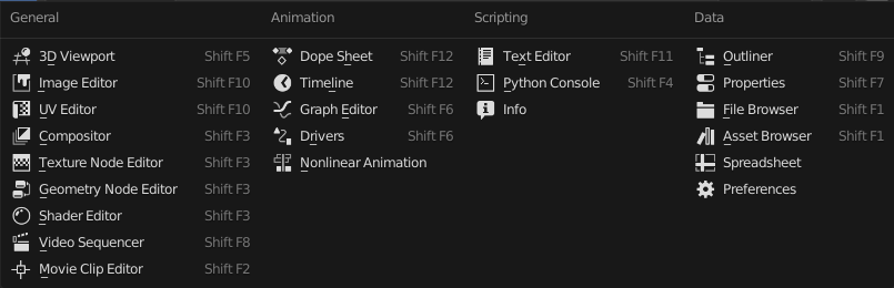

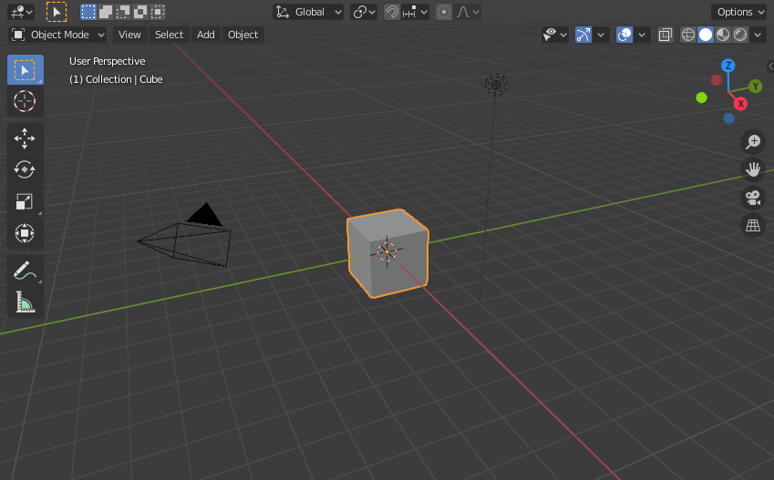
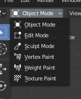


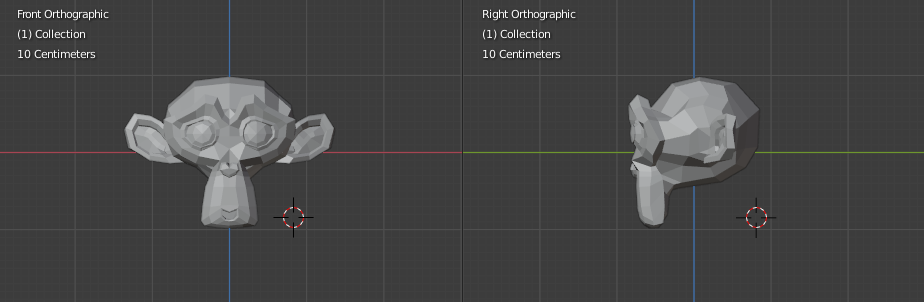
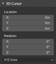


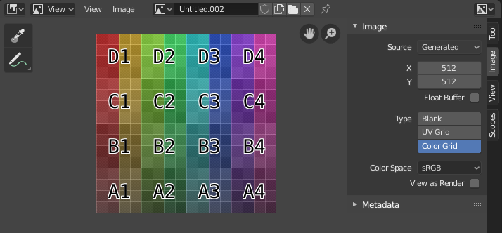


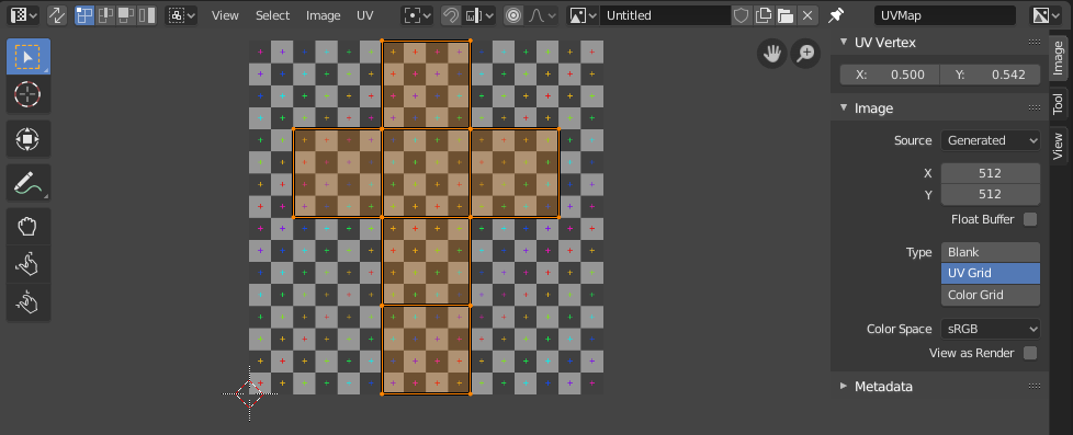


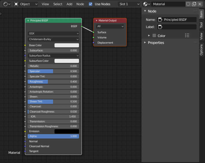
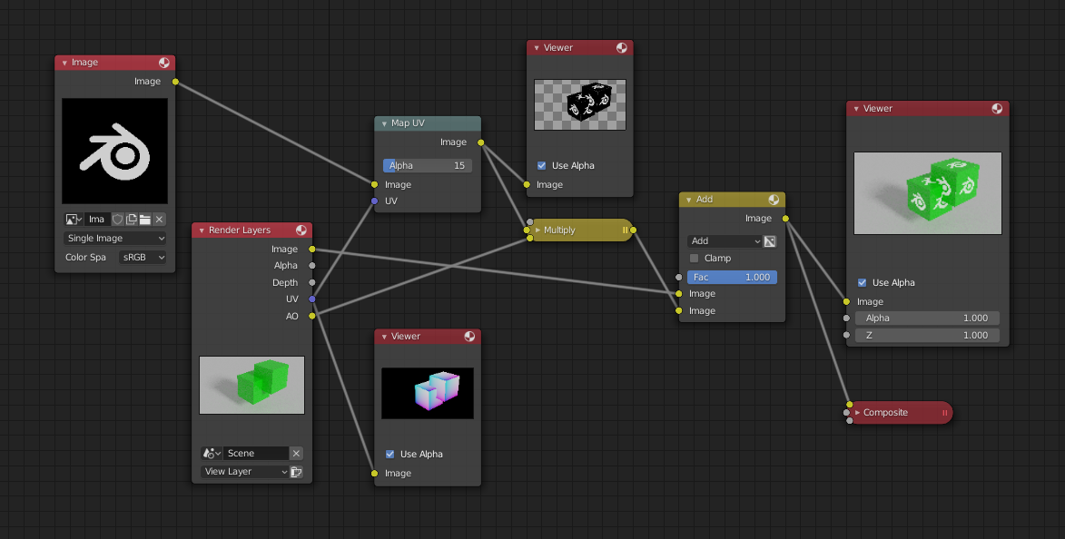
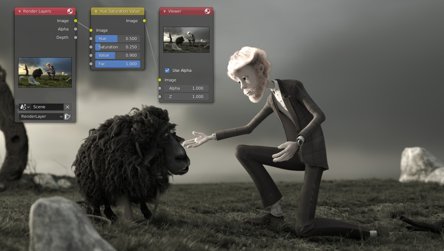


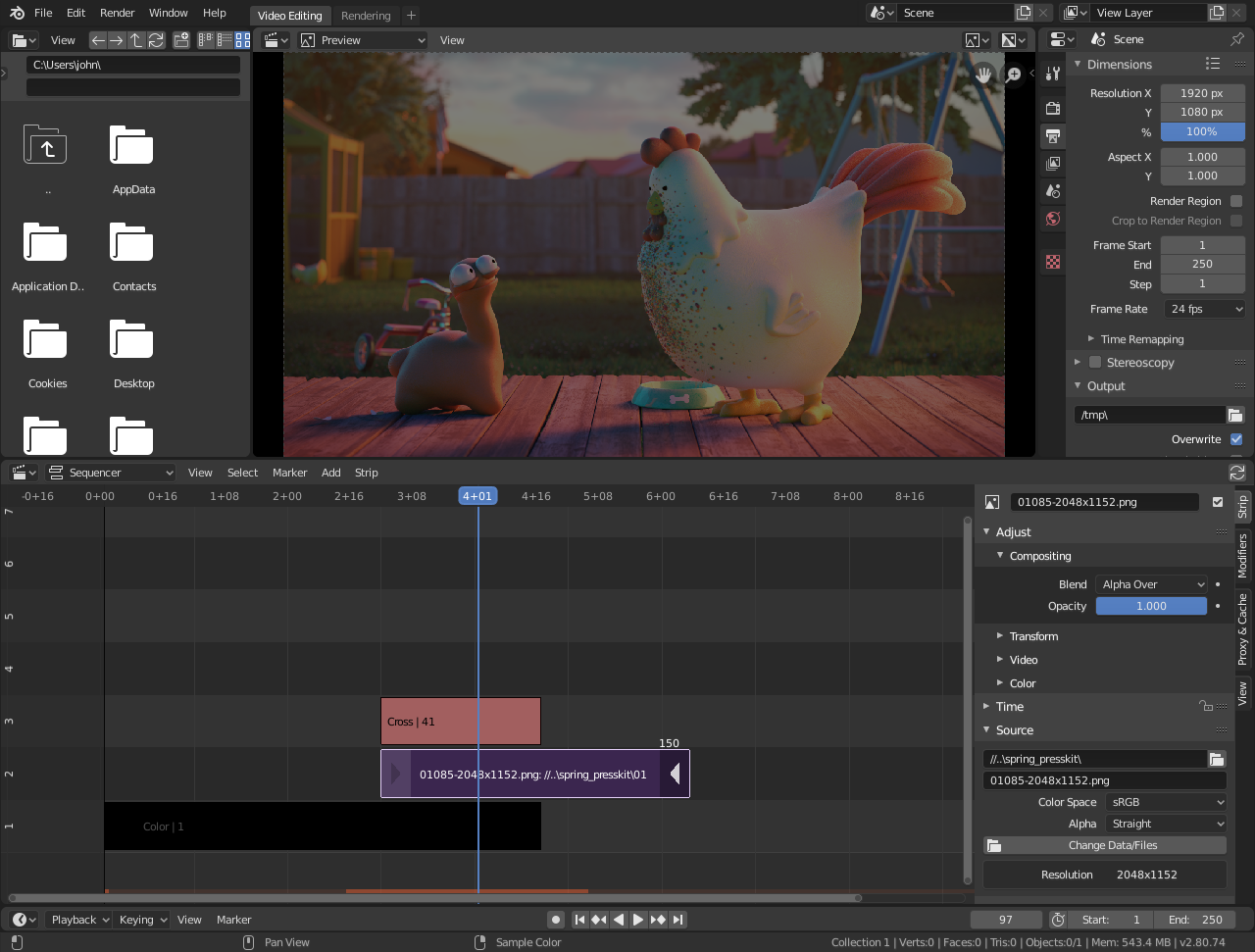


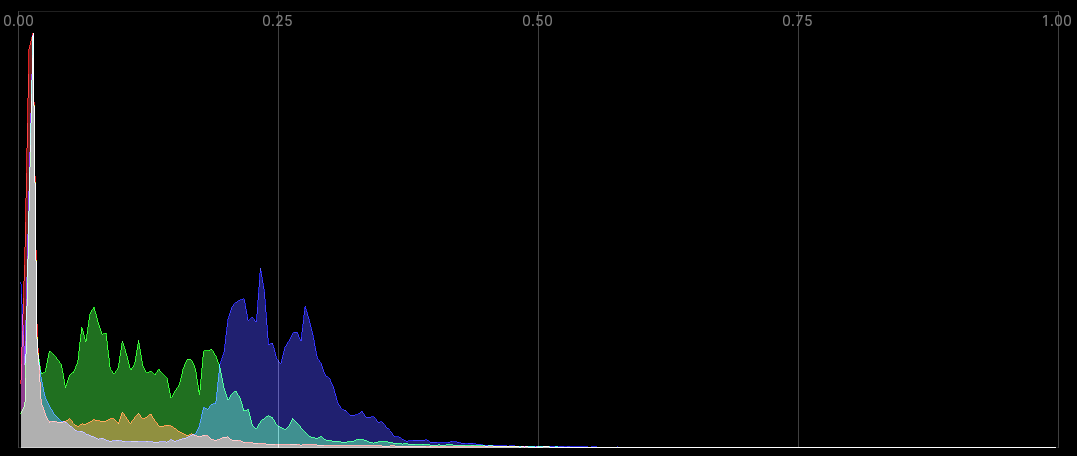

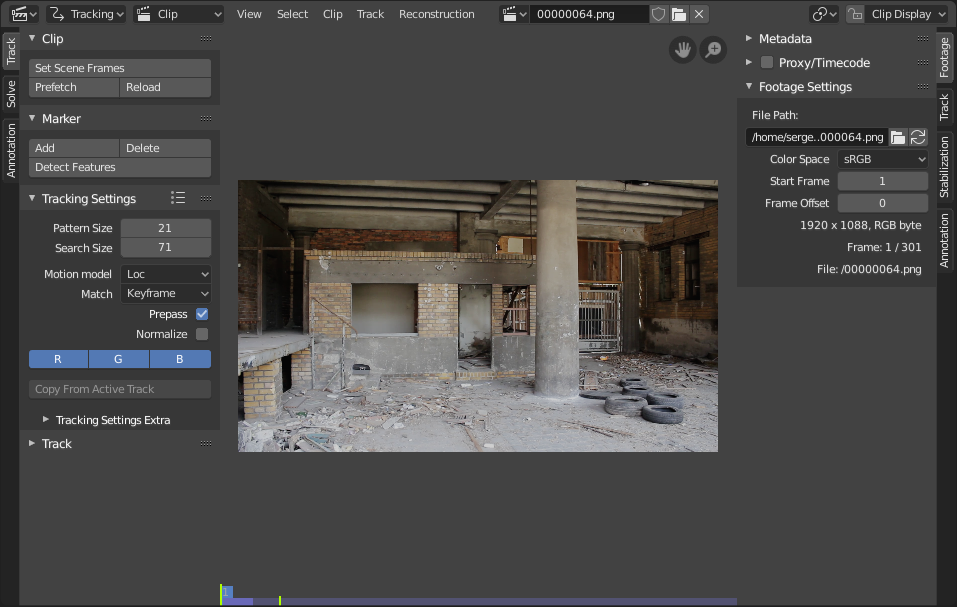
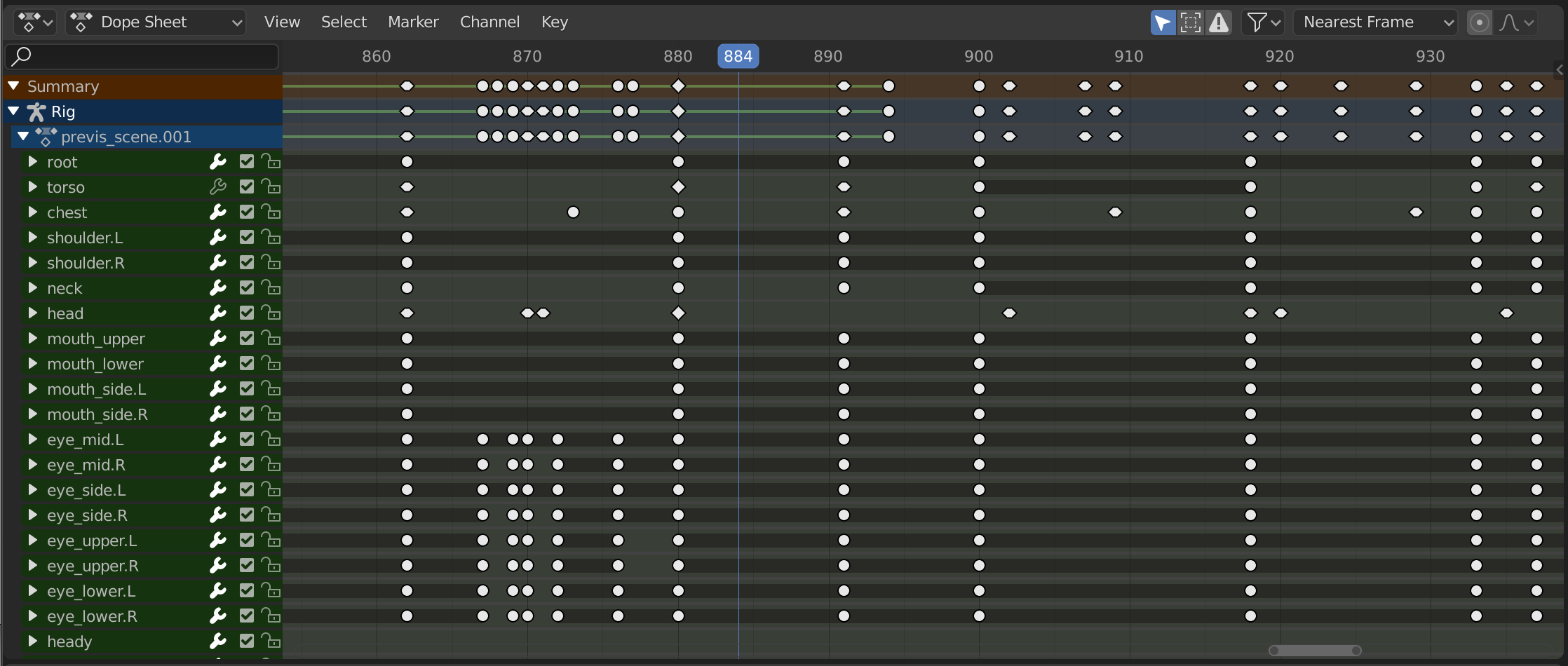
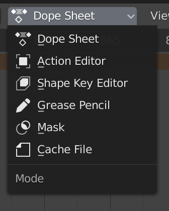
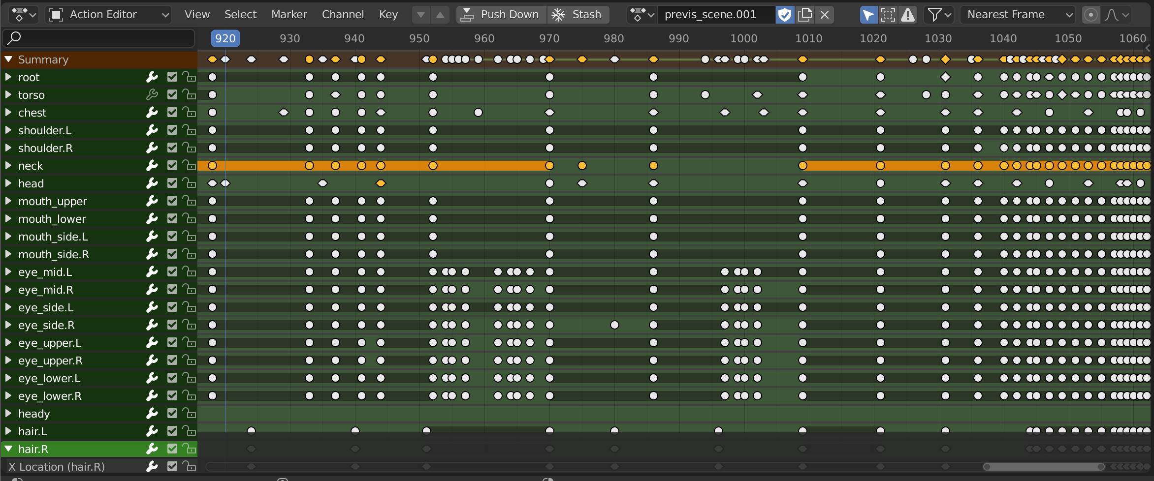
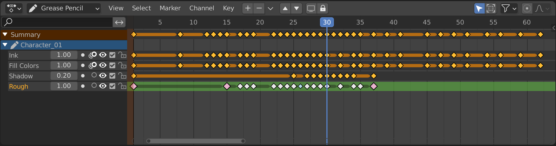
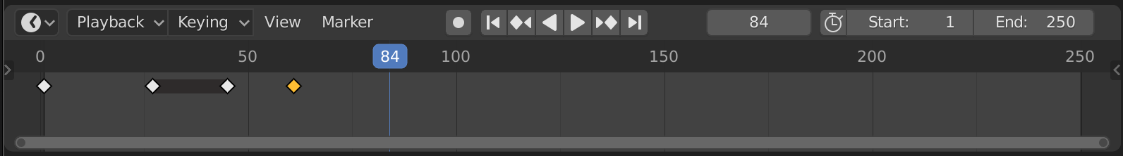
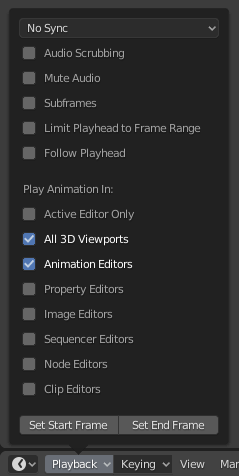
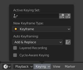

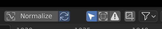

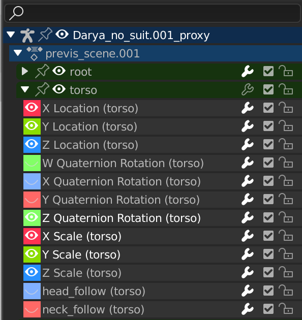


